Monday, March 28, 2022

a moment in the day: just to say

I come up the stairs with a cold glass of water to offer to my dog because he was just lapping at the very bottom of his. He's up on the futon bed, now, curled up comfy, so instead of pouring it into his dish, I take the glass and sit down next to him. Take a drink to show him how much he'll enjoy it. Reach the glass down to his level.

Nicholas looks at the glass and then at me. He's not interested.

I drink again, offer it again. He looks at the glass.

"Drink this," I tell him. "It's so good. So cold. Like a plum from the fridge or whatever. Don't you get poetry?"

Nicholas is unimpressed.

Sunday, February 20, 2022

Book Cover: Please Be Advised

A really fun project I had this winter was designing the book cover for Christine Sneed's next book, Please Be Advised. It's an epistolary novel of sorts—except that instead of being written in the form of letters, it's written in the form of office memos. Here's how it was described in Publishers Marketplace:

Grace Paley Prize for Short Fiction winner Christine Sneed's Please Be Advised, pitched in the vein of Dear Committee Members, a humorous novel in corporate memoranda chronicling the implosion of a “miniature office products” company through the work lives, extracurricular relationships, and dubious business strategies of its employees.

And here's something Christine mentioned in an email to me, that I think is an even better, deeper description of what this book is all about: "...my overall goal was to write a book that expressed the absurdity and accidental sadness of office culture, i.e. how nuts it is that many of us are forced to spend most of our waking hours doing jobs we don't like alongside people who, in most cases, we don't like much either."

When we first started working on the concepting for the cover, Christine shared some of these memo pieces with me, and they're witty and clever and hilarious.

Christine suggested that the cover, like the book itself, be constructed of memos, and of course this was perfect. In my head it was one memo for the title and one for the author name, arranged askew and with some office detritus scattered around. I pictured the cover as an organized mess, reflecting the "implosion" of the office world Christine had created.

And maybe there could be some particular object sitting on the main (title) memo. "A coffee cup," I tossed out to Christine and to editor Kurt Baumeister, "a bunch of crumpled paper, one or more of those miniature office products mentioned in Publishers Marketplace... Is there some funny element that could be hanging out on top of the memo? Spilled coffee?"

When Christine wrote back to say she liked the way I was thinking, she shared one of the specific memos from the book, and it was all about spilled coffee, and it was so good that I went all in for the coffee spill concept.

I started by arranging some pieces of paper and my husband's overturned coffee cup on the cutting
board in my kitchen and taking pictures of it. Then I got on illustrator and recreated the pages and the coffee cup. See, this is how simplistically my design work starts. ------->

As I constructed my cup I was thinking on how best to arrange it all: memos, title, author name, coffee cup... where might a blurb go, where does the book's subtitle want to be? What other remnants of office life want to be included? I thought about the edge of a keyboard but that felt too overpowering. A lot of the challenge of this cover was balance. Enough of the coffee cup has to be in the frame that the viewer instantly identifies it as a coffee cup, but then does it overwhelm the more important elements of title and author name? Make the coffee cup smaller and it doesn't look realistic against the size of the paper. Add the edge of a keyboard and you likely don't have any place for the blurb to go.

I constructed some small objects that could evoke office without taking away from the important stuff. A pen.


A paperclip. 


And finally I started arranging my elements to match the layout that was in my head.

My first color scheme was lots of reds and blues. And browns, of course. That's another interesting thing about balance. You have to puzzle together the balance of the colors. And it's more than what colors fit well together in a space. Sometimes you have elements that guide the color. A coffee spill means there's going to be brown. The main text being in the form of memos means those spaces are going to be lighter colors than the text on top of them. Which means you need a strong color for the background. Here were my first couple samples.


Christine and Kurt didn't love the coffee spill sort of blurring and obscuring the author name, so we scrapped that. They both chose the layout I liked best, which is the one on the left with the blurb up top. Putting the subtitle on the pen was fun but the other layout worked better, so that's the one we went forward with. 

Christine said she didn't love blue, so I started to think on other colors. And while I was experimenting, I got a note saying, what if it were a martini glass rather than a coffee cup, to reflect the fact that, as Christine described it, "this novel has a drunk malcontent as a main character and quite a bit of raunch too."

Then things got interesting.

Alright, things were already interesting, but think about the new challenge of creating an object of glass, spilling a transparent liquid, out of simple colors and shapes. And what would this do to the balance of color, especially with the paper no longer being blue: would we have whites on whites on whites? What would this do to the balance of the layout, now that whatever was behind the martini glass would be partly visible?

I didn't have a martini glass in the house to position into my scene at the called-for perspective so I started to scour the internet for pictures that could. Then I went back to my shapes and lines to create the glass.


Shades of white on white on white made the martini glass disappear too much (unfortunately I didn't keep any samples of that, that I could show here) so I decided to experiment with light yellows for the pages and hints of blues in my grays for the glass and spill.


I stayed with reds and reds for the moment, and of course with a martini comes an olive, so that added a bit of green (although too bright in the shade I have it in, in the above). We had to lose the second pen because it competed with the shape and smaller footprint of the glass.

I liked the yellow for the pages. It definitely brightened things up a bit in a design that had been looking a little heavy, colorwise.

Once I got the martini glass to work, it was just a lot of small adjustments as I talked back and forth with Kurt and Christine, and then later got thoughts from Leland Check, the publisher. Playing with colors. Moving and enlarging the subtitle. Playing with the text of the memo that shows behind the glass. 


And in the end they chose the iteration that they liked best, and we switched out the blurb for a mention that Christine is a bestselling author and a prizewinner, and we had a cover:


Please Be Advised will be out in October of this year. More info on 7.13 Books is here. More info in Christine Sneed is here. And enjoy a very funny excerpt from the book below.

*

INTEROFFICE MEMORANDUM

Date:   September 12

To:       All Quest Industries Employees

From:  Ted Kluck, Junior Partner, Gounes and Flinderman LLC

Subj:    New Doughnut Policy


This memorandum serves as your formal notice that forthwith and without exception, all doughnuts that appear in Quest Industries’ communal spaces must be shared with everyone. Quest doughnuts may not be thrown into the trash due to someone’s punitive relationship with food, hoarded at anyone’s desk, or resold on the neighboring streets to children and dimwitted tourists.

This memorandum does not serve, however, as an endorsement of doughnut-eating in general. Doughnuts are widely considered by licensed nutritionists and other healthcare professionals to be a source of empty calories, if not an outright danger to one’s health due to the manner in which they cause one’s blood sugar to spike and subsequently plummet with life-threatening swiftness.

We are cognizant of the fact they are extremely delicious treats, but nevertheless advise you to consume them at best infrequently and with humility.

Please direct any questions about this matter to President Bryan Stokerly’s executive assistant, Hannah-Louise Schmidt, not to me, i.e. Ted Kluck. This is my last day in Chicago for the foreseeable future, as I am heading to Washington, D.C. where I will be serving on a federal grand jury focused on corporate malfeasance, offshore banking, red light camera abuses, money laundering, and rooftop gardens.

Thank you for your attention to this matter.

Sunday, February 13, 2022

Book Cover: House Fire

Recently, I had an email from Leland Cheuk, the publisher of one of my favorite small presses, 7.13 Books, asking if I had time in my schedule to design a book cover. All he said in that initial email was, "It’s a special one!"

Leland's promotional text for the back of the book explains it best:

From an automaton navigating a forbidden relationship with a man in post-apocalyptic Australia to a reimagining of a friendship between Franklin Pierce and Nathaniel Hawthorne, Nawrocki’s short fiction ranges from futuristic to historical and everywhere in between. House Fire, the winner of the 2009 James White Poetry Prize, judged by Mark Doty—a book that was never published—blazes with poems that are erudite and precise, even when confronting the messiness of love, grief, and mortality.

The work of the late Jim Nawrocki, who died of cancer in 2018, is poignant, rangy, and genre-bending, and House Fire is a debut collection from a literary voice gone far too soon.

So, a special one, indeed. I've never before designed a book cover for someone who wouldn't see it. I definitely felt the tension of that as I experimented with colors and shapes and lines. And what a tragedy that the original book never happened for him in his lifetime. But how lovely that, recently, when Jim's partner Jason approached Leland with a pitch for finally making this book happen, Leland said yes. 

Jason had two thoughts about the possible design direction. First, he shared that when Jim's book was initially going to be published, Jim had suggested a famous piece of stencil art by David Wojnarowicz for the cover. "But after 12 years," Jason told me," and a Whitney retrospective, it might be too popular now. (Also, I think another book used it for a cover design in the past year or two...)"

Then Jason shared that another image that had been talked about for the cover of that original book was an old photo of two men that Jim had picked up somewhere, an antique store or a bookshop: "Jim had always projected onto the photo the idea that these two gold rush-era men were lovers or partners of some kind."

I loved the photo—and the back side even appeared to have the names of the men on it.

But I did worry about copyright issues in using it outright on a book cover. Even with antique photos, copyright stuff can be a bit of a minefield. And then I saw that the image was too small to reproduce well in print. 

But I started thinking. Why not combine both of these directions into one? Why not make a stencil of sorts out of Charlie and Roy's picture?

I started by drawing lines around the various areas of the men's forms and creating shapes in Illustrator

After I had created Charlie and Roy simplified down to just three colors each, I worked on a couple layouts incorporating title, author name, and place for a blurb. And added some stencil-like texture. The lettering I played with was a stencil font, which I figured I'd refine and make more my own if they decided they liked that direction. My original idea for color was reds, oranges and yellows—fire colors.

So, okay, it's a little harsh on the eyes.

Tarantino-y is what Leland called it when I sent him the samples. 

He said he and Jason liked what they saw but were interested in a softer, more obviously historical tone. "The stories and poems are wide ranging," Leland said, "contemplative, about art and history and gay identity. There’s a level of erudition in the work as well. Would love to see something a little softer to reflect that."

To get more of that historical feel, I chucked the stencil font and played with adding a decorative border. I experimented with different color schemes, including shades that could evoke a sepia tone. 


They liked the border and the sepia-like color scheme, and we refined it further. Bringing the colors up a little brighter. Trying a very deep red for the main text.

When we finally had a finished cover we loved and I started writing this post, I asked Jason for a little more information about the James White Poetry Prize, the book that hadn't happened, and the path it took to become the book it is now.

"I actually read about Leland and 7.13 in an article/blurb in Poets & Writers magazine," he said, "which Jim was still receiving for a bit after his death. 

"After reading more about Leland’s journey, I wrote him a heartfelt email (taking a chance to stray from the usual query letters I saw Jim had used for many of his past submissions) about how similar their journeys seemed to be, with one major exception—Jim didn’t make it through his illness.

"I felt like I needed to do this for Jim, to finish his life’s work ❤️❤️❤️ As I wrote to Leland, who wouldn’t do something like this for someone they loved?"


House Fire will be out in the world on May 18th. More info on this and other 2022 7.13 titles is on the 7.13 Books site here.

And here's a little sneak peek from the very first story:

*

Severin Park was, almost literally, a work of art. The creation and crowning achievement of Chansen Soo Park, the eccentric, reclusive, and infamous cybernetics genius of Seoul, Severin had been the world’s first fully functioning automaton (to use the archaic parlance his creator preferred). He was virtually indistinguishable from a human, but for the strange and almost ethereal cast of his skin, which Park père had fashioned from a mysterious kind of advanced ceramic, durable and specially developed for his robotics work.

Severin had become a celebrity of sorts. He’d been deliberately gifted with a combination of a face and physique considered both unusual and attractive. Seen often at art and fashion-world fetes, he had more or less stumbled into a kind of side career as a model, appearing in several high-end European fashion magazines. He’d had some roles in films in what had been called independent cinema. He was even something of a playboy; his creator had also taken care to endow Severin with not only the functioning anatomy required for physical intimacy, but the desire (albeit a moderate one) to use it as well, and there hadn’t been a shortage of women, or even of men, who coveted the chance to earn a turn in Park’s bed.

His wealthy creator had appeared indifferent, at least publicly, to the unusual life assumed by his handiwork. His only formal statement on the matter had been a manifesto, which, true to his preference for old technologies, he published in a limited edition and expensively produced letterpress book On the Moral Autonomy of Automatae. As its title suggested, one of its proposals was a radical addition to the system of Linnaean taxonomy, a recognition of cybernetic creations and artificial intelligences as worthy categories of “life.” The manifesto was quickly reproduced on electronic media and available to everyone. It was widely read and debated at the time. While it was clear that the inventor had used his considerable wealth to finance Severin’s emergence into the world at large, it was also evident that, after a certain interval, the quasi-human being he created had been able to support himself and live independently. Park and his creator had little contact after that threshold had been crossed.

Saturday, January 8, 2022

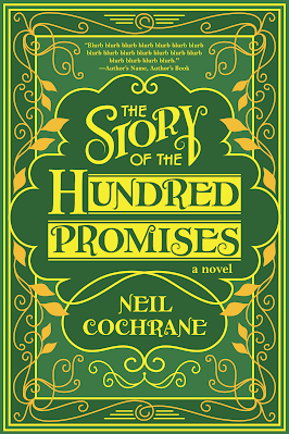
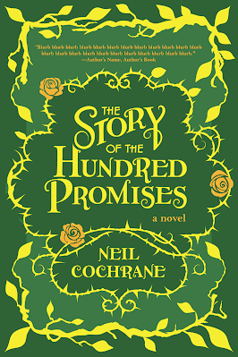
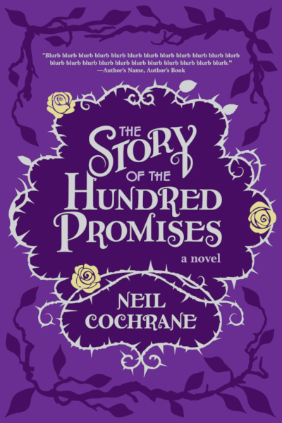
Book Cover: The Story of the Hundred Promises

The next Forest Avenue Press book, The Story of the Hundred Promises, by Neil Cochrane, is an adult fairytale, loosely based on Beauty and the Beast, with a trans protagonist. How cool is that? It's got a mysterious enchanter and a magical rose bush and silver trees that withstand human greed (!). This was one of those books whose premise gave me a fairly instant idea of what I wanted to experiment with for the cover, and I knew it would be fun.

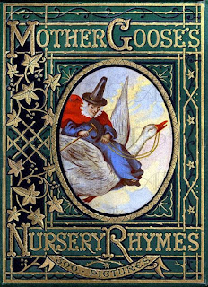
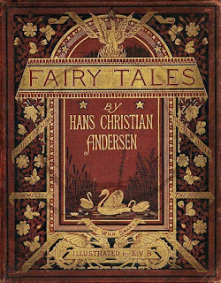
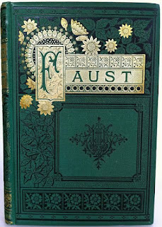
I love old book covers, and I love emulating their styles and bringing them into a modern aesthetic, as I got to do with The Alehouse at the End of the World (illuminated manuscripts) and Froelich's Ladder (fancy mid-to-late-1800s books). For this cover, I looked at a lot of beautiful old storybooks.

Look at this!

And this!

And this!

Just kidding. That one's not for kids.

(Granted, Neil's novel isn't a kids' book either, so we're even.)

I love the detail in these fancy, old book covers, and I love the simple, elegant color schemes. For my own experimenting, I started with greens and golds because I knew that the environment I wanted to depict in my design was something woodsy—to instantly evoke a fairytale feel and because I was going to include the tree and rose elements from Neil's story.

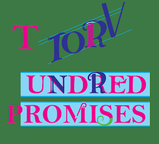
Putting together a design like this one is sort of like putting together a puzzle. Or maybe more particularly putting together a puzzle blindfolded, because you don't know how the pieces fit together until they fit together. I built the title first, using a font to determine placement but then breaking the letters and augmenting them for my storybook ornamentation. Here's a very messy picture of that process in progress.


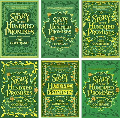
Once I had a working title, I built the rest of the design around it. I had two basic designs in the beginning: one more intricate and sans roses, and the other that felt more storybook to me. I liked the rose bush element particularly because thorns put some energy of tension and danger into the design.


I sent some samples to publisher Laura Stanfill and she discussed them with Neil. There was some back and forth as I played with different versions...


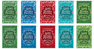
And then once they'd made their choice (they went with the rose thorns), there was a lot of experimenting with color. 


Neil wanted me to try the branches in silver to reference the silver trees in the book. Laura wondered if purple flowers would compliment the silver details, and although the purple didn't end up working like we wanted it, it made me try purples as the background colors as well, and Neil really liked that. In fact, he had this to say:

I also LOVE the purple, it feels lush and gay just like the story, haha. I don't know how else to explain it.

Sometimes I get so far in my head with the considerations of what colors contrast well with other colors, and it's so nice to get that fresh take as to what the colors also invoke to someone outside my head—particularly the author.

In asking me to try yellow flowers instead of the various shades of peach and pink that I'd been playing with, he also said:

Bonus on the purple: purple, white, yellow and black are the colors of the nonbinary pride flag. 😄😄😄

Which kind of sold me even before I'd tried out the yellow. And as it turned out, the yellow worked really nicely. In the end, Laura and Neil chose the purple and yellow, and I was thrilled. Interestingly, although silver was originally requested for the branches, Neil ended up preferring dark purple branches—but the silver lives on in the text and in the thorns. 


The Story of the Hundred Promises will be out October 4th, published by Forest Avenue Press. 

Here's a taste:

*

Darragh noted the course of the river, and Iarom’s place on it, and nodded. “So what happened to the forest?”

“It wasn’t just the forest. There was some huge storm, a quake, a cataclysm they say,” Ceara said. “There were floods and rockslides; the road broke into pieces, houses collapsed. Plenty of people died—that’s when the Barrow was built. And the trees petrified. You can’t cut them at all now.”

“A natural disaster,” said the older officer.

“A storm doesn’t turn trees to stone,” Ceara shot back.

“What does?” Darragh asked.

She looked back at him, eyes wide, and said, “Magic. But not like the alchemists. My gran, he said—”

“Your gran is so old he hardly remembers his name.”

“Yes, so old he was alive when it happened!” Ceara replied. “He was too young to remember himself, but his parents told him all about it, and they always warned my parents to stay away from the forest, because something dark and powerful lived there. It got angry when people chopped down the forest, and it punished them.”

The older officer huffed again, more forcefully this time. Darragh glanced at them, then leaned into Ceara and said, softly, “I believe you.”

She smiled and, suddenly shy, bobbed her head and left him to study the map.

Friday, October 1, 2021

Book cover: Brownie's Big PDXmas

This year I had the chance to design a cover for a kind of book I haven't had a chance to design for before: a picture book. Picture books are very close to my heart, and of course I jumped at the chance. Brownie's Big PDXmas is a charming story about a Swiss Bernese Mountain dog who has a holiday adventure in her home of Portland, Oregon. The book is written by Karena Stoner and illustrated by Anastasia Khmelevska.

It was fun to work with Anastasia's lush, glowy illustrations. For the front cover background, I took the Brownie figure from one of her illustrations and added it to the cityscape from another.

Karena had a font in mind for the main text but unfortunately, when we started working on the front cover, she couldn't locate it again, so I offered to create the lettering by hand, based on the principles of the original font. 

It would be a scrappy typeface, its lines not exact, its sizes varied letter to letter. All lower caps. It would be built on outlines and filled with texture rather than solid color, then backed with a 3-D shadow also built on outlines.

To create it, I laid the title out in Illustrator using a kid-friendly font, basically just for spacing, found a lay-out we liked and which fit nicely into the illustration, and then I built the new lettering on top of that layer, using simple lines. Here's an example along that process. The lettering for the author and illustrator names are still just stand-ins and you can see their shape is very different from the shape of the lettering I was creating.

Once we had lettering with a shape that Karena liked, I experimented with different textures for the inside: simple hatch lines, yellow balls (a la the holiday lights studding the illustration) and Karena's great idea: squares to mirror the windows in the tall building in the illustration that Portland residents will recognize as "Big Pink."

Karena chose the Big Pink version and then I refined it, adding more of a glow, then built lettering for the smaller words based on the shapes of the larger letters. I enjoyed working with the colors in the illustration, the Big Pink pink, the Portland sign green, giving us a color scheme that still looked holiday but wasn't too on the nose.

Speaking of nose, here comes Brownie, making her debut on the cover of her very own book! Brownie's Big PDXmas is available now through Barnes and Noble here, and will be available in lots of other places soon. I hope you'll check her out and get lost in her sweet adventure.

Monday, August 30, 2021

Book Cover: A Year in the Life of Death

I've been having a love affair with a book, the latest book I've been working on creating a cover design for. That's a pathetically clunky sentence, but I don't even care. I love this book that much. 

For one (small) thing, it's a bucket list book. I've never designed for a poetry collection before.

It's also a book written by a friend, which makes it extra special.

But beyond that, I have a history with this book. Back in March of 2016 I did a reading with writers Shawn Levy and Shannon Brazil at Salon Skid Row. Curated by writer Josh Lubin, Salon Skid Row was a great Portland reading series that I hope returns once we can get out and do live in-person readings again. 

Everyone who read at Salon Skid Row got their picture taken under the Off-Track Betting sign

That night, Shawn Levy read some poetry he'd written based on obituaries in the New York Times. It was unlike anything I'd see him do before. I was used to Shawn as the writer of books like DeNiro: a Life and Rat Pack Confidential: Frank, Dean, Sammy, Peter, Joey, and the Last Great Show Biz Party. These poems he read were like taking his interest in biography and, instead of going expansive with it, paring it down to the barest of details. 

The way he focused on the New York Times specifically touched my nerd soul. And I was completely enthralled with the idea of poetry based on obituary. It's about death but, more so, it's about tribute. It's about life.

What began with that reading at Salon Skid Row grew into a book: A Year in the Life of Death. And what a year that was. To borrow from Shawn's introduction, 2016 was, "the year that everybody died: David Bowie, Prince, Merle Haggard, Leonard Cohen, Muhammad Ali, Arnold Palmer, Gordie Howe, Antonin Scalia, Nancy Reagan, Fidel Castro, John Glenn, Janet Reno, Carrie Fisher, Debbie Reynolds, etc. … a roll call that was also a history of the 20th century."

I don't generally solicit design jobs; they generally find me—but when I heard this was going to be a book, I went after it. I sent a please-think-of-me email to the publisher, University of Hell Press. I sent one to Shawn. I may have made a pest of myself. I don't know. But I got lucky and got the job. And when publisher Greg Gerding sent me the manuscript I devoured it. I often don't have time to read a book I'm designing for, but I couldn't stop. Each poem was a tiny mystery story with the last line revealing the subject. I'd scroll and not allow myself to look ahead. I'd try to figure out who each poem was about before I got to the end. I was surprised by how many of them made me cry. Many also made me laugh. The book was more than I'd even expected it to be, indeed a history of the 20th century full of fascinating information and social commentary and nostalgia and, of course, human stories that ran the gamut from celebrities to folks I'd never heard of. 

I was over the moon. And not only was I hired to design the cover but he asked if I'd like to design the interior as well.

Yes, please, yes, please.

I got together with Greg on Zoom and we talked about the book, about book covers he likes, about thoughts both of us had. The main consideration he had for the cover was that, in my color scheme, I use a powder blue that could evoke the color of the blue bags the New York Times comes in.

Greg also had an idea of a tunnel of concentric shapes, much like this design for The Bell Jar, but the center or entrance of that tunnel would be the simplified shape of a gravestone rather than a circle.

I went to work on that idea and also did some concepting of my own. 

I thought about how to evoke the concept of a year. I mocked up an idea using the phases of the moon with a newspaper hanging from one of the phases. I thought about how to evoke the concept of death without being too on the nose. I mocked up an idea of a collaged lily, the flower of funerals, made of scraps of paper—scraps from obituaries, showing the names of some of the recognizable figures in the book. 


The original subtitle was NYT Obit Poems 2016, but as you can see, I screwed that up in my first couple samples, leaving off the word Obit. I liked the idea of torn bits of paper overlying my backgrounds and used that in my titles and author names. Of the two blues I tried, Greg preferred the lighter, so that was the color that continued forward into later samples.

Greg liked the sample using the grave-shaped tunnel and asked that I try it with cut paper rather than torn, with straight placement instead of skewed. All-caps for the title.


In the lower left, by the way, is the University of Hell logo, which gets placed on the front covers of all their books, often in fun, creative ways.

While making suggestions for the tunnel concept, Greg encouraged me to try other ideas, and I kept coming back to the names. What could be a better selling point for the book than the names of all the amazing subjects of Shawn's poetry? I tried the names running behind the title, obscured by blots of ink to evoke the newspaper printing process. I tried them hanging over the title on a torn piece of paper. I tried throwing them across the cover and piecing the title and author together from their individual letters. That one might have been a little strange.


Greg and Shawn chose the sample with the names on paper looming over the title. Now that we had a direction, we refined it, making the names smaller, more newspaper-like, added the ages in. We changed up the subtitle, tried different textures. In the end, when we had a cover we all liked, I sent it to my mom to show off. She said her first reaction was to be stunned by the names. By the sheer volume of the names. That reaction brought home for me, I think, what really works about that design. How you can't help but be surprised by all that came to a close in 2016. And the names on the cover are only a fraction. It truly is a history of the Twentieth Century, rendered in the elegance and thoughtfulness of Shawn's words.

A Year in the Life of Death is available for preorder through the University of Hell Press here. It officially pubs on October 12, right alongside another really great U-Hell book, 2020*: The Year of the Asterisk, an anthology of essays exploring that very fraught year. In fact, the publisher has added a $5-off "2021 U-Hell bundle" that includes both books, and that offer can be found here.

Thursday, August 12, 2021

A moment in the day: bee

When Stephen leaves for the dentist, he asks me to catch the grasshopper that's on the inside of the bathroom window curtain and take it outside. "Do you want to do your good bug deed for the day?" is how he asks it. I take a water glass into the bathroom and gently lift the curtain back, cup the glass over the grasshopper's body, then slowly lower the glass down, sliding it against the curtain, until I can slip a piece of paper across the rim and trap the grasshopper inside. 

I take a moment to view my captured friend. It sits on the curved inner surface of the sideways glass, tiny bright green body, angled limbs and antennae. As if it's not at all cornered in a small pocket of space, it sort of casually raises one of its hands to its mouth, grooming. Making itself pretty.

I take it outside. I don't want to put it in the grass because the grass is dead and hot in the beating-down sun and maybe the grasshopper will die of this heatwave, so I let it go next to that low-to-the-ground plant that creeps across the pavement in the corner where the shade is.

At the very edge of that creeping plant something is moving. I crouch down. It's a bee. It's lying sideways on the pavement, little limbs twitching, and at first I think it's fallen over and can't right itself. I consider taking the corner edge of my piece of paper and using it to gentle the bee upright. But then I think, no, the bee is dying. If you're dying, you don't want someone coming along and trying to shove you up on your feet.

The other day I saw one of those memes showing a closeup of a bee with text declaring that these are the most important animals in the world.

I sit down next to the bee. There are tiny spots of bright orange pollen on its legs. I don't want to leave it, somehow. Its tiny legs twitch in an almost frantic, convulsive way. 

Even in the shade, the pavement is hot. This burning planet.

The bee slows its twitching.

The bee dies.