Saturday, August 13, 2022

Book Interior: Glory Guitars

I feel like starting this post with the classic Sesame Street sign-off.

This book was brought to you by the letter G.

Because how can I not, when the memoir Glory Guitars, by Gogo Germaine, is being published by University of Hell Press' Greg Gerding, with cover art by Joel Amat Güell, author photos by Glenn Ross, and interior design graced by my own Gs*? The number of Gs in that list makes me so giddy that I want to go through the entire interior of the book and count all the Gs in it. But that would be weird.

8,295.

Sesame Street is a strange reference, of course, when you're talking about a book crammed full of sex, drugs, and punk rock. University of Hell describes the book as the "memoir of a ’90s teenage punk rock grrrl." It's a power-chord-fueled joyride full of personality and wit (gee, that sounds like a blurb)—and toward the beginning of this year, Greg reached out to me about designing its interior. Now, interior design doesn't sound anywhere near as fun a project as cover design, but this one was a blast. It was way more than laying paragraphs of text down on the page. Greg wanted the interior design to match the edge and energy of the book and provided me with super fun illustrations that I could use throughout and loads of freedom for experimenting with how to use them.

The cover design was done, as I mentioned before, by Joel Amat Güell, and it's drop-dead perfect.

A lot of Joel's elements from that cover were given to me in individual, black and white form.


And Joel created special illustrations to head each chapter. Like so:


So fun, right?

One of the cool things about Glory Guitars is that it's structured around a "soundtrack." Each chapter is divided up into short sections, and each section is headed and ended with a song in this soundtrack. "Never Say Never" by Romeo Void. "Submission" by Sex Pistols. "Fun Time" by Iggy Pop. "Demirep" by Bikini Kill. The songs give flavor and a nice layer of punk history to the book but they're also nicely curated, reflecting the stories and the tones of each section. My job was to give the soundtrack its visual sense, something that would fit with the overall look of cover and interiors and evoke, of course, music. Music and edginess and, since these were breaks between sections... breakiness.

Joel made us a couple small CD illustrations in the style of the rest of his art, and I arranged things like so, referencing the way the subtitle is styled on the cover.


It was fun to be loose and scrappy with these, make them different every time. The challenge was fitting everything elegantly on the page. If the text came too far down, for example, there wasn't enough space for a soundtrack break but too much empty space left at the bottom. The added element of footnotes on some pages made this challenge even harder. Then the big challenge came in the proofing process, where small changes were being made in the book, and each tiny change could set off a chain reaction to the spacing for the rest of the chapter.

Chapter openers had the special Joel illustration, with some added styling of my own, plus a soundtrack song to start them off.


As I worked through the pages, arranging text and artwork, I found and listened to lots of the songs in Gogo's soundtrack.  I don't know much punk, although I've always like the hypertensive, raw sound of it. It was fun to immerse myself in her chosen songs as I put together the interior of her book.

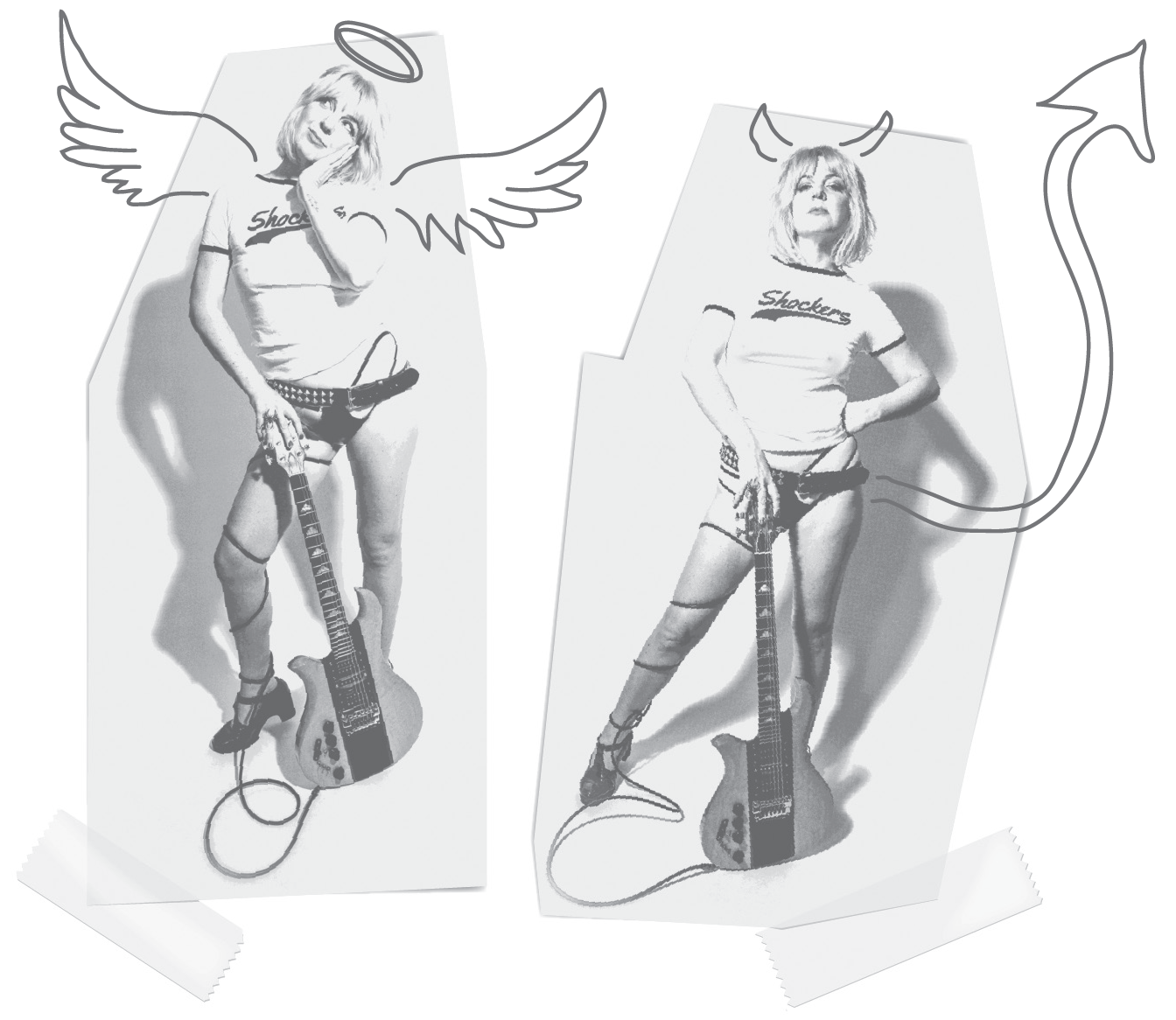
I won't share all the different touches, but I'll say that I extra enjoyed blinging up her author photos...


...and doing a little Glory Guitars treatment to Patti Smith's epigraph.


Glory Guitars
is available for preorder in all the main places, like Indiebound, and also on the University of Hell Press website where you have the added bonus that you can choose from five different variant color covers. It's officially out on October 11, which is also the International Day of the Girl. A cool promo video, is here. Here's an excerpt to let you know just what kind of punk grrrl you're dealing with:

By age fifteen, we had discovered an intricate infra-structure of debauchery across Fort Collins. Our entire network of punks and degenerates knew its secrets. We knew which liquor stores sold to minors: the cramped chunk of cement on Riverside Drive with a view of the train tracks; the more wholesome, suburban wine shop where parents might shop, yet they surprisingly didn’t ID. We knew which cafes would let underage people smoke inside: Max’s Subsonic—an old house turned café, with rooms to get lost in, that threw actual parties for underage kids—plus late nights at IHOP, and within the dingy, red-painted walls of Paris on the Poudre, the goth cafe. While I’m glad for the health of today’s youth, I almost feel bad they won’t ever experience the dirtbag tang of indoor smoking.

Teenage haunts are havens for illicit activity that are hidden in plain sight; they often have short names easily whispered in a pinch. The Ditch. The Dam. The Path. I knew the Path was a hard place the day one of the skaters shot a new girl at school with a duck gun as his friends erupted in laughter. I was horrified, but the fact that I didn’t do anything to help still haunts me.

There was the Starlite, the downtown punk club as shitty as its glittery aspirational name suggests. It hosted many of my friends’ bands, touring acts, and it even hosted an impromptu show in the parking lot featuring ALL, former members of the Descendents. Plus, the occasional party where girls wrestled in kiddie pools of Jell-O.

The memories of such parties and locations are often mysterious. I have a hazy memory of participating in Jell-O wrestling at the Starlite but can’t be sure. It happened during Corinne’s and my wrestling phase, a brief period when we couldn’t even be together without her getting an evil glint in her eye before thrashing me on whatever PBR-soaked carpet or viscid floor we were on. I have a glimpse of a memory of the Starlite, and looking down to see my white tee soaked in syrupy red. I have another piece of a memory of making out with a skater boy, Shane, in the back of a crashing car. Kitty was backing out and lodged the car into a pole.

~

*Not wanting to not give credit where it's due, the front cover photos were by the decidedly G-less Carri Lawrence.

Sunday, August 7, 2022

Book cover: No God Like the Mother

Recently, Forest Avenue Press acquired reprint rights to Kesha Ajọsẹ-Fisher's story collection No God Like the Mother. It was originally published in 2019—and in 2020 won the Ken Kesey Award for Fiction!—but the press that published it, Portland's Inkwater Press, closed its doors and the book went out of print.  Later this year, Forest Avenue Press will be bringing it back and giving it national distribution through Publishers Group West. It's an honor to play a small part in the relaunch of this amazing book by creating a new cover for it. 

It's daunting, too. After all, you want to honor the original but still make it new.

I designed a new cover for a reissue once before, for Sara Lippmann's Doll Palace. In that instance, we wanted a completely new cover, but I incorporated a small reference to the original art into my new design. For No God Like the Mother, the original cover art was created by author Kesha Ajọsẹ-Fisher's own daughter, Omo’Dara Ajọsẹ-Fisher! It's a fabulous line drawing of a woman wearing a headscarf and hoop earrings, standing with her back to the viewer. 

Because of the obvious personal connection between Kesha and her original cover artist, we wanted to create the new design as an homage to that art. But I'll admit that I procrastinated a bit at the beginning of the project. I had a lot of who-am-I-to thoughts. Who am I to take this art and make it something new? An impostor? A usurper? A wannabe who might not be up to the task?

I thought about films that remake the original, how each stand on their own. 

I thought about a recent art series of my husband Stephen O'Donnell (Re:Pose), in which he created new paintings based on classic works, swapping the genders of subjects and using it to say new things.


With that, I started to find my way in, and I quickly got caught up in the task of recreation. Homage is a seductive exercise. Some of my favorite projects have been ones that allowed me to pay homage to something else—pulp magazines for City of Weird, illuminated manuscripts for The Alehouse at the End of the World. For No God Like the Mother, it was content rather than style that I was paying homage to. The single subject, back to the camera, the head scarf, the earrings. I used it all and worked to make it something new.


It turned out that I needed only one basic sample to send to Publisher Laura Stanfill, for her to in turn send to Kesha, and everyone was happy all around. From there it was small tweaks as we arranged the blurb and added the award badge. And then one last step made things really special.

Laura and Kesha discussed adding the Nigerian translation of the title, No God Like the Mother, to the cover. Kesha got us the translation and I thought on how best to incorporate it cleanly and unconfusingly, and we had our cover.

No God Like the Mother will be out sometime later this year, depending on the current supply chain issues. More info is here. And here's an excerpt!

“All my children came with the rain,” she said. “This one will, too.” Her voice was feather-light. She looked down at her protruding belly. “Even the ones fighting to stay inside have no choice when the sky opens.” She held up three fingers. “I walked to the tents by myself, three times, and never came home with my children.” Shifting on her bottom, she continued: “1960, independence for Nigeria, a sweet year, even here in Ile Omi. I heard of a new midwife across the river. When I tried to cross, the river threw me this way and that. I kept moving and singing to chase the pain away. I sang about birds hiding from rain, and inside, you kicked and kicked. When I mentioned the birds returning after the rain to steal fattened worms, you were quiet.”

Saturday, July 9, 2022

A dozen random things about my aunt Kathy

1. When I was a kid, her nickname for my little sister Edina was "My Pal."

2. She was a huge lover of animals and her house was always full of dogs, cats, and at one point, birds. The first animals I remember were the dog trio of Bingo, Domino, and Hopscotch.

3. Once when she was living in Brussels, Belgium, young and partying, she decided to stow away on a boat bound for America, and they had to dock in Cherbourg to offload her and send her off to call home from the hoosegow.

4. She was a great audience and if you were at a comedy show, a lit event, a performance of a family song, a drag show you put on for your fortieth birthday, you could always hear her laugh over the rest.

5. She always insisted on paying the bill when she went out to eat with you. The only way you could get her to let you pay is if you were stealthy and pretended to go to the bathroom in the middle of the meal and pulled the server aside and slipped them your credit card.

6. This from my kid diary, June 3, 1985 (spelling errors intact): "We awoke around seven to get ready to leave and we left around 8. We were listening to one of my Beatles tapes and it was great. But, this wierd guy in a truck did something to Kathy that provoked her to shoot him the finger. This truck started following us at 85 miles per hour, easy. Really close. We sped up. It still followed. We finaly slowed to let him pass and the guy actually tried to bump at us as he passed! Well, we took down the licence number and tried to report him, but we weren’t successful. But, we didn’t get killed, so it’s alright."

7. She's the reason most of my life is what it is today. She sent me the CD of Rufus Wainwright's Poses, which led me to the Rufus Wainwright message board, which led me to hearing about an art show by an artist named Stephen O'Donnell, which led me to see the art show on a visit to Portland, which led me to write the artist a fan email, which led to an online friendship, which led me to visit Portland again to meet him, which also led me to meet Kathy's friend Steve Arndt, which led me to meet Tom Spanbauer and to learn about Dangerous Writing, all of which led me to move to Portland, marry Stephen, study writing under Tom, work for Powell's, dot, dot, dot. At our wedding we told a hopefully more truncated version of this story, and Stephen summed it up with: "No Kathy, no party."

8. Another moment from a kid diary, September 1, 1985: "Last night, we went over to Kathy & Mike’s to see them for dinner. Fred cooked beans and rice. After dinner, Edina and I had a great talk with Kathy. All about life and morals and philosophies, and friends, juicy things like that. A really spicy conversation."

9. She had a great eye. In the last years, she got really into art, doing lots of lovely sketches and paintings. Earlier in her life, she made her own darkroom and took and developed really great pictures.

10. When she broke her hip and was in the hospital for surgery, and I offered to go get her some supplies like pillow, brush, iPod, she asked me to sneak her in some weed.

11. She was endlessly generous, supporting so many people in so many ways. Friends, family, houseless folks, many different organizations. She was for years the sponsor of the Burnt Tongue reading series and the Portland Writers Picnic.

12. She really rocked that pink hair.

Saturday, July 2, 2022

Book cover: Plums for Months

I'm very excited for Forest Avenue Press' next memoir, Zaji Cox's Plums for Months. Publisher Laura Stanfill describes it this way:

As a neurodivergent child in a hundred-year-old house, Zaji Cox collects grammar books, second-hand toys, and sightings of feral cats. She dances and cartwheels through self-discovery and doubt, guided by her big sister and their devoted single mother. Through short essays that evoke the abundant imagination of childhood, Plums for Months explores the challenges of growing up mixed race and low-income on the outskirts of Portland, Oregon.

The book was submitted for consideration under the working title The Gresham House, but when Laura and I first started discussing cover design, she and Zaji were separately in talks about different possible titles. Still, whether that house was in the title or not, it's a very important element in the book, and in brainstorming thoughts for the cover, Laura threw out the idea of a house, small within the frame, surrounded by the trees of its forested backyard. Specifically cedars. I wanted to make it look like the actual Gresham house of Zaji's childhood. I asked if she could get me pictures. But Zaji couldn't find photos that showed enough of it, and sadly, the house is no longer there.

I drew some cedars in Illustrator as I waited to find out if we could get a good picture of the house, and in the meantime, Laura and Zaji finally settled on the title, Plums for Months: A Memoir of Nature and Neurodivergence.

When Laura forwarded an email from Zaji that had info on the house (we thought maybe I could Google Earth the address back to the time the house was still there, although I couldn't figure out how that's done), the email thread came with some lovely back and forth as Laura and Zaji worked through title ideas, and this commentary on what Laura liked about the title Plums for Months really caught my eye:

"The abundance in it, the single mom raising two girls in a house with fruit right outside the door, the sweetness of your relationships, how this book is not full of trauma, but of wonder. How you receive and receive from the outdoors at the Gresham House, how it never gets old or boring to you—you keep finding joy in nature. Even the hard things in your book come with wonder and surprise, not fury or anger. I also love that evocation of senses—purples and sweetness..."

And a little further down:

"PLUMS FOR MONTHS has a sense of delight, that delight you felt as a kid and put on the page, and I think that's why it's at the top of my list. The gift of a tree. Of land with trees that fruit."

I was struck by two things in Laura's remarks. First that this memoir is not full of trauma but of wonder—something we could all use right now. And second, the importance, in the book, of abundance. Of sweetness and the gifts of nature. The word abundance kept following me around as I mulled the design. And I started to see plum branches (and, oh my gosh, plum branches are the definition of abundant) cradling the title, subtitle, and author name. So, I put the house aside for a while and started building plum branches.

No thought to color at the start, just creating shapes and tossing out reds and blues and yellows to distinguish between the elements.


Often I work on more than one concept at a time for a book cover, but the plum branches sort of consumed me. 

Maybe part of my obsession with it was what was going on in my life outside of this work. I spent a weekend full of worry because a very close loved-one was in the hospital, and all I could do, when not talking back and forth with family, was build plum branches. 


I made plums and leaves while worrying about learning bad news, I made plums and leaves while finally learning better news. By the beginning of the week, as she was heading home from the hospital, I was surprised to find a fully formed cover design that I really loved.  I played around with where the blurb should go and sent samples to Laura. 


Laura was happy with what she saw. She chose which one she liked best, and we decided to go ahead and see what Zaji thought. I did a little more refining and added some stars and then Laura sent it to Zaji.


Zaji was happy, too, but had one request. "I wonder if there's a way to incorporate cat imagery...without it seeming too obvious." Ah, yes, the feral cats! 

I liked the idea and started thinking on how best to incorporate them without taking away from the design. I liked her thought of not making them too obvious. They could maybe be a surprise you come upon. Laura was brainstorming right away: "I wonder if a cat could be sitting facing the reader with its head at the bottom of the plum wreath, almost like it’s wearing the plums. Or like a jigsaw puzzle with ears jutting into the wreath. It could be this same color scheme—a black and teal cat or whatever, not a realistic one. Or a turned-head silhouette on the top left, overlapping the trees? Or there could be a hidden cat (or cats) within the plums, so only people who are really paying attention see them. I’m thinking more silhouettes like the trees, more than photographs or anything. If you think you could add a touch of cat."

Heh. A touch of cat.

I was particularly interested in her idea to hide the shape of a cat or cats within the coloration of the plums. But I started a little more literal, creating a simple silhouette cat and moving it around, seeing what happened. I kind of loved the fact that it's easy for cat ears to camouflage as leaf tips, and there was something distinctly catlike about having them hide in the greenery. I sent back a couple versions of the cover with my touch of cat, and Laura and Zaji liked them and both chose their favorite—the same favorite—and we had our cover (stand-in blurb included to show balance).


Plums for Months will be out in May of 2023. More info is on the Forest Avenue Press site here.

Here's an excerpt!

*

As the rain of autumn becomes the rain of winter, the mother and older daughter keep the house warm with chopped firewood and the downstairs heater that sometimes works. Summer finally arrives to bring enough blackberries, blueberries, grapes, apples, and plums for months. Hands scrape past thorns and reach above tall branches to pick the very best fruits to cook with. The younger daughter helps cut back the invasion of blackberry bushes around the sides of the house whose vines tap the windows; her small hands curl around hedge clippers and reach as close to the roots as possible. With nimble fingers she helps mend the broken downstairs window with plastic and tape. 

Some nights, the three listen to the wind howl, the house creak, or the rain and wet tree branches thrum against the house, and continue to adjust to the new nature. They huddle closer in the living room, closer to their popcorn and movie and each other, and let the outside music play in the background.

Sunday, April 24, 2022

In the bathroom with Barbra Streisand

 I've been looking through my old kid diaries trying to find passages about my aunt Kathy to share. But I came across this, which seemed appropriate for Barbra Streisand's 80th birthday. Kathy features a little, but mostly this is my cousin Heather and me and our brush with Streisand.

From my diary, with all spelling and punctuation errors intact. June 7, 1984.

*

Well, last night was the N.O.W dinner with Barbara Streisand. First, mom & I rode down to Heather's house with our clothes and everything. We got dressed & made our selves beautiful. (I went & got a dress at the mall with mom) at Heather's. A long, blue limosine picked us up and we started for the place. There were 4 seats in the back, 2 facing each other and the other 2 facing each other. We drank virgin Marys from the limo while Mom & Kathy drank champagne. It was raining. People would watch to see if we were anybody famous. We walked in after leaving instructions with our shofer (however the hell you spell it), Rob. The place was packed. I had a ginger ale & we found our seats. Dinner wasn't very great. We had dry chicken breasts with the bones still inside and some rice. Heather & I got served white wine with it. Then Heather & I decided to walk to the bathroom. In the bathroom, Heather was waiting on a stall and out came Barbara Streisand. I brushed her arm slightly as she rushed past & Heather sat on the same toilet.  

Saturday, April 2, 2022

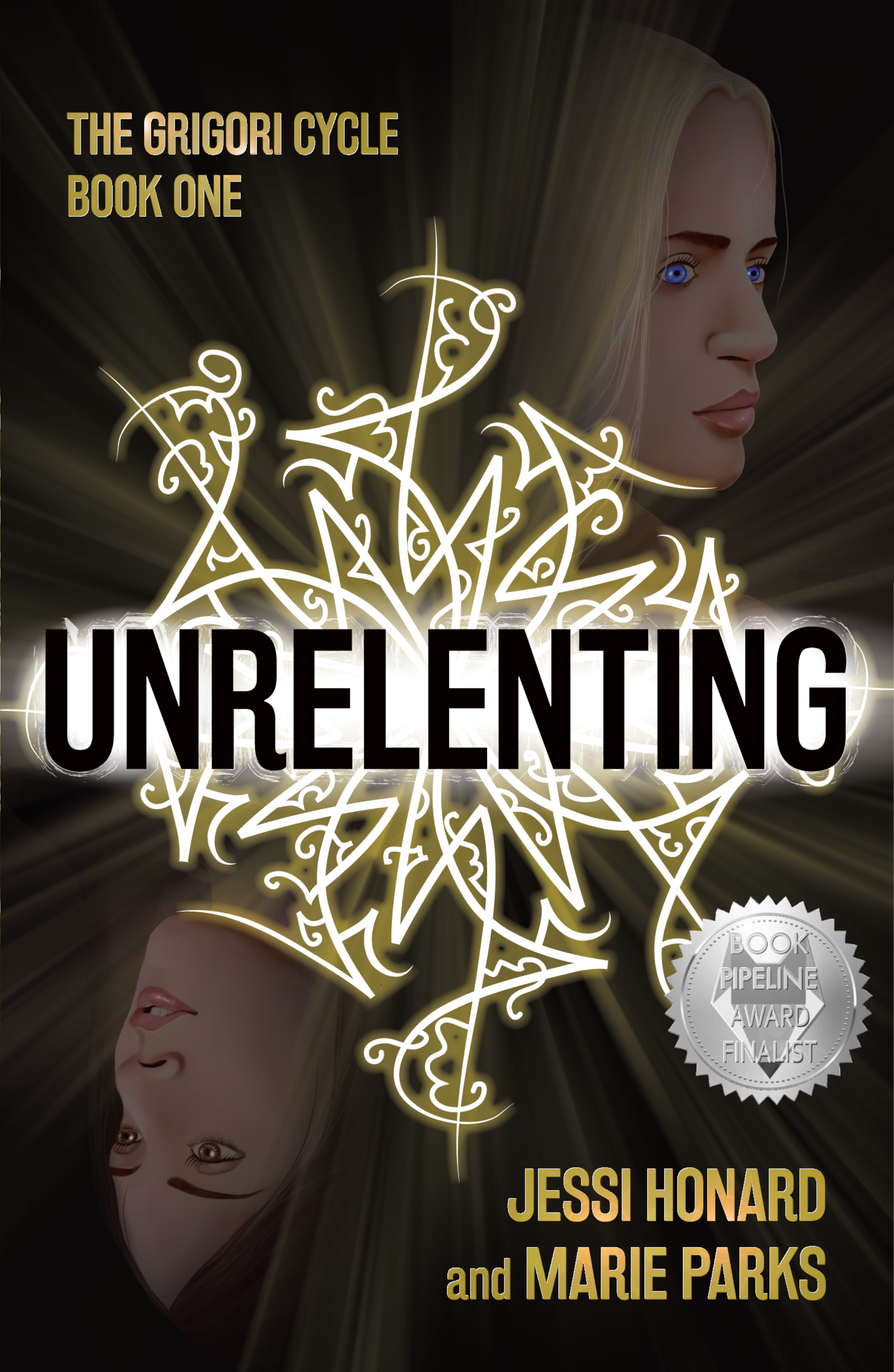
Book Cover: Unrelenting

Whew. This was a hard one.

One of the reasons I love design work is that there’s always a challenge. Fitting the elements together, the colors, the fonts, it’s always a puzzle, and I love the puzzle of it.

The challenge in Unrelenting, a novel due out April 19 from Not a Pipe Publishing, was that I offered to produce a painted illustration as part of the cover design. 

Now, I'll say it's not that I've never stepped back from the computer to create art for a cover before. I had, not too long before, done the cover art for Caitlin Vance’s Paper Garden by hand-painting the faces and tulips for that illustration, and it had turned out nicely. But the style of art that authors Jessi Honard and Marie Parks wanted for Unrelenting was much more finely detailed. In fact, in sending me examples of the type of illustration they like, they referenced my cover for The Untold Gaze, the book I co-produced with my husband who’s an actual fine artist. 

And yeah. Sadly, I’m no Stephen O’Donnell.

But I’m getting ahead of myself. Before I even started working on the painting of the book’s most important characters, Bridget and Dahlia, I created the main element of the cover design, the Grigori symbol.

Briefly, the book is about Bridget, a young woman who, in searching for her missing sister Dahlia, discovers, as the publisher describes it, “a carefully-guarded plot tied to powerful, age-old magic.” The magical dark forces in the story are called the Grigori, and their calling cards are symbols that are found in various places throughout the novel—on walls as graffiti, even on people’s skin. Here's a description from early on in the book:

An intricate array of black strokes covered the worn cinder blocks. The artist had taken care to ensure the geometric pattern was precise, creating an expanding knot of swoops.

And further down:

“It’s cool,” he remarked, stepping forward to get a closer look. “Kinda reminds me of fractal art.”

My early experimenting to create one of these symbols relied heavily on the combination of graffiti and fractal art and the description of the symbol as "an expanding knot of swoops."


But then Jessi sent me an extra explanation that really clarified the idea behind these symbols:

They are a precise written language that is so complex that people train for decades to interpret and create them. Each symbol essentially creates a 'contract' (our magic system is based on signing contracts via these symbols). There are several different types of symbols, but each individual one is unique. Some create new Grigori, some impact physical objects, and others put conditions on people. The different swirls, lines, and shapes within the symbol create these stipulations, show the signature of the signer, and give it its power. 

The thing that struck me the most in this description was the idea that the symbol was a complex written language. That allowed me to think beyond the concept of pattern to something more intricate.


Once we had a symbol we all liked (Jessi, Marie, publisher Benjamin Gorman, and editor Viveca Shearin), I moved on to the sisters. 

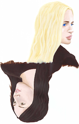
The authors sent me stock photos representing how they pictured Bridget and Dahlia looking. I found two that worked well as mirror images of each other, that felt right for the layout I wanted, and I started by sketching them out on paper. Then I moved to acrylic paints. My plan, knowing my art and design skillset, was to start the art as a painting and then bring it into Photoshop to refine it.

Annoyingly, when I had a painting that I was happy with, I found it difficult to reproduce digitally. Subtlety and softness disappeared in the scans I took, and brushstrokes came through chunky and less-than-elegant.


Now, the idea for this painting was that it would float very dimly in the space above and below the title and the Grigori symbol, that the faces would be subtle shadows, against a dark background. But still, I needed to do loads of work to get these two sisters to look as we all wanted them to look.

Here are some closeups as I refined, added details, darkened and deepened the image behind the symbol. (The idea to have the symbol cup the jawlines of the sisters came from publisher Benjamin Gorman, by the way.)


And finally, here are both Bridget and Dahlia and the completed cover sporting a spiffy award badge from the book earning a finalist nod for the Book Pipeline award.


Unrelenting will be out on April 19th. Jessi and Marie were given an exclusive cover reveal on LGBTQReads. You can check that out, along with more info on the book and an excerpt here. The book is available for preorder now. And here's one more exclusive excerpt for you!

*

Bridget hit play. Again.

A dark alleyway appeared on her phone’s screen, its rough brick walls gleaming as a fine rain fell. A puddle reflected the single light that flickered above a worn metal door. It was the kind of scene that would kick off an old noir film.

In the fourth second of the clip, a woman stepped into the alleyway from the quiet street beyond. Her face remained in shadow, a hood covering her hair. She cast her gaze over her shoulder once before wrenching open the heavy door and stepping through. Dim, hazy light shone from the window, then faded. The video ended.

Dahlia. There was no doubt in Bridget's mind. Yes, the scene was dark and misty. No, the camera never clearly captured her face. But she would recognize that walk, that glance, that posture anywhere.

It was her. It had to be her.

As Bridget watched, she found herself repeating a familiar refrain. It isn’t your fault. The words felt flatter each time. For the rest of her life, she’d never shake the angry, abrupt end to their last call. And all over a guy Bridget knew was bad news. Their fight had carved out a hollow place within her.

At first, the reigning theory was that Dahlia and her boyfriend, Dan, had run off together. But Dahlia wouldn’t do anything so extreme without confiding in her sister, even after a blowout. She refused to give up hope. Even after Dan’s car was found, Bridget knew her sister wasn’t gone. She would’ve known if Dahlia was dead.

And now she had proof. The video’s metadata told her the recording happened two months after Dahlia’s disappearance. It hadn’t arrived in her inbox until a couple of weeks ago, with the file attached. The first time she'd played those ten seconds, alone in her bedroom in North Carolina, it was a moment of vindication. Finally, she had confirmation her sister was still out there. Since then, she must have watched the clip a hundred times, relief giving way to frustration as Ivanova dismissed her.

She returned to her inbox, staring at her messages. She'd planned to send a follow-up to their meeting, but given the way Ivanova treated her, she doubted she’d get a response. The detective had made herself clear. Bridget should have known better than to trust the police.

But she had made herself clear, too. She wasn’t giving up on this lead. She needed to find out what had happened to Dahlia.

With a steadying breath, Bridget returned to the email chain containing the video. It was a long back-and-forth by now, after two weeks of correspondence. The sender, a classmate of Dahlia’s, had provided a spark of hope when everyone else had given up. Maybe he could help.

James, she wrote, I made it to Cleveland. Any chance we could talk in person tomorrow?

Bridget felt a small surge of satisfaction as she hit send and turned off the screen. She refused to keep waiting for news that never came. At least she had a plan. A loose, unformed plan, but it was better than nothing.

As she settled among the blankets, she hoped it would be enough.

Monday, March 28, 2022

a moment in the day: just to say

I come up the stairs with a cold glass of water to offer to my dog because he was just lapping at the very bottom of his. He's up on the futon bed, now, curled up comfy, so instead of pouring it into his dish, I take the glass and sit down next to him. Take a drink to show him how much he'll enjoy it. Reach the glass down to his level.

Nicholas looks at the glass and then at me. He's not interested.

I drink again, offer it again. He looks at the glass.

"Drink this," I tell him. "It's so good. So cold. Like a plum from the fridge or whatever. Don't you get poetry?"

Nicholas is unimpressed.