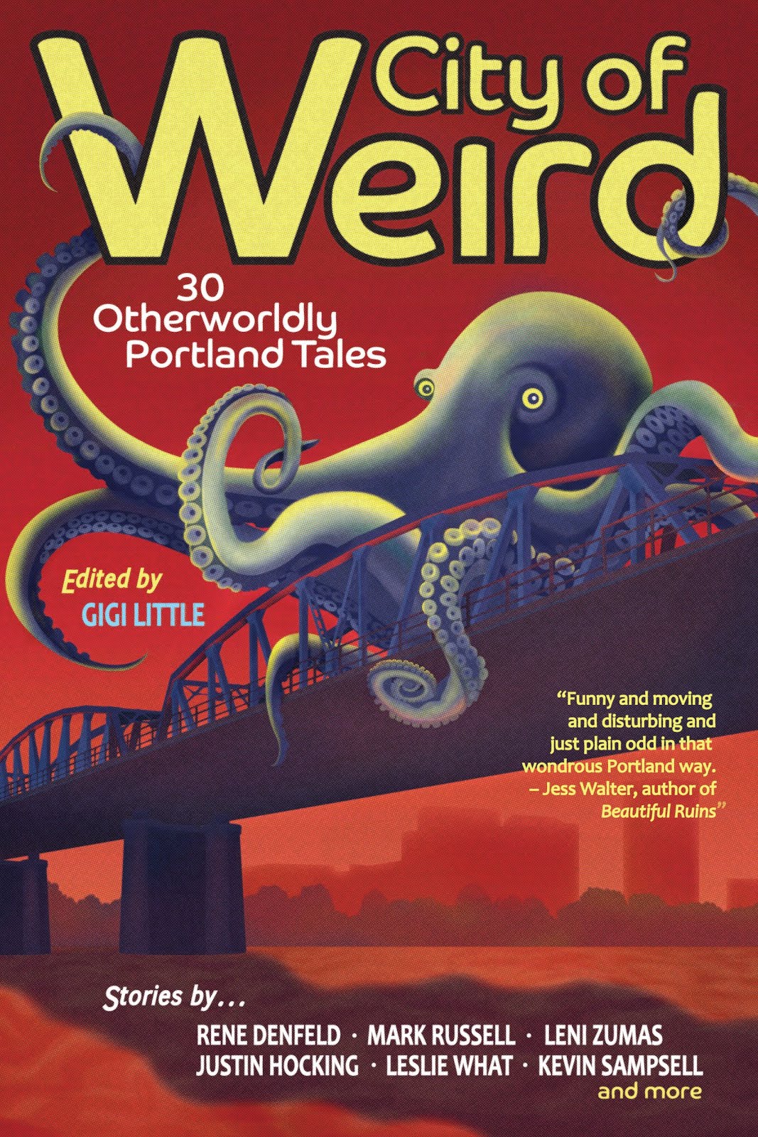
Had I not been handed a few specific directions at the start of the project, I might have done exactly what the author didn't want. After all, when you're presented with a book that's based on Frankenstein, your mind immediately goes to that classic image of the monster. Also I am a certified monster-story fanatic (see: City of Weird), particularly vintage monster stories, so I can see myself going all Groovy-Goolies-slash-Boris-Karloff on my cover design, if left to my own devices. Alright, maybe not Groovy Goolies.
But for the cover of Chicano Frankenstein, author Daniel A. Olivas had two specific wishes, which publisher Laura Stanfill liked and sent my way. First, he wanted to avoid any stitched-together bodies or body parts. So no imagery directly referencing a Frankenstein-monster type of character.
If you're wondering whether there are in fact any Frankenstein-monster types of characters in the book, here's the publisher description:
An unnamed paralegal, brought back to life through a controversial process, maneuvers through a near-future world that both needs and resents him. As the United States president spouts anti-reanimation rhetoric and giant pharmaceutical companies rake in profits, the man falls in love with lawyer Faustina Godínez. His world expands as he meets her network of family and friends, setting him on a course to discover his first-life history, which the reanimation process erased. With elements of science fiction, horror, political satire and romance, Chicano Frankenstein confronts our nation’s bigotries and the question of what it truly means to be human.
(Doesn't that sound so cool?)
Daniel's second wish was that I use the iconography of Día de los Muertos in my cover design. Specifically the skeletons and the lovely, decorative skulls.
I was excited to work with this beautiful and thought-provoking imagery, but I wouldn't have explored using iconography with roots in Mexican culture, a culture that isn't mine, if it hadn’t been Daniel's wish. I may have done so, say, ten years ago, but I understand so much more, now, how people are the gatekeepers of their own culture. Only because it was Daniel's suggestion did I, and Laura, feel comfortable referencing it, and what I created would have to get his approval if we were to use it.
One idea Daniel had was to reference the old Hitchcock Vertigo movie posters with the swirling vortex and the body falling down and down.
And one idea I had was to build the title and author name out of bones. Including skulls for the Os in Chicano and in Daniel's last name.
The first thing I did when getting started was to throw down the title in the 6" x 9" space I had for a cover, to see the room it might take up on the page. I was concerned about how long the word Frankenstein is. The longer the word, the smaller the font has to be. I tried slanting it.
I tried breaking it.
That was interesting. I wondered whether Laura would be okay with broken words. Would she worry that it would make the title hard to easily and quickly read? I liked the idea of really filling the space up with words made of bones, and the three-piece version left nice space open for the author name and blurb. I decided to give it a try.
I liked Daniel's Vertigo idea, too, so I decided to try the vortex as a background for my very text-heavy concept. I built a vortex and some bones.
I built a couple of skulls. I wanted to keep them simple and similar since they would be smallish details in a larger text scheme.
Working in multiple layers, I arranged the bones into (on top of) the shapes of the words.
When I had the layout of text as I wanted it, I popped in the skulls for the Os, and then added some flowers, referencing the flowers in the skulls, as extra ornamentation, particularly so that I could get some more color into the design. Added the requisite placeholder blurb and "a novel," and...
The biggest tinkering I did with this concept was with the skull Os. Did they want to be the detailed skulls I had made, or did they want to be something simpler? Again I worried about readability. I tried simplifying them using the actual Os of the original font with added skull detail/decoration.
Hmm.
For a moment I tried to tell myself their shape referenced Frankenstein with that classic squared-off head, but no. They just looked like Tic Tacs. I tried with a more rounded O and simplified the design further, thinking if the faces blended into the background, they might look more like Os.
But they looked like decorated eggs.
I resolved to send all three, plus a version with no skulls as Os at all, to Laura and see what she thought. Then I moved on to Daniel's Vertigo idea.
This time I built a whole skeleton and positioned it falling down through the vortex. I thought it might look cool if the lettering also followed the shape of the vortex, so I used a simple Adobe Illustrator effect to get my title and author name, still in bone form, to twist. I arranged them around the fulcrum of the falling skeleton man and then I started to refine the letters so that they wouldn't look so warped by the effect I'd used on them. Knowing it would take a lot of refining to get the lettering to look as I wanted it to look, I only worked so long before sending samples to get Laura's opinion on the concept. If she liked the concept, and then if Daniel liked it, I'd refine it further.

I wish I remembered the thought I had that made me pivot to a third concept. I know I was experimenting with what might look good if I left the lettering un-broken and un-warped. If it just sat straight across on the page. Something made me take the skull and blow it up and fill the whole space with it to see where things would fall. Where they fell was great and I got excited. I could position the title and author name so that the eyes and the skeleton teeth peeked out between the words, and it was an arresting image. Then I arranged a handful of flowers at the edges to bring in some color and some balance (dark/light, death/life).
And one last impulse before I sent it all off for Laura to look at. After all the monkeying about with bones, what if the text were simple and clean?
I was very pleased that Laura didn't have any readability issues with the skull-face Os or the broken Frankenstein. In fact, she said, "I also love FRANKEN STEIN split onto two levels because he’s made up of two different bodies. It gets to the stitched-together theme in such a cool way."
I always love how conceptual Laura gets with her thoughts on cover art. It was a connection I hadn't made, and I loved that she had found it.
She was drawn to the covers with more color and asked if I could try bringing more color into both the big-skull cover and, in particular, the Vertigo cover, which had very little ("The tiny skeleton face makes me really happy because of its colors," she said.). For the big skull cover, we experimented with different numbers and arrangements of flowers.
Laura suggested adding another color to the vortex in the Vertigo cover, and I was surprised and pleased with how well that worked. I was able to add the color and line things up nicely so that it didn't obscure the lettering and kept everything in balance.
And the three added flowers not only added to the color but also to the sense of the twirl.
Another thing Daniel envisioned: bones breaking or falling off the body. So I added that detail too.
Laura pulled together a sampling of favorites and sent them to Daniel for his thoughts. He chose his favorite, and we had our cover. In his back and forth with Laura, he sent her this cute comment:
"I am so happy with my new baby's outfit."
I am so happy too. In the end, the simpler concept won out. And we may just sneak some of that vortex design onto the back cover.
Chicano Frankenstein will be out March 5, 2024. More information
is here. More info on Daniel and his other books, including
How to Date a Flying Mexican,
is here. The photo I used in this post of Día de los Muertos painted skulls was taken by Nikola Tinková and shared from Pixabay.
Here's an excerpt from the book!
The man closed his apartment door and entered the cool evening. He stretched his legs and twirled his arms in three clockwise circles. The man took a deep breath, put on his hoodie, and then started on his nightly run. He turned left on Hurlbut Street toward Pasadena Avenue and then turned left again. The man let his legs stretch out in long strides as his muscles slowly warmed up. Running cleared his mind, made him feel whole. This night, his arms and legs moved as they should, as part of one machine that was created to function without a hitch, in perfect rhythm. This was not always the case, but tonight, the man felt the kind of balance that calmed a desperate small voice in his head. His breathing grew heavy as his legs moved faster and faster in the cool evening. The man’s mind was free and clear as he ran and ran and ran.


