People who know me won't be surprised to find that if I were going to build myself a husband, I'd start with Joan Crawford. I mean the glamorous Joan, not the whole Mommie Dearest thing.

But would I start with young Joan?
Or older Joan?
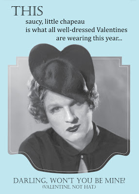
In putting together this year's Valentine's Day card for Stephen, I went with both. My main image was the early Joan with the heart-shaped hat. I so wish I knew where that lovely photo came from and exactly what year it is. After a long while of looking through pictures of Stephen as Madeleine Prèvert, I found one that seemed to match, angle-wise and lighting-wise, and tipped the face in over Joan's.
 But he looked a little sad. Plus, I wasn't completely happy with Joan's hair. Maybe he wasn't either. Which is where the photo of older Joan comes in.
I got a nice, smooth bit of hair from photo number two and then Photoshopped young Joan's mouth back in, plus some shadow along the face from the hat and various tweaks to make it look its best. I wanted the card to be reminiscent of fashion ads from the twenties, so I took the image into Illustrator to finish it off. I love the way a lot of the photos in those old ads are framed.
In his Valentine's Day card to me, Stephen's creativity came from a very different place. I don't have any in-progress versions to show off all the intricate Photoshop work he had to do on his, so I'll just give it to you as I saw it.
The envelope.
The outside.
Um, whoa.
And a detail on the inside.
Stephen as Hercules.
By way of I Love Lucy.
Plus, as he's pointed out, he kind of looks like Mandy Patinkin from Sunday in the Park with George.
Greek god or Hollywood goddess, lovely or wacky, that's my husband.


You are a God.
ReplyDeleteYou did such an amazing job, sweetie! Everything about it was so right, so period perfect. Your best yet!
ReplyDeleteThis.Is. Fantastic!
ReplyDelete