
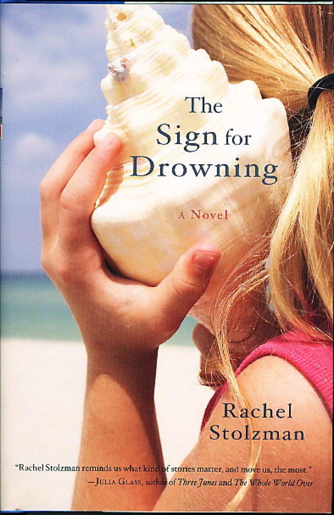
This fall I had the good fortune to be contracted to design two different book covers for two books for one of my most favorite presses, 7.13. One was The Sign for Drowning by Rachel Stolzman Gullo. The novel originally came out in 2008 from Trumpeter Publishers, and this is its reissue. Publisher Leland Check had these succinct words to say about the book when he reached out to me:
It's a terrific novel about grief, about the Deaf community, written quite beautifully.In the story, the narrator, who is a teacher to Deaf children, is haunted by the death of her sister, years earlier, to drowning. Here's the original cover.
To start things off on this new edition, Leland had Rachel give me some thoughts on covers and cover elements she liked. She shared an article on book cover trends and said:
Also, here’s covers I find beautiful.

She also shared this image that she thought might make an evocative cover:

In some book cover design projects, I come up with or am given a concept and run with it, working on that one design until it's good. In many projects, I work through two or three concepts in rough form, show them to the clients for feedback, and when the clients choose their favorite, I refine from there. With The Sign for Drowning, I shuffled through many different concepts, creating and showing, creating and showing, until we finally zeroed in on what spoke to Rachel.
I started with her notes on liking big, hand-drawn lettering, flowers, specifically African violets, and her idea of drawing on The Little Prince, which is a book that figures in her story. With the African violets, I scattered them across water, floating the lettering, which I hand-drew, on top. For the Little Prince, I experimented with the single rose from the story, swirling the stem and threading it through the lettering, and in this instance my reference to water was a single drop hanging from the flower.

When I shared these rough drafts with Rachel and Leland, I also mentioned that I thought the photo of the hand dipping into the water might be a little too on the nose but that I could certainly try it. I reminded then that these concepts were in their early stages and that I'd add things like texture and detail down the line if they liked where I was going with it.
Rachel said:
Wow! It’s amazing to see a new cover coming to life! I like the rose one quite a lot. I’d be very interested to see you add texture and detail and how it develops further.
I can’t help but want to see one version with water, but I hear you about on the nose.
BTW- My last name has a Z in it- Stolzman. Hope that doesn’t change everything- just kidding!


OOPS.
Also, I'd obviously gone too subtle with the water in my African violets design (there are rings around some of the flowers, but you can't really catch the nuance from the images that show on this blog) and she couldn't tell it was water at all.
Leland said:
Yeah, I also really like the rose direction, and the idea of incorporating water in some way into that design.
I’m open to photography and testing it out. But to me, the rose is a winning direction. But it’s Rachel’s book and therefore, her cover...
So I stuck with the rose direction and added water to it. Of course laying my swirl of stems and leaves in water meant I should remove the drop from the rose. I also replaced the simple, single-layer leaves, which were mostly just three or four leaf shapes that I'd reproduced, with individual leaves with multiple layers of detail.

Seeing this new version, they began to rethink, wanting to move toward something more somber. Rachel suggested I read a certain scene in the book and look for concepts and elements there.
So I tried a new handful of ideas. The sister's drowning death happens from a yellow blow-up boat, so I thought about a tiny yellow boat, alone, in a wide field of water. I tried the violets again with fewer of them and more water. I on impulse one day created a scrappy, sketch-like version of the hand-touching-water photograph. Because the scene Rachel suggested I read has the narrator by the ocean at night I created two concepts in that vein, one highly playing on the phenomenon of bioluminescence that the narrator experiences in the scene. Within these concepts I tried different layouts and fonts, including more hand-drawn lettering.

As before, these were unpolished. I could, for instance, try adding some texture to the hand-lettering to make it look like it was, say, drawn with a pen. But that would happen after a concept was chosen.
In the end, none of these concepts were chosen. While we went back and forth on a few designs, particularly the bioluminescent beach, honing in on that idea, Rachel shared a painting her cousin Faye Stolzman made, that was quite lovely.

I tried a sample or two using it.

And suddenly we were off on a new direction. Rachel and Leland really liked the painting, and we tinkered with it (I played with layout and Rachel asked me to try some different fonts)...

...until we settled on a design.

The problem then was that the photographs Rachel was able to get of the painting were not high resolution. Faye was still working on the painting so we gave her some time to get to a place she was happy with and then she took some more, higher-res photos. Once we got the images, the shoreline and, more importantly, the clouds had changed and the lettering didn't fit the same way, so I did some photoshopping to combine a couple different passages along the long painting to create the space I needed. Also Rachel was interested in me trying some hand-drawn lettering again, and some more versions with the font, so there were more samples back and forth.

In the end, she zeroed in on the version she liked best. It's interesting how far we came from the elements and concepts I started exploring in the beginning, but I'm so happy we found a cover that Rachel could love, and one that uses beautiful art from someone she loves. The Sign for Drowning is a book ultimately about human connection, and with the cover, we got a human connection we hadn't bargained on.

The Sign for Drowning is out now. It can be purchased here. And here's an excerpt:
We have been reading The Little Prince. Not the usual image of a mother reading to a child. We face each other. She watches my eyes and my hands. Adrea is deaf as a stone. She says that I named her.
Our first contact was a spring day in her classroom at the Huntington School. I frowned at the stained rug, ripped books, bare barred windows. Frowned at the eight special foster children. Her rounded tense back suddenly curled against my shins. She was sitting on my feet, facing away, holding herself. An introduction.
I looked down at this unfamiliar five-year-old child, her head resting on my knees. Her hair was neatly parted down the middle, braids curving down each side like rivers rushing to reach the back of her neck. Lowering myself to the floor, I was careful to keep my legs steady and not jostle the girl. She spun around, placing her small feet on top of mine. She wrapped her arms around her knees, looked directly at my face and then away. I read her name tag and signed, “Hello, Adrea.”
She pursed her lips tentatively, broke into a smile. Two rows of perfect baby teeth. Slowly she brought out one grubby hand, signed carefully, “My name is—” then in a rush, “Adrea,” as I had.
I’d skipped a letter, a loose fist, two fingers over the thumb, two fingers under the thumb—N. We’d made a truce, unknowingly, that would be permanent.
I put aside the book. We need to talk about a flower that loves. Adrea wants to know what I believe. God, I need to know her every belief. We agree a flower can love, so can a plant and a tree. Lying on Adrea’s bed, the sun boasting and rain tapping down, hands that talk, flowers with heavy hearts, what possibility would I dare deny?
Surely there’s some scrap of bible that a stone overheard.
Now she’s Adrea. I’m the mother who never conceived. She is the child who entered this world soundlessly, as silent and swift as a drowning. But I must not think of these things together.


No comments:
Post a Comment