
For the book cover for the upcoming Forest Avenue Press book Trust Me, a novel by Scott Nadelson, I had one particular idea that popped into my mind, which I ran with. I usually like to tinker with more than one concept in the early stages of a cover project, but once in a while, something gets into my head and grabs hold.
The seeds for this idea came from publisher Laura Stanfill, who sent me notes on her thoughts:
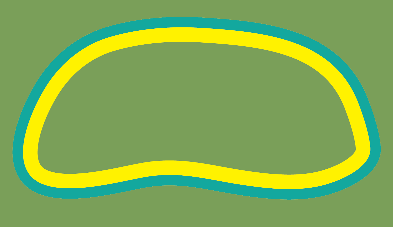
This, by the way, is a king bolete mushroom. Huge!

Reading Laura's ideas. I instantly had an image in my head of that king bolete mushroom, front and center, with the title written inside it. The letters of Trust Me would hug the shape of the mushroom as if growing organically inside it, the longer Trust inside the wider cap and the narrower Me in the stem.


She has one hand on her hip, head tilted to the left, so her hair falls across her neck. The way her braces push out her lips gives her mouth a permanent pout, made sour by the scrunching of her eyes. It’s a disconcerting look, not only because it resembles the one Veronica turned on him so often in the last years of their marriage, when she was debating how long she could stay in it, but because it sits on Sills’s face so naturally. Only twelve, and she doesn’t have to work to make him squirm. Twelve and a half, that is. She reminds him every time he objects to her sitting in the car alone while he goes into a store, or to her walking by herself to the diner on the highway, where, if he doesn’t order a burger and salad for her, she’ll eat nothing but a shake and fries. I’m twelve and a half, for crying out loud, she’ll say, and he’ll reply, Exactly, before walking with her to the diner though its food gives him cramps.
I took the rest of Laura's notes and my imagination built the woods around my mushroom: trees in shades of green, a path leading somewhere, the A-frame cabin partially hidden in the overgrowth.
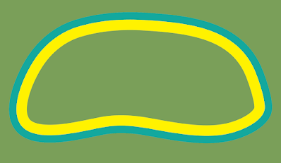
The text I started freehand in Illustrator, fitting the letters inside the shape I created for my mushroom. The first rendition was... crude.
The text I started freehand in Illustrator, fitting the letters inside the shape I created for my mushroom. The first rendition was... crude.

Edges of the letters were fighting each other and looking way too scrappy. But it gave me a starting place. The more I refined the more I used the mushroom itself to create the letters. To do this, I took the shapes of the cap and the stem...

and turned the solid into outline.
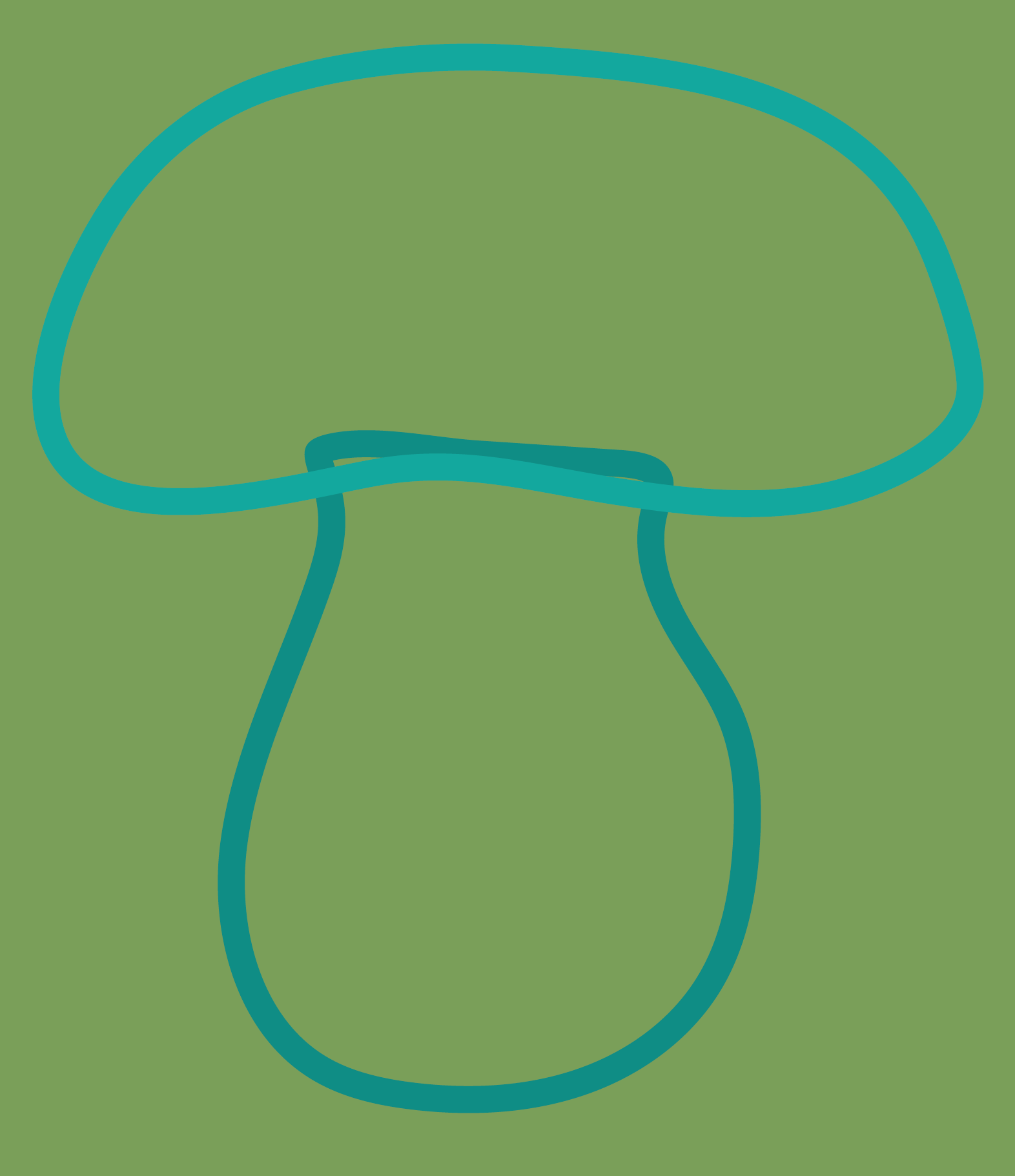
I fixed the outline so that it grew inward from the edges. That became the outer border for my lettering.
Then I took that inward-facing outline and turned it into a solid shape and gave that shape another inward-facing outline.
I turned that outline, too, into a solid shape. And that solid shape became parts of letters. For instance the tops of the Ts in Trust.

You can see how I added shapes in tan to demarcate the edges of the tops of the Ts. And the blue border shape demarcates the bottoms of the Ts. I cut these tan and blue shapes out of my yellow pieces, changed the color, and had my Ts.

I used that same process to reshape much of the lettering in the title. Then I was creating my woods around the mushroom, moving things around, adding detail. I sent Laura a quick sample the work in progress.

When Laura saw the first draft, she really liked it but tossed out the idea, what if I removed the mushroom and kept the mushroom shape of the lettering; would that evoke the mushroom on its own. I thought that was a super interesting idea but wasn't sure I could pull it off, especially with the open space created by the Ts. Then she thought about it and came back to say she didn't think that was a good idea after all and we should keep the mushroom. But she did worry that the design was too flat. She wondered about adding some little pops of color. But not too much. The flowing lettering and the mushroom shape had the potential to slide into psychedelic territory so getting too groovy with color could be dangerous.
The first step I took was to bring up the saturation of the whole design to make it brighter. Then I thought about how to add extra pops of color. I thought about some purple flowers—not the really... flowery kind but something more spiky that could just add a spray of color. Like these.

And what about a bird in the upper right? A yellow bird to balance the warmth of the yellow windows in the A-frame house.
Lastly, and maybe most importantly, I thought about Laura's word flat, but not just in the context of color. In my early draft, the artwork was pretty flat simply because I hadn't yet added all the detail. The path had some texture but not enough. The swipe of greenery running behind the mushroom and through the trees was one flat shape with no added detail at all. But those updates would come. What I was really thinking about was the mushroom. What if I added just a little more dimension to the mushroom?
Once I had these changes made, I wasn't sure the bird was necessary. It felt a little superfluous. I sent Laura a sample with and a sample without.

Laura preferred it without the bird. We sent it to Scott for his thoughts.
I love when something small surprises you with its effect. That little added highlight on the mushroom made such a difference. Laura said, "I love the lighter blob on the top of the mushroom. I'm amazed that a blob could change the whole tone of the cover! I mean the colors are adjusted too but for me, that blob puts it into sweet/family tone."
But would Scott like it? I felt a little anxious, because I'd only given him one thing to choose from. Maybe he wouldn't be in favor of any of it. I could certainly jump back to the drawing board, but my brain had only spat out that one idea.
He said, "Exciting! I love the A-frame and the color scheme and of course the mushroom. I just showed it to Alexandra and Iona, who both have a better visual sense than me, and they were less crazy about the title font inside the mushroom—they thought it was too Alice in Wonderland whimsical, maybe suggesting a younger readership than what the book is aiming for. I can see their point, though I also think it's eye-catching."
So, yay! But also ack—we were veering into psychedelic territory again, albeit of the younger form.
I went back to my mushroom shape outlines and came up with lettering that still hugged the shape of the king bolete but wasn't quite so Mad Hatter.
With this change in lettering, and some more refining of the details of the forest, we had our cover. And it was good that we scrapped the bird, because it gave us room for this quote from the fabulous Laurie Frankel—which this creaky, old blog isn't presenting in full sharpness, so:
"Scott Nadelson beautifully, movingly sketches the balance between turbulence and poise, wonder and boredom, bravery and vulnerability that is being twelve, or raising someone who is twelve."
One last thing to note about the lettering. And I hadn't noticed it at all, and certainly hadn't engineered it this way. One of the first things Laura noticed was that the word US stands out in the center of Trust. A fitting bit of serendipity for this book.

Trust Me will be out in fall of 2024. More information is here. And here's an excerpt:
She has one hand on her hip, head tilted to the left, so her hair falls across her neck. The way her braces push out her lips gives her mouth a permanent pout, made sour by the scrunching of her eyes. It’s a disconcerting look, not only because it resembles the one Veronica turned on him so often in the last years of their marriage, when she was debating how long she could stay in it, but because it sits on Sills’s face so naturally. Only twelve, and she doesn’t have to work to make him squirm. Twelve and a half, that is. She reminds him every time he objects to her sitting in the car alone while he goes into a store, or to her walking by herself to the diner on the highway, where, if he doesn’t order a burger and salad for her, she’ll eat nothing but a shake and fries. I’m twelve and a half, for crying out loud, she’ll say, and he’ll reply, Exactly, before walking with her to the diner though its food gives him cramps.


Your process in conjunction with Laura is fascinating and precise. Thanks for sharing!!
ReplyDelete