
I guess I get obsessed with every project, but with The Queen of Steeplechase Park, I've been even more obsessed. I've known the book and loved the book for a long time. Author David Ciminello brought it in various iterations to two different writing groups I've been in. This book that is a love letter to New York, to early twentieth century nostalgia, to Italian cooking, to his beloved great aunt Amelia P. Aguiar (after whom the protagonist Bella is based) is lushly written and over-the-top in the most wonderful way. Here's the publisher description:
When David's submission showed up in the queue for Forest Avenue Press's January-February open submission call, I got very excited. Before the book was even chosen, I had a picture in my head of what I would do if I got to make the cover.
It would begin with Bella, of course, front and center and big as life. Smiling confidently and dressed as a beauty queen.
I pictured the trappings of Coney Island around her: the Ferris wheel, the parachute jump, maybe a roller coaster or the steeplechase ride itself.


And just as importantly, there would have to be food. From the book:
Her lasagna Bolognese made Lolly scream.
Her lobster and crab ravioli made Oui Oui kiss her feet.
Her fettuccini carbonara made Minnie leap.
Her homemade peanut brittle made Peanut trumpet into the trees.
Her cacio e pepe brought Chester to his naked knees.
Her spaghetti and meatballs made the entire house sing, “We love you, Belladonna Marie!”
I pictured the ingredients of Italian cooking all around her: huge, sumptuous tomatoes, cloves of garlic, basil leaves. Maybe she'd be rising up out of a pile of these grand ingredients, or maybe they'd make a frame around her... or no, maybe not a frame. Bella is too full of life, I thought, to be contained within a frame.
Another reason I craved this project is that it's a period novel and I'd get to play with the time period. I wanted to give it the look of an old movie poster or one of those wonderful vintage food advertising prints. The texture of the paper, the rich shading.


 I popped in some chunky text using a stand-in font, but including the star detail that I found in this great poster for the 1943 film Coney Island.


I pictured the ingredients of Italian cooking all around her: huge, sumptuous tomatoes, cloves of garlic, basil leaves. Maybe she'd be rising up out of a pile of these grand ingredients, or maybe they'd make a frame around her... or no, maybe not a frame. Bella is too full of life, I thought, to be contained within a frame.
Oh, this cover for a book we hadn't even accepted yet: I could almost taste it!
Another reason I craved this project is that it's a period novel and I'd get to play with the time period. I wanted to give it the look of an old movie poster or one of those wonderful vintage food advertising prints. The texture of the paper, the rich shading.

David had ideas, too, and I was excited that his thoughts lined up so well with mine. He was sending Laura images of some of those same vintage ads and others, pictures of tomatoes. One thing he wanted was to use a picture of the actual Bella.

Look at her there, strutting her stuff on the beach! Unfortunately the resolution/quality of the photo wasn't good enough for print. But I resolved to create my Bella to reflect the vitality, the boldness, the sparkle and fire of the Bella David had created for his book.
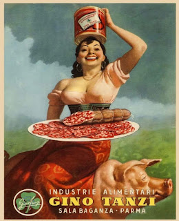
I particularly liked this Italian food poster he had sent in. Her open and strong, joyful expression, her head thrown back, her sexy but not rail-thin figure. I decided to use her as one of the models for my Bella.

To scope out a set of legs and a hand-on-the-hip pose, I looked through vintage pictures of beauty queens until I found this photo of Bettie Page. She was in a similar position to the actual Bella in David's picture, but it gave me more detail to work off of, including shoes.

In early summer, I lost a close friend, and then almost immediately all three of us, Laura, David, and I, lost another, Robert Hill, who was a Portland writer and one of Forest Avenue Press's authors. During that very sad time, I was immersing myself in work on David's cover, and on building my Bella, specifically. Laura was working on Soul Jar, our upcoming anthology. Somewhere in the middle of things, Laura and I had this text conversation:
Laura: I’m okay. Looking forward to the work I guess. Just to pour energy into something. This weekend I was happiest when working on the garden. (Or not even happy, but not feeling dull inside and quite as lost as the rest of the hours.)
Me: I understand that. And we have to be able to be happy, too, when the garden makes us happy.
Then both of us at the same time:
Me: Building Bella is making me happy
Laura: Totally. I love that you are working on David’s cover.
Laura: JINX!

Here's the first version of Bella, which I built in Illustrator out of various overlapping shapes. She definitely wasn't a beauty queen yet. But wait. She got better. That early in the game, she was very simple layers filled with flat color which would approximate the areas of future shading. I based her pretty closely on my source material, knowing that closeness would change the longer along I got in my process.
Along with Bella, I built a bowl for spaghetti, and you can see that I used the scalloped design I was seeing in those Italian food ads.
I liked the idea that Bella would be impossibly holding up this heavy bowl of pasta with her fingertips like her joy for food gave her superhuman strength.
I started to put together a simplified version of the Steeplechase Park Ferris wheel.

And a classic roller coaster.

And Steeplechase Park's iconic parachute jump.

I found pictures and pictures of beautiful vegetables and built tomatoes, basil, garlic, red onions. Alright basil isn't a vegetable.

Maybe there could be a ribbon wrapping around Bella—like a beauty queen's sash but also maybe like a banner advertising the best show on the boardwalk. Ooh, and maybe that's where the title and author text could go.


Then once I had my elements, I started to arrange and refine. I played around with color. Added some silhouettes behind my spread of Italian ingredients. Bella had an empty bowl for a while but then I finally added spaghetti and meatballs.

At this late moment in the process, I decided to double-check the history of my landmarks, annnnd... the parachute jump did not arrive in Steeplechase Park until after the book's finish. Oops.
So bye-bye, parachute ride. I did some more refining, added a burst of rays shooting up behind Bella, tried a night view with fireworks. I'd already been working so long on this project, as well as some others, and we were starting to come close to deadline. When Laura checked in with a nudge, I sent her a few samples of where I was.

We knew we weren't going to make that deadline, but we both wanted to get a cover that would best sell the book and would make David happy. He was happy with the early samples and had some requests, mostly around Bella, who he wanted to see be "much more voluptuous—bodacious. Big breasts and ample hips (think Adele before the ridiculous slim down, Claudia Cardinale at her most voluptuous)."
He sent more pictures of the real Bella, and examples of hair and shoes he imagined she'd wear. Open-toed shoes with toenail polish. He asked, could we have more spaghetti and meatballs in the bowl, could I get rid of the red onion nestled in with the vegetables at the bottom. As I refined further and sent more samples, he asked about an even bigger bust, even higher hair, even more spaghetti. "(can it touch the top of the book or even bleed off the cover?)" I like this close-up screenshot on my file in Illustrator, showing the names I'd given to the various layers I was adding in response to his feedback. More Bella. More spaghetti. More hair.

It feels fitting, as The Queen of Steeplechase Park is all about more. All about, as David wrote to Laura, "abundance—even excess."
Another detail he asked about was maybe a halo of stars around her head "like a Saint or Mary" to reference the often-irreverent religious aspect of the book. Laura thought this would probably be too busy with all the detail already in the cover, but she wrote to me suddenly with an epiphany based on that request:
I loved what moving the burst of rays to center on her belly did to the design. Whether or not it got to the religious aspect of the book, it just made the whole thing better, more dynamic. I added a shine of yellow-almost-white, like a glow, also, close in around her. More samples:

This old blog. Examples never drop in with their original sharpness, but hopefully you can get an idea of things from what you can see.
We honed in on the design with the purple sash and bowl, and I started the shading/texturing process.
There's probably some quick way, or semi-quick way, to create a texture like a vintage poster, but I don't know what it is. I didn't want to just add a grain effect or something. And yes, my process was probably more painstaking than other designers would bother taking on. But it's the way my brain works, and I wanted the texture to look really real. I found this print on Wikimedia Commons. I don't know how much of the texture you can see from this image, but it's there.
And from that, I created my own blank textured paper that I then made copies of in various of the colors from my design.

Then I married each shape from my design with that colored paper by making what's called a clipping mask of each shape. Here are some of the layers of one bunch of basil.

I took those pieces into Photoshop, layered them on top of each other, and created the shine and shading by erasing away what I didn't want from each layer.

Again, the reproduction in this blog is a little fuzzy, but you get the idea. It's sort of like painting but backwards. Or inside-out. It took a while, but it's what got me from this:

to this:

Now as for Bella, I had sort of Frankensteined her together, so I wanted to make completely certain that I had everything in the right place. Luckily, I live with a fine artist who specializes in, among other things, the human form. I printed Bella out and asked Stephen to have a look. He discussed it with me and even gave me some pencil guides, which I took back to my desk for more refining.


After a little more tinkering here and there, some flag garlands to add a little something more to the background, and a great blurb excerpt from author Blair Fell, we finally had a cover that we all liked, and which I hope would make Bella proud.

The Queen of Steeplechase Park will be out in May of 2024. More info is on the Forest Avenue Press website here.
I think this excerpt, which is the opening to the novel, will give you the perfect taste:


