Showing posts with label university of hell press. Show all posts

Saturday, August 13, 2022

Book Interior: Glory Guitars

I feel like starting this post with the classic Sesame Street sign-off.

This book was brought to you by the letter G.

Because how can I not, when the memoir Glory Guitars, by Gogo Germaine, is being published by University of Hell Press' Greg Gerding, with cover art by Joel Amat Güell, author photos by Glenn Ross, and interior design graced by my own Gs*? The number of Gs in that list makes me so giddy that I want to go through the entire interior of the book and count all the Gs in it. But that would be weird.

8,295.

Sesame Street is a strange reference, of course, when you're talking about a book crammed full of sex, drugs, and punk rock. University of Hell describes the book as the "memoir of a ’90s teenage punk rock grrrl." It's a power-chord-fueled joyride full of personality and wit (gee, that sounds like a blurb)—and toward the beginning of this year, Greg reached out to me about designing its interior. Now, interior design doesn't sound anywhere near as fun a project as cover design, but this one was a blast. It was way more than laying paragraphs of text down on the page. Greg wanted the interior design to match the edge and energy of the book and provided me with super fun illustrations that I could use throughout and loads of freedom for experimenting with how to use them.

The cover design was done, as I mentioned before, by Joel Amat Güell, and it's drop-dead perfect.

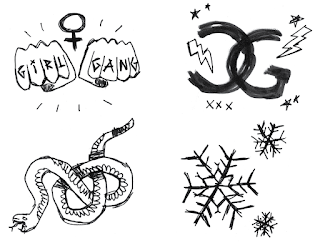
A lot of Joel's elements from that cover were given to me in individual, black and white form.


And Joel created special illustrations to head each chapter. Like so:


So fun, right?

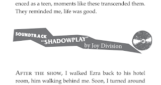
One of the cool things about Glory Guitars is that it's structured around a "soundtrack." Each chapter is divided up into short sections, and each section is headed and ended with a song in this soundtrack. "Never Say Never" by Romeo Void. "Submission" by Sex Pistols. "Fun Time" by Iggy Pop. "Demirep" by Bikini Kill. The songs give flavor and a nice layer of punk history to the book but they're also nicely curated, reflecting the stories and the tones of each section. My job was to give the soundtrack its visual sense, something that would fit with the overall look of cover and interiors and evoke, of course, music. Music and edginess and, since these were breaks between sections... breakiness.

Joel made us a couple small CD illustrations in the style of the rest of his art, and I arranged things like so, referencing the way the subtitle is styled on the cover.


It was fun to be loose and scrappy with these, make them different every time. The challenge was fitting everything elegantly on the page. If the text came too far down, for example, there wasn't enough space for a soundtrack break but too much empty space left at the bottom. The added element of footnotes on some pages made this challenge even harder. Then the big challenge came in the proofing process, where small changes were being made in the book, and each tiny change could set off a chain reaction to the spacing for the rest of the chapter.

Chapter openers had the special Joel illustration, with some added styling of my own, plus a soundtrack song to start them off.


As I worked through the pages, arranging text and artwork, I found and listened to lots of the songs in Gogo's soundtrack.  I don't know much punk, although I've always like the hypertensive, raw sound of it. It was fun to immerse myself in her chosen songs as I put together the interior of her book.

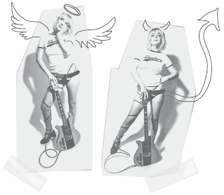
I won't share all the different touches, but I'll say that I extra enjoyed blinging up her author photos...


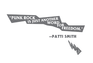
...and doing a little Glory Guitars treatment to Patti Smith's epigraph.


Glory Guitars
is available for preorder in all the main places, like Indiebound, and also on the University of Hell Press website where you have the added bonus that you can choose from five different variant color covers. It's officially out on October 11, which is also the International Day of the Girl. A cool promo video, is here. Here's an excerpt to let you know just what kind of punk grrrl you're dealing with:

By age fifteen, we had discovered an intricate infra-structure of debauchery across Fort Collins. Our entire network of punks and degenerates knew its secrets. We knew which liquor stores sold to minors: the cramped chunk of cement on Riverside Drive with a view of the train tracks; the more wholesome, suburban wine shop where parents might shop, yet they surprisingly didn’t ID. We knew which cafes would let underage people smoke inside: Max’s Subsonic—an old house turned café, with rooms to get lost in, that threw actual parties for underage kids—plus late nights at IHOP, and within the dingy, red-painted walls of Paris on the Poudre, the goth cafe. While I’m glad for the health of today’s youth, I almost feel bad they won’t ever experience the dirtbag tang of indoor smoking.

Teenage haunts are havens for illicit activity that are hidden in plain sight; they often have short names easily whispered in a pinch. The Ditch. The Dam. The Path. I knew the Path was a hard place the day one of the skaters shot a new girl at school with a duck gun as his friends erupted in laughter. I was horrified, but the fact that I didn’t do anything to help still haunts me.

There was the Starlite, the downtown punk club as shitty as its glittery aspirational name suggests. It hosted many of my friends’ bands, touring acts, and it even hosted an impromptu show in the parking lot featuring ALL, former members of the Descendents. Plus, the occasional party where girls wrestled in kiddie pools of Jell-O.

The memories of such parties and locations are often mysterious. I have a hazy memory of participating in Jell-O wrestling at the Starlite but can’t be sure. It happened during Corinne’s and my wrestling phase, a brief period when we couldn’t even be together without her getting an evil glint in her eye before thrashing me on whatever PBR-soaked carpet or viscid floor we were on. I have a glimpse of a memory of the Starlite, and looking down to see my white tee soaked in syrupy red. I have another piece of a memory of making out with a skater boy, Shane, in the back of a crashing car. Kitty was backing out and lodged the car into a pole.

~

*Not wanting to not give credit where it's due, the front cover photos were by the decidedly G-less Carri Lawrence.

Monday, August 30, 2021

Book Cover: A Year in the Life of Death

I've been having a love affair with a book, the latest book I've been working on creating a cover design for. That's a pathetically clunky sentence, but I don't even care. I love this book that much. 

For one (small) thing, it's a bucket list book. I've never designed for a poetry collection before.

It's also a book written by a friend, which makes it extra special.

But beyond that, I have a history with this book. Back in March of 2016 I did a reading with writers Shawn Levy and Shannon Brazil at Salon Skid Row. Curated by writer Josh Lubin, Salon Skid Row was a great Portland reading series that I hope returns once we can get out and do live in-person readings again. 

Everyone who read at Salon Skid Row got their picture taken under the Off-Track Betting sign

That night, Shawn Levy read some poetry he'd written based on obituaries in the New York Times. It was unlike anything I'd see him do before. I was used to Shawn as the writer of books like DeNiro: a Life and Rat Pack Confidential: Frank, Dean, Sammy, Peter, Joey, and the Last Great Show Biz Party. These poems he read were like taking his interest in biography and, instead of going expansive with it, paring it down to the barest of details. 

The way he focused on the New York Times specifically touched my nerd soul. And I was completely enthralled with the idea of poetry based on obituary. It's about death but, more so, it's about tribute. It's about life.

What began with that reading at Salon Skid Row grew into a book: A Year in the Life of Death. And what a year that was. To borrow from Shawn's introduction, 2016 was, "the year that everybody died: David Bowie, Prince, Merle Haggard, Leonard Cohen, Muhammad Ali, Arnold Palmer, Gordie Howe, Antonin Scalia, Nancy Reagan, Fidel Castro, John Glenn, Janet Reno, Carrie Fisher, Debbie Reynolds, etc. … a roll call that was also a history of the 20th century."

I don't generally solicit design jobs; they generally find me—but when I heard this was going to be a book, I went after it. I sent a please-think-of-me email to the publisher, University of Hell Press. I sent one to Shawn. I may have made a pest of myself. I don't know. But I got lucky and got the job. And when publisher Greg Gerding sent me the manuscript I devoured it. I often don't have time to read a book I'm designing for, but I couldn't stop. Each poem was a tiny mystery story with the last line revealing the subject. I'd scroll and not allow myself to look ahead. I'd try to figure out who each poem was about before I got to the end. I was surprised by how many of them made me cry. Many also made me laugh. The book was more than I'd even expected it to be, indeed a history of the 20th century full of fascinating information and social commentary and nostalgia and, of course, human stories that ran the gamut from celebrities to folks I'd never heard of. 

I was over the moon. And not only was I hired to design the cover but he asked if I'd like to design the interior as well.

Yes, please, yes, please.

I got together with Greg on Zoom and we talked about the book, about book covers he likes, about thoughts both of us had. The main consideration he had for the cover was that, in my color scheme, I use a powder blue that could evoke the color of the blue bags the New York Times comes in.

Greg also had an idea of a tunnel of concentric shapes, much like this design for The Bell Jar, but the center or entrance of that tunnel would be the simplified shape of a gravestone rather than a circle.

I went to work on that idea and also did some concepting of my own. 

I thought about how to evoke the concept of a year. I mocked up an idea using the phases of the moon with a newspaper hanging from one of the phases. I thought about how to evoke the concept of death without being too on the nose. I mocked up an idea of a collaged lily, the flower of funerals, made of scraps of paper—scraps from obituaries, showing the names of some of the recognizable figures in the book. 


The original subtitle was NYT Obit Poems 2016, but as you can see, I screwed that up in my first couple samples, leaving off the word Obit. I liked the idea of torn bits of paper overlying my backgrounds and used that in my titles and author names. Of the two blues I tried, Greg preferred the lighter, so that was the color that continued forward into later samples.

Greg liked the sample using the grave-shaped tunnel and asked that I try it with cut paper rather than torn, with straight placement instead of skewed. All-caps for the title.


In the lower left, by the way, is the University of Hell logo, which gets placed on the front covers of all their books, often in fun, creative ways.

While making suggestions for the tunnel concept, Greg encouraged me to try other ideas, and I kept coming back to the names. What could be a better selling point for the book than the names of all the amazing subjects of Shawn's poetry? I tried the names running behind the title, obscured by blots of ink to evoke the newspaper printing process. I tried them hanging over the title on a torn piece of paper. I tried throwing them across the cover and piecing the title and author together from their individual letters. That one might have been a little strange.


Greg and Shawn chose the sample with the names on paper looming over the title. Now that we had a direction, we refined it, making the names smaller, more newspaper-like, added the ages in. We changed up the subtitle, tried different textures. In the end, when we had a cover we all liked, I sent it to my mom to show off. She said her first reaction was to be stunned by the names. By the sheer volume of the names. That reaction brought home for me, I think, what really works about that design. How you can't help but be surprised by all that came to a close in 2016. And the names on the cover are only a fraction. It truly is a history of the Twentieth Century, rendered in the elegance and thoughtfulness of Shawn's words.

A Year in the Life of Death is available for preorder through the University of Hell Press here. It officially pubs on October 12, right alongside another really great U-Hell book, 2020*: The Year of the Asterisk, an anthology of essays exploring that very fraught year. In fact, the publisher has added a $5-off "2021 U-Hell bundle" that includes both books, and that offer can be found here.