Recently, I designed the interior for the first book published by Limit Zero, a new indie publisher that has secured distribution via University of Hell Press. I don't always blog about interior design, not unless it comes with a bunch of bells and whistles like the super fun UHell title Glory Guitars, but a few things make this project unique.
Second, because this is the first book to come out through Limit Zero, I was told that the styling I used in various spots throughout the book would likely become interior branding for LZ titles moving forward. So, I paid extra attention to things like the table of contents and epigraph, wanting to match all the elements up well with the existing branding created for Limit Zero by designer Joel Amat Güell. It felt cool to have a hand in the styling of a small press, even if in a very small way.
The book, Against Common Sense, is poetry—really excellent poetry that's full of not only Brian's fabulous word magic, but also beautiful nerdiness (he's got a poem in there called "Dos Command Upbringing") and loads of story. My plan in starting to lay out the main body of the book was to quick toss the text down and then go back through to pretty it all up—but it wasn't quick at all. Because I kept stopping to read every poem. I'm in love with this collection, and that made it extra special to have the chance to work on its design.
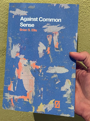
Limit Zero has very specific branding that was created, as I said, by Joel Amat Güell. Notice the font and placement of title, author, and logo on the front cover (the artwork is a detail from a painting by Brian by the way).
All LZ books will be styled that same way.
And the back cover.
LZ styling is very geometric, very left-and-right. I wanted to reference that with the interior design.
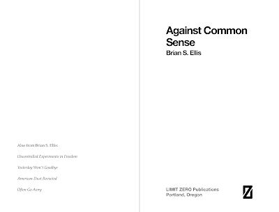
Title page spread:
Keeping the press name and location in gray so as not to get in the way of the left-and-right of the title/author and logo.
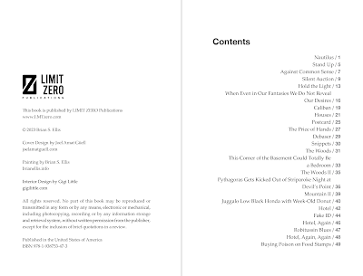
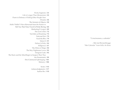
Table of contents:
There was something juuuust so slightly subversive to me about the right-justified contents sitting by themselves on that second spread—and you don't want to know how much thought I put into whether to pin that epigraph to the left or the right.
But the most striking thing about working on this design came when I got into the body of the work, the poems, themselves. Brian has a lot of lines in his poetry that don't fit on a single line of space in the book. When that happens, the publisher likes to let it land as it wants on the page but then indent the first word of the second line. Like so:
In my first interior draft, I did just that. But then we wondered if Brian would like to look at some of those long lines and add breaks where he thought he'd like them. I sent him a note with the interior file in progress and a copy of his manuscript with the indented words highlighted and he went through it. When he was done, he'd decided to create new breaks for 90 percent of the hanging lines.
He wrote back: "Only a few times did I want a single word or phrase to be indented on their own line, but there were a few words that I felt could carry the weight of the empty space around them. I made notes in the word document, and you can go through them. There's a lot! (Sorry. ((not that sorry.)))."
As I went through his notes, I tried to predict, on each new page, where he'd want each line break. I mulled the weight and importance of every word, thinking down into the tiny details of what makes Brian's poetry work. I can't really describe it here, but it was a kind of intimate experience. And when I predicted correctly, I felt smart. And when I predicted wrong, I felt I learned something.
Against Common Sense officially comes out on October 24. Brian has a launch event at Zidell Yards, Saturday, October 21, at three o'clock.
Meantime, though, here's a taste:
Feed the Bite
The first thing they teach you
about what to do
when a human being bites
you, is to not follow your instinct.
When another person sinks their teeth
into, say, your arm
your instinct will be to pull away
to jerk the arm back
and, in doing so,
lose a lot of flesh.
It seems strange that our instincts would be wrong
on this, that human evolution has delinquent
standard operating procedure when it comes
to bite attack. You would think natural selection
would have accounted for this,
but even that ancient and advanced technology
fight or flight sometimes contains errors.
The best possible scenario
if you ever find yourself
being gnawed upon by another
is to take your free hand,
if you have one, and place it gently but securely
upon the back of the head
in the same place you would cradle a newborn,
and then, commit a maneuver that is often
referred to as feeding the bite.
This requires moving towards the damage
when everything is telling you to pull away.
You will move towards the injury
turn your body into a harness
contort around the violence
push forward until you find the back wall of pain
wait until the jawbone
releases
and then,
let go.

