Showing posts with label art. Show all posts

Saturday, December 13, 2025

Book Cover: Felan's Fables

Last year, I designed a book, inside and out, for Jamie Yourdon, author of Froelich's Ladder. The book, Swanya, was a limited edition novel (only 100 copies made) based on the story of Snow White. I wrote about the process here.

This year, Jamie's got a new project, and I'm in love with it. It's called Felan's Fables and is a collection of 60 short, charming, weird, fascinating fables that take place in a world of Jamie's creation. They don't all revolve around the eponymous Felan, but Felan is there, and important, and as you read, the world grows up around you in a wonderful way.

I was excited to get to design this book inside and out as with Swanya—and as with Swanya, Jamie gifted me with some gorgeous artwork to work with.

Look at this!

This is Felan. Commissioned from artist Graham Francoise whose art you can check out here. I love his style and I absolutely love the image of Felan that he created. It was such a joy to work on this cover because throughout the process, there was Felan for me to feast my eyes on.

Look at that nose and freckles!

Along with the Felan image, Graham created a patchwork quilt of tiny images each representing a fable. That was to be the background, and also the main imagery for the back cover. (I also used each little square to head its fable on the inside.) Graham gave this to me in layers, and Jamie said I could position Felan any way I wished.


I chose, of course, to put Felan front and center, and then I looked for fonts that felt right for the subject. The challenge for this cover was to get the balance between Felan and text right, and also to ensure that the elements didn't get overwhelmed by the detail of the patchwork background. To make sure the title stood out, I added a subtle wash of color across the top half of the cover. For text color, I stuck mostly with reds and greens to integrate the words into the artwork, adding in some cream and black as well, as I experimented. Sometimes the text wants to stand off of a cover. For Felan's Fables, I wanted it to nestle inside.

At first, I tried also adding a little bit of extra ornamentation because we had included some in the Swanya cover and it had worked well.

But it felt extraneous to both Jamie and me. One element too many. Sometimes the best design is something subtle, that allows the artwork to be the star completely.

I did some experimenting....


And of course sent samples to Jamie to choose from. One thing that happened in the process of this book is that we found out late in the game that the printer couldn't accommodate Jamie's chosen trim size. That meant that after all of my experimenting, we needed to reformat the cover to a shape that was a little taller and thinner. I think, in the end, that served Felan well.


Felan's Fables will be out March 10, 2026. Jamie will be launching a Kickstarter campaign in January. You can have a sneak peek here. For more information on Jamie and all his books, go here. To feast your eyes on more of Graham's work, go here. And here's a taste of one of Jamie's fabulous fables:

Once there was a boy whose bones were made of wicker. His father was a scarecrow and his mother was not.

The boy’s limbs were sturdy as a wicker chair. His ribs were like a picnic basket, with all his organs neatly tucked away. His heart, lungs, liver, and kidneys were all normal. It was only his bones that made him different.

“You must never tell anyone,” his mother had cautioned him, “or people will cut you open to see your insides.”

So the wicker boy had kept his secret safe.

One day the wicker boy chanced upon two brothers by a lake. The brothers had been arguing, but they fell silent when they saw him approaching. Though one brother was clearly older, both were larger than the wicker boy and both had a menacing disposition.

Their faces turned from scowls to smiles.


Friday, September 6, 2024

a moment in the day: picture

I'm sitting in a vintage dress on an antique chair in the early evening sun. Crouched in front of me, Eric aims the camera and fires off shots as Stephen, assisting, holds the big reflector, angling it so that its gold surface bounces sunlight across my face.

Something deeply ingrained says, who am I to be sitting here having my picture taken. 

Eric has been on a mission to photograph Portland writers and artists, treating them to long, intimate sessions behind his camera, capturing them with his magical eye. He says, "Let your neck relax. Picture yourself in an opium den."

Opium dens are, of course, not where anyone would picture me, but I'm giving myself over to everything he says this evening. I let my head loll against the back of the chair. He leans in and his camera goes ksh ksh ksh.

"Loosen your jaw," Stephen says. "You keep all your tension in your jaw."

I relax my chin, let my mouth open a bit. Something deeply ingrained says, don't open your mouth, you'll look slack-jawed and unintelligent. I don't know where to look, then remind myself I can look wherever I want. I glance to my right, I glance down, I glance to the camera. Ksh ksh ksh.

Eric pauses in his shots to check out what he's been getting and then he turns the camera backwards toward me. "Have a look at this." His enthusiasm is infectious and calming. It momentarily quiets the voices in me. I look into the viewfinder. My vision tunnels down into darkness and stops on a tiny, luminous image of me. It looks beautiful and I tell him so. 

Something deeply ingrained says, who am I to think an image of me is beautiful. 

Feels egocentric, feels like it must be a lie.

He turns the camera back around and the session continues. I settle back in the chair. Light from Stephen's reflector dances and winks.

Eric says, "Close your eyes."

I've been thinking lately about that thing you do where you look at an old picture of you from when you were younger and you think, if only I'd known how good I looked back then. If only I had appreciated it. That's a universal experience and it can happen at any age. Seventy-five, and you're looking back on your fifty-five-year-old self and saying, why didn't I appreciate it? Eighty-five and you're looking back on seventy-five. You know what would be nice? If we change that narrative: be fifty-five and make the active decision to look at and appreciate it now.

Eric says, "Open your eyes."


Thursday, June 27, 2024

Book Cover: POST-Apocalyptic Valentine

Normally the story I tell about a book cover is about brainstorming concepts, experimenting until I find something I like, maybe trying a new technique. But for POST-Apocalyptic Valentine, the upcoming poetry collection by Linda Watanabe McFerrin, and published by 7.13 Books, the cover story was something altogether different. 

We had a tight timeline, just a few weeks, but luckily the author had a photo she wanted to use and a strong idea about tone and type treatment. We met on a Zoom call to discuss. 

Linda described just why she thought the photo, which showed a lonely looking, graffitied phone booth sitting in the middle of a wide sweep of sand, would be the perfect image for her book. I jotted notes of what she said: 

junk, abandoned, writing in the sand, writing on the wall, missed connections...

It wasn't until the next day, when I sat down to play with how I might work this image into a book cover with the added elements of title and author name that I realized we had a problem. I think the reason I didn't make the connection the night before is that when I'm Zooming (or god forbid chatting with someone on the phone) half my attention is always taken up with the social aspect of the call, social anxiety, the effort of needing to appear normal in the world. Somehow I didn't make the connection between the phone booth picture and the other handful of pictures Linda had offered up as possible cover fodder, all of which were taken on the sand at the Salton Sea. One showed a giant metal cricket. One showed a curved sculpture built of toilets.

The phone booth was an art installation.


Which meant in order to use it, we needed permission from not only the photographer (Linda's husband, so: check), but also the artist.

Linda said the art installations at the Salton Sea were not signed, so we didn't know who had made this particular piece. I asked Linda to think through other images that might work for the cover, and I set to trying to track down the artist. I knew Linda had her heart set on this particular photograph, and I, too, wasn't keen on having to find something new. With only a few weeks to create a cover, we really didn't have time to come up with a whole new direction.

I got lucky. I don't really remember the words I put into Google. Public art... Salton Sea... Phone booth... I Googled at random. Phone booth on the sand. But it didn't take me long at all to track down other images of the phone booth art piece, and the name of its creator, through some recent news articles.

This sent me down a whole new rabbit hole. Iröndäd, as he's known, has been on a quest to save the Salton Sea. "Few issues need the attention of Californians more than the ecological crisis here at the Salton Sea," he says in this article on KSUI News San Diego. "Since 2018, the sea has been shrinking at a rapid rate, exposing vast playas that emit toxic dust in the air as the wind blows across them." To bring the ecological crisis to the public's attention, Iröndäd started the Salton Sea Run, in which he runs the entire shoreline (around 95 miles, taking about 30 hours), tracking his GPS coordinates as he goes, thereby recording the shrinking of the shore in a very particular way through run after run. He does this in a gas mask, keeping himself safe from those toxic fumes but also, again, bringing attention to the crisis.

Here's another article about it in The Guardian.

I was captivated by Iröndäd's quest, but more importantly for my purposes, I had found the name of the man who created the art Linda wanted to use for her book cover.

One task down of three. I'd discovered who he was. Now we had to find his contact information, and contact him in hopes of getting permission.

I Googled Iröndäd, with and without umlauts, looking for a website or social media accounts, something with contact information. Turns out there are a lot of people using Irondad as a social media name. I think it's a term having to do with running (he's completed triathlons and ultramarathons) and there's also some sort of Spiderman connection to the word. I didn't delve too deep. I was looking for a real, non-superhero man (or maybe superhero if he can save the Salton Sea).

I couldn't find him on Facebook, Twitter, Instagram... but I did find some sort of Bombay Beach art association Facebook page, and I slipped in there, asking if anyone knew him. Wasn't hearing anything back. Time was growing ever shorter. I jumped on an email thread I had going with Linda and with publisher Leland Cheuk, to tell them I wasn't having any luck. I got halfway into that email and thought, what if we could contact the reporters or news platforms of the articles about him. I clicked into one. Would they give out contact info? That felt unlikely. Privacy issues. Scrolling through the article, feeling like I was grasping at straws with no time left, my eye caught something. Right there in the middle of the feature, plain as day, was a link to the artist's website.

I don't know why I had missed it before or why I had been unable to find his website by Googling him. But suddenly I had a website with a contact page.

Finding him didn't guarantee in any way that we'd be able to secure permission, but I took a flyer on it and while Linda reached out to him, I started working the image into a cover.

First I needed to build a little more of the photo. I needed more space around the phone booth for my text. So, I took it into Photoshop and added more sky and sand by cutting and pasting pieces of the existing photo and using the clone brush to clean it up and get rid of obvious duplication.

Then I experimented with the type treatment. Linda had said she was interested in lettering that looked like graffiti. I had a graffiti font I liked, and I played with that, manipulating the duplicate letters so that they were all different from each other. I also looked at pictures of graffiti and built some lettering based on that.

Time was going by and I wasn't hearing back about the artist, but I just kept experimenting. The photo seemed to want the lettering to be slanted, so a lot of my samples did that. The couple book covers that Linda had said she favored (I always ask an author what book covers she really likes) had some element of curved lettering so I tried doing my lettering in an arch as well. For colors I stuck mainly with sky and sand colors, sometimes using the red of the phone and the pink of the antenna heart as accents.

On impulse I also tried a different direction, thinking what if, instead of graffiti, the title and author looked like they were written out by hand. Something loose and thin that allowed more of the background picture to show through, left more air in the image.

And then I got an email from Linda: Iröndäd had said yes.

Hurrah! I kept working and finally sent some samples out to Linda and Leland. Linda loved the handwritten sample and said it looked like skywriting to her, which hadn't occurred to me. We had some back and forth about the blurb snippet and then finally, and in the nick of time, had our cover, with special thanks to Iröndäd. 

When I share these little blog posts, I, of course, hope that folks might enjoy hearing about the design process and be interested in the book, but in this case I also hope you might delve a little deeper into Iröndäd's art and his cause and what's happening out there at the Salton Sea.

POST-Apocalyptic Valentine will be out officially on September 3. More info on Linda Watanabe McFerrin is here. More info on Iröndäd and the Salton Sea Run is here. The photo of Free Love Phone Booth by Iröndäd was taken by Lowry McFerrin.

Here's one of the poems from the book for a little taste:

"POST-Apocalyptic Valentine"

My heart, my love,
FRAGILE
was on the line
HANDLE WITH CARE
when everything went haywire.
CONTENTS MAY SHIFT UNDER PRESSURE
You, a zombie now,
CONTENTS MAY SPILL UNDER PRESSURE
without a clue about me
or you—
promises all broken and
an apocalypse looming …
URGENT
URGENT
URGENT
I need to send a bullet
SPECIAL DELIVERY
into your brain.
EXPRESS MAIL
I am so sorry.
RETURN TO SENDER
ADDRESSEE UNKNOWN

Thursday, June 20, 2024

Book Cover: A Tree of My Own

Today, and in celebration of World Refugee Day, we're doing the cover reveal for a book that's very close to my heart. As far as writing in my blog is concerned, A Tree of My Own deserves more than just a cover reveal post, because my role went beyond cover design and beyond even interior design, although I did both. I was brought in on the project—which is a children's picture bookprimarily to work with the illustrator, Kayor, and refine the visual storytelling. To do that, I took some of his early sketches, changed things around, added some sketches of my own, and storyboarded the book, giving Kayor the map that he used to turn into his beautiful illustrations. I suggested changes in story structure and even some text edits. The project was highly collaborative and it was truly wonderful to work with publisher Frances Lu Pai of Qilin Press and writer Nui Wilson as well as Kayor. 

But I'll detail some of that process in a later post. This post is for the cover.

A little about the book. The story tells about the refugee experience of the Karen people (some information on the culture is here) through the point of view of a young girl, Posada (which means youngest child in her language), who, with her small family, flees her war-torn Burma village to a refugee camp in Thailand, and then later to a new home in Portland, Oregon. 

When Posada is born in Burma, the tradition in her village is that every new child is given her own tree. In her early years, Posada goes often to the woods to visit her tree and play with its seeds. After she and her family are forced to leave, and throughout her journey across countries and cultures, Posada doesn't feel truly settled, truly at home, until she finds herself a new tree in America.

When I met author Nui Wilson at last year's Portland Writers Picnic and heard her talk about the tradition of Karen trees and how Nui was weaving that tradition into a story, I was captivated. 

And Kayor's art captivates me further. He lives and works in Thailand where he makes art primarily focused on the lives of the Karen people. His work is friendly and joyful, richly colorful, adorable without being cutesy. You can check out his Instagram page here.

For the cover, Kayor gave us a few sketches to choose from with concepts for cover art.

The detail of representing the Y in My as a seed was Nui's great idea. In discussing the cover art with Nui and publisher Frances, I suggested we go with number 5. It features Posada nicely, is joyful and exuberant, and I loved the slant suggested by her body. The open space in the art felt perfect for adding the text we needed. Frances and Nui liked it too.

When I got the finished artwork I was so happy. Look, how pretty!

For the type treatment, I started with lae-li as inspiration. Lae-li is a Karen word for goodbye. There are two places in the book where Posada has to say goodbye to her home and on each of these pages, we wanted to include that word. I worked the word up in Illustrator and dropped it onto the page in InDesign. Here's a detail of one of the two pages.

So, when it came time for me to start work on the cover text, I thought I'd see what it would look like if I built the words in the same style as my lae-li.

At the same time, I looked at some fonts including a simple one called Chalkboard and a more whimsical one I love called Little Pearl. Using all three typefaces, I experimented with space in the artwork to see what would fit the best. Also, we wanted to include one other element: the Karen translation of the title, not a transliteration like with lae-li, but an actual translation in letters too, which Nui got for me:

The challenge of the cover was color. The cover art has muted colors, a lot of browns, which at first I thought was a good thing, an opportunity to use the lettering to add color and pop. And, I mean, it was—but it was also a challenge because a lot of colors ended up tending to recede against the mid-range shades of the art. Reds, bright greens, blues, purples were too dark; oranges, light greens, pinks were too quiet. Greens in particular would fit nicely with the illustration, but I couldn't find a shade that stood out enough—and I really wanted to get some color in there that was on the red-pink-orange side, to add some of that particular brightness. But really the only colors that stood out well enough against the muted browns were white and yellow.

I did some wild, random, mostly unsuccessful experimentation:


Do you notice one thing? In all my early doodling, I forgot Nui's seed letter Y.

But I did like the effect I got when I played around with adding this blurred fuchsia on top and green on the bottom of the title. It gave me that bit of warm, on-the-red-side color and that bit of green that I wanted, while letting the yellow do its job in helping the title stand out.

Frances and Nui liked this too, so I played around with different layouts, experimenting with whites and yellows, changing the fuchsia out with a red that more matched the colorway of the cover art, and particularly the colors in Posada's dress pattern. 

You might notice, too, that all of our names went on the cover. Frances had said mine should be there, and I, in turn, said hers should. With a project as collaborative as this one, it felt right.

In the end, we all agreed on the color and layout we liked best, and then Nui asked if I'd switch the font for one she liked better from a different sample—and we had our cover. With just one last update to make: I wanted Posada's seed to stand out better in its brown against brown, so I took the cover into Photoshop and did a tiny tweak to that seed so that it would pop a little more.

It's been so lovely seeing Posada come to life, and I can't wait for you to meet her too. A Tree of My Own will be out this fall through Qilin Press. Qilin Press is a nonprofit so all the proceeds from the book will go to providing educational and training opportunities for people in the Karen community, particularly those who are still living in refugee camps. More info on the book and on Qilin Press is here. More info on Kayor's art is here. I'd also be remiss if I didn't mention that Frances Lu Pai is also the publisher of Demagogue Press, whose focus is primarily on cool games, and you can check that out here. More information on World Refugee Day is here.

Monday, December 18, 2023

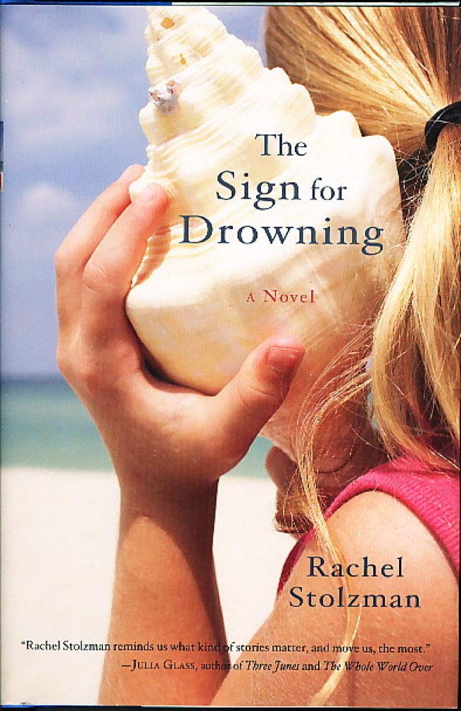
Book Cover: The Sign for Drowning

This fall I had the good fortune to be contracted to design two different book covers for two books for one of my most favorite presses, 7.13. One was The Sign for Drowning by Rachel Stolzman Gullo. The novel originally came out in 2008 from Trumpeter Publishers, and this is its reissue. Publisher Leland Check had these succinct words to say about the book when he reached out to me:

It's a terrific novel about grief, about the Deaf community, written quite beautifully.

In the story, the narrator, who is a teacher to Deaf children, is haunted by the death of her sister, years earlier, to drowning. Here's the original cover.


To start things off on this new edition, Leland had Rachel give me some thoughts on covers and cover elements she liked. She shared an article on book cover trends and said:

This article speaks to me and I like the idea of handwritten large title and flowery stuff- flowers symbolizing ephemeral. We might play with imagery in book from the The Little Prince. The flower enclosed in a fence. Or not. I had a review in the Sarah Lawrence magazine that used the African violets that Adrea falls for…

Also, here’s covers I find beautiful.


She also shared this image that she thought might make an evocative cover:


In some book cover design projects, I come up with or am given a concept and run with it, working on that one design until it's good. In many projects, I work through two or three concepts in rough form, show them to the clients for feedback, and when the clients choose their favorite, I refine from there. With The Sign for Drowning, I shuffled through many different concepts, creating and showing, creating and showing, until we finally zeroed in on what spoke to Rachel.

I started with her notes on liking big, hand-drawn lettering, flowers, specifically African violets, and her idea of drawing on The Little Prince, which is a book that figures in her story.  With the African violets, I scattered them across water, floating the lettering, which I hand-drew, on top. For the Little Prince, I experimented with the single rose from the story, swirling the stem and threading it through the lettering, and in this instance my reference to water was a single drop hanging from the flower.


When I shared these rough drafts with Rachel and Leland, I also mentioned that I thought the photo of the hand dipping into the water might be a little too on the nose but that I could certainly try it. I reminded then that these concepts were in their early stages and that I'd add things like texture and detail down the line if they liked where I was going with it.

Rachel said:

Wow! It’s amazing to see a new cover coming to life! I like the rose one quite a lot. I’d be very interested to see you add texture and detail and how it develops further. 

I like that there’s something off or mysterious about the long circular stem and just one rose. It makes me curious. 

I can’t help but want to see one version with water, but I hear you about on the nose. 

BTW- My last name has a Z in it- Stolzman. Hope that doesn’t change everything- just kidding!

OOPS.

Also, I'd obviously gone too subtle with the water in my African violets design (there are rings around some of the flowers, but you can't really catch the nuance from the images that show on this blog) and she couldn't tell it was water at all.

Leland said:

Yeah, I also really like the rose direction, and the idea of incorporating water in some way into that design.

I’m open to photography and testing it out. But to me, the rose is a winning direction. But it’s Rachel’s book and therefore, her cover...

So I stuck with the rose direction and added water to it. Of course laying my swirl of stems and leaves in water meant I should remove the drop from the rose. I also replaced the simple, single-layer leaves, which were mostly just three or four leaf shapes that I'd reproduced, with individual leaves with multiple layers of detail.


Seeing this new version, they began to rethink, wanting to move toward something more somber. Rachel suggested I read a certain scene in the book and look for concepts and elements there.

So I tried a new handful of ideas. The sister's drowning death happens from a yellow blow-up boat, so I thought about a tiny yellow boat, alone, in a wide field of water. I tried the violets again with fewer of them and more water. I on impulse one day created a scrappy, sketch-like version of the hand-touching-water photograph. Because the scene Rachel suggested I read has the narrator by the ocean at night I created two concepts in that vein, one highly playing on the phenomenon of bioluminescence that the narrator experiences in the scene. Within these concepts I tried different layouts and fonts, including more hand-drawn lettering.


As before, these were unpolished. I could, for instance, try adding some texture to the hand-lettering to make it look like it was, say, drawn with a pen. But that would happen after a concept was chosen.

In the end, none of these concepts were chosen. While we went back and forth on a few designs, particularly the bioluminescent beach, honing in on that idea, Rachel shared a painting her cousin Faye Stolzman made, that was quite lovely.


I tried a sample or two using it.


And suddenly we were off on a new direction. Rachel and Leland really liked the painting, and we tinkered with it (I played with layout and Rachel asked me to try some different fonts)...


...until we settled on a design. 


The problem then was that the photographs Rachel was able to get of the painting were not high resolution. Faye was still working on the painting so we gave her some time to get to a place she was happy with and then she took some more, higher-res photos. Once we got the images, the shoreline and, more importantly, the clouds had changed and the lettering didn't fit the same way, so I did some photoshopping to combine a couple different passages along the long painting to create the space I needed. Also Rachel was interested in me trying some hand-drawn lettering again, and some more versions with the font, so there were more samples back and forth.


In the end, she zeroed in on the version she liked best. It's interesting how far we came from the elements and concepts I started exploring in the beginning, but I'm so happy we found a cover that Rachel could love, and one that uses beautiful art from someone she loves. The Sign for Drowning is a book ultimately about human connection, and with the cover, we got a human connection we hadn't bargained on.


The Sign for Drowning is out now. It can be purchased here. And here's an excerpt:

We have been reading The Little Prince. Not the usual image of a mother reading to a child. We face each other. She watches my eyes and my hands. Adrea is deaf as a stone. She says that I named her.

Our first contact was a spring day in her classroom at the Huntington School. I frowned at the stained rug, ripped books, bare barred windows. Frowned at the eight special foster children. Her rounded tense back suddenly curled against my shins. She was sitting on my feet, facing away, holding herself. An introduction.

I looked down at this unfamiliar five-year-old child, her head resting on my knees. Her hair was neatly parted down the middle, braids curving down each side like rivers rushing to reach the back of her neck. Lowering myself to the floor, I was careful to keep my legs steady and not jostle the girl. She spun around, placing her small feet on top of mine. She wrapped her arms around her knees, looked directly at my face and then away. I read her name tag and signed, “Hello, Adrea.”

She pursed her lips tentatively, broke into a smile. Two rows of perfect baby teeth. Slowly she brought out one grubby hand, signed carefully, “My name is—” then in a rush, “Adrea,” as I had.

I’d skipped a letter, a loose fist, two fingers over the thumb, two fingers under the thumb—N. We’d made a truce, unknowingly, that would be permanent.

I put aside the book. We need to talk about a flower that loves. Adrea wants to know what I believe. God, I need to know her every belief. We agree a flower can love, so can a plant and a tree. Lying on Adrea’s bed, the sun boasting and rain tapping down, hands that talk, flowers with heavy hearts, what possibility would I dare deny?

Surely there’s some scrap of bible that a stone overheard.

Now she’s Adrea. I’m the mother who never conceived. She is the child who entered this world soundlessly, as silent and swift as a drowning. But I must not think of these things together.

Saturday, April 2, 2022

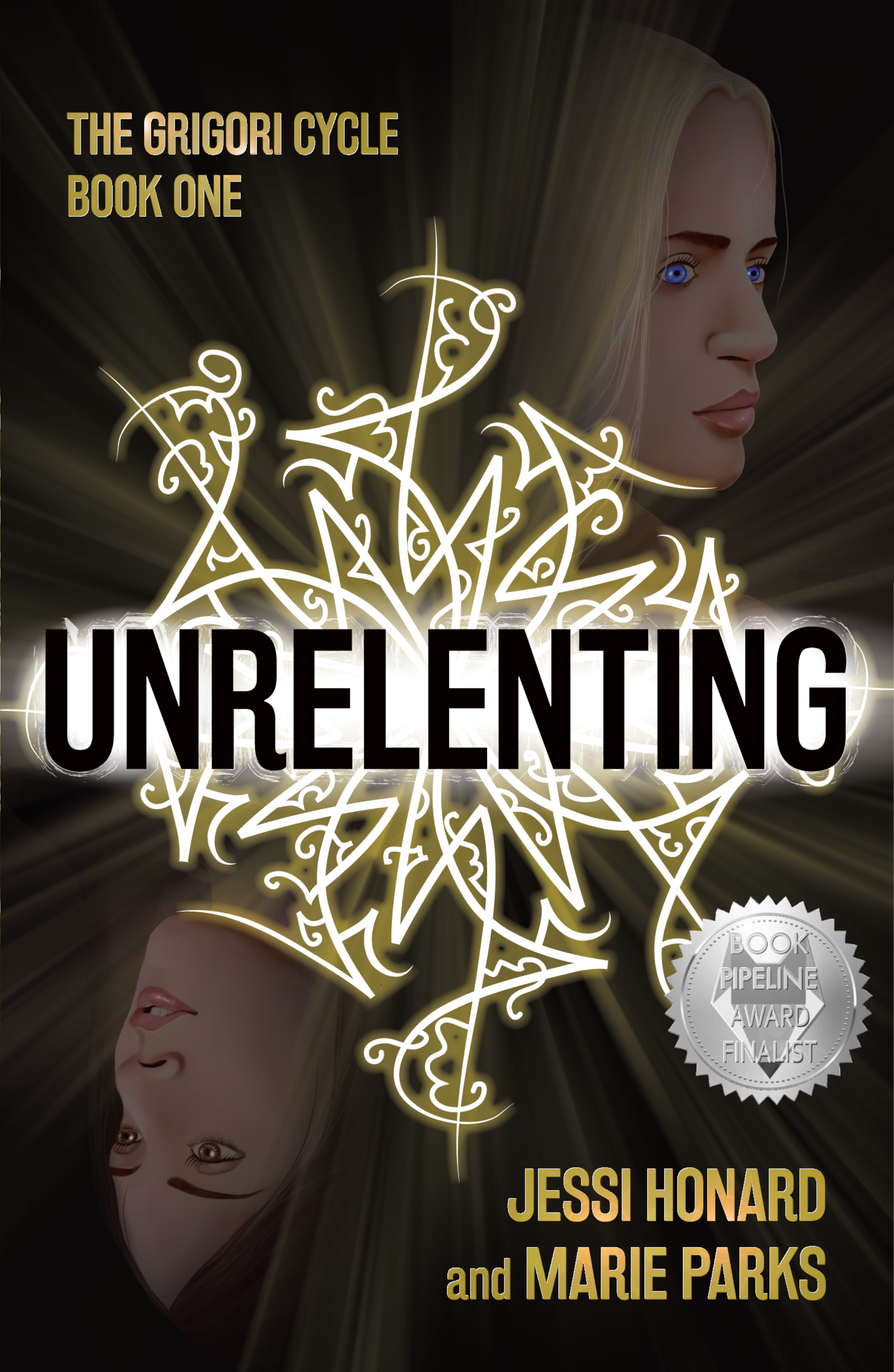
Book Cover: Unrelenting

Whew. This was a hard one.

One of the reasons I love design work is that there’s always a challenge. Fitting the elements together, the colors, the fonts, it’s always a puzzle, and I love the puzzle of it.

The challenge in Unrelenting, a novel due out April 19 from Not a Pipe Publishing, was that I offered to produce a painted illustration as part of the cover design. 

Now, I'll say it's not that I've never stepped back from the computer to create art for a cover before. I had, not too long before, done the cover art for Caitlin Vance’s Paper Garden by hand-painting the faces and tulips for that illustration, and it had turned out nicely. But the style of art that authors Jessi Honard and Marie Parks wanted for Unrelenting was much more finely detailed. In fact, in sending me examples of the type of illustration they like, they referenced my cover for The Untold Gaze, the book I co-produced with my husband who’s an actual fine artist. 

And yeah. Sadly, I’m no Stephen O’Donnell.

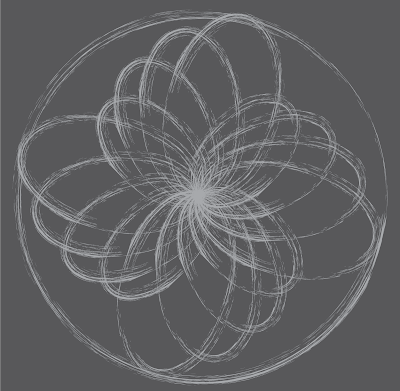
But I’m getting ahead of myself. Before I even started working on the painting of the book’s most important characters, Bridget and Dahlia, I created the main element of the cover design, the Grigori symbol.

Briefly, the book is about Bridget, a young woman who, in searching for her missing sister Dahlia, discovers, as the publisher describes it, “a carefully-guarded plot tied to powerful, age-old magic.” The magical dark forces in the story are called the Grigori, and their calling cards are symbols that are found in various places throughout the novel—on walls as graffiti, even on people’s skin. Here's a description from early on in the book:

An intricate array of black strokes covered the worn cinder blocks. The artist had taken care to ensure the geometric pattern was precise, creating an expanding knot of swoops.

And further down:

“It’s cool,” he remarked, stepping forward to get a closer look. “Kinda reminds me of fractal art.”

My early experimenting to create one of these symbols relied heavily on the combination of graffiti and fractal art and the description of the symbol as "an expanding knot of swoops."


But then Jessi sent me an extra explanation that really clarified the idea behind these symbols:

They are a precise written language that is so complex that people train for decades to interpret and create them. Each symbol essentially creates a 'contract' (our magic system is based on signing contracts via these symbols). There are several different types of symbols, but each individual one is unique. Some create new Grigori, some impact physical objects, and others put conditions on people. The different swirls, lines, and shapes within the symbol create these stipulations, show the signature of the signer, and give it its power. 

The thing that struck me the most in this description was the idea that the symbol was a complex written language. That allowed me to think beyond the concept of pattern to something more intricate.


Once we had a symbol we all liked (Jessi, Marie, publisher Benjamin Gorman, and editor Viveca Shearin), I moved on to the sisters. 

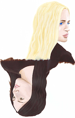
The authors sent me stock photos representing how they pictured Bridget and Dahlia looking. I found two that worked well as mirror images of each other, that felt right for the layout I wanted, and I started by sketching them out on paper. Then I moved to acrylic paints. My plan, knowing my art and design skillset, was to start the art as a painting and then bring it into Photoshop to refine it.

Annoyingly, when I had a painting that I was happy with, I found it difficult to reproduce digitally. Subtlety and softness disappeared in the scans I took, and brushstrokes came through chunky and less-than-elegant.


Now, the idea for this painting was that it would float very dimly in the space above and below the title and the Grigori symbol, that the faces would be subtle shadows, against a dark background. But still, I needed to do loads of work to get these two sisters to look as we all wanted them to look.

Here are some closeups as I refined, added details, darkened and deepened the image behind the symbol. (The idea to have the symbol cup the jawlines of the sisters came from publisher Benjamin Gorman, by the way.)


And finally, here are both Bridget and Dahlia and the completed cover sporting a spiffy award badge from the book earning a finalist nod for the Book Pipeline award.


Unrelenting will be out on April 19th. Jessi and Marie were given an exclusive cover reveal on LGBTQReads. You can check that out, along with more info on the book and an excerpt here. The book is available for preorder now. And here's one more exclusive excerpt for you!

*

Bridget hit play. Again.

A dark alleyway appeared on her phone’s screen, its rough brick walls gleaming as a fine rain fell. A puddle reflected the single light that flickered above a worn metal door. It was the kind of scene that would kick off an old noir film.

In the fourth second of the clip, a woman stepped into the alleyway from the quiet street beyond. Her face remained in shadow, a hood covering her hair. She cast her gaze over her shoulder once before wrenching open the heavy door and stepping through. Dim, hazy light shone from the window, then faded. The video ended.

Dahlia. There was no doubt in Bridget's mind. Yes, the scene was dark and misty. No, the camera never clearly captured her face. But she would recognize that walk, that glance, that posture anywhere.

It was her. It had to be her.

As Bridget watched, she found herself repeating a familiar refrain. It isn’t your fault. The words felt flatter each time. For the rest of her life, she’d never shake the angry, abrupt end to their last call. And all over a guy Bridget knew was bad news. Their fight had carved out a hollow place within her.

At first, the reigning theory was that Dahlia and her boyfriend, Dan, had run off together. But Dahlia wouldn’t do anything so extreme without confiding in her sister, even after a blowout. She refused to give up hope. Even after Dan’s car was found, Bridget knew her sister wasn’t gone. She would’ve known if Dahlia was dead.

And now she had proof. The video’s metadata told her the recording happened two months after Dahlia’s disappearance. It hadn’t arrived in her inbox until a couple of weeks ago, with the file attached. The first time she'd played those ten seconds, alone in her bedroom in North Carolina, it was a moment of vindication. Finally, she had confirmation her sister was still out there. Since then, she must have watched the clip a hundred times, relief giving way to frustration as Ivanova dismissed her.

She returned to her inbox, staring at her messages. She'd planned to send a follow-up to their meeting, but given the way Ivanova treated her, she doubted she’d get a response. The detective had made herself clear. Bridget should have known better than to trust the police.

But she had made herself clear, too. She wasn’t giving up on this lead. She needed to find out what had happened to Dahlia.

With a steadying breath, Bridget returned to the email chain containing the video. It was a long back-and-forth by now, after two weeks of correspondence. The sender, a classmate of Dahlia’s, had provided a spark of hope when everyone else had given up. Maybe he could help.

James, she wrote, I made it to Cleveland. Any chance we could talk in person tomorrow?

Bridget felt a small surge of satisfaction as she hit send and turned off the screen. She refused to keep waiting for news that never came. At least she had a plan. A loose, unformed plan, but it was better than nothing.

As she settled among the blankets, she hoped it would be enough.