Sunday, December 31, 2023

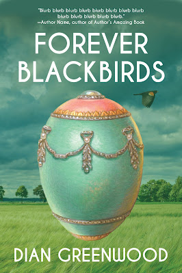
Book Cover: Forever Blackbirds

Recently, I designed a book cover for the forthcoming novel Forever Blackbirds, written by my good friend Dian Greenwood.

Not only have I known Dian for years, I was in a writing group with her for years (well, two writing groups, actually), and I got to know Forever Blackbirds through the many different pieces she would present in group as she wrote and wrote and edited and edited. Now it's coming together as a finished book—actually one of two. Forever Blackbirds is the first in a duology surrounding the life of Marta Gottlieb: born in a small village near Odessa, Russia; escaped, with her family, the political turmoil of the early twentieth century to immigrate to America through Ellis Island; settled in the small town of Elgin, North Dakota, with little more than her family legacy (a precious Russian Easter egg) and her spirit.

I've loved getting to know the many iterations of this wonderful book, and Dian and I worked closely on the cover (and interior) together, which was a lovely experience.

The book takes place in two timelines: the early days of the family's immigration, and Marta's life in the 1940s. In thinking on cover ideas, I wondered whether we'd want to put the 1940s on the page or the early teens or both. Dian had ideas for imagery: North Dakota farmland, vast wheat fields, a church (Marta's connection to her religion figures strongly in the story), Ellis Island, the Fabergé egg. Dian took some pictures for me of a church she liked, and I gathered more images we could use for fodder. 

Here's one of the church photos. Isn't it pretty!

Since the larger portion of the story takes place in Marta's 1940s present in North Dakota, I figured we should focus on that timeline first. I looked through images and gathered some great ones of midwest farmland, which I shared with Dian. The one she liked most was this beautiful field with a moody sky, courtesy of Albrecht Fietz on Pixabay.

I love that little break in the clouds.

This became our base for a number of different cover iterations, some also incorporating the early teens timeline and some not.

I started work with the combo idea. I found this great image of barges bringing immigrants to Ellis Island on Wikimedia Commons.

I isolated the barge on the right, and then I worked way too long trying to smush the two images together, the barge and the field.  Well, to elegantly blend the two, but it was hard to get them to work together well. The barge kept looking like it was weirdly sailing through the wheat field. I wanted to keep the color of the landscape and bring the barge in in sepia to evoke age, but the break between the two color schemes made it look, to me, like something just out of frame was on fire and sending muddy smoke into the sky.

But I was happy with the font choice and Dian was too. I wanted something that suggested vintage but not in an over-the-top or cheesy way. Then I created the F for Forever in Illustrator. We were happy, too, with the flying red-winged blackbird that I added to the scene. We wanted to have a literal blackbird element for the cover, not only to reference the blackbirds in the title, but a bird would lend a poignancy to the imagery, symbolizing journey, freedom, perhaps longing. In this combination, it just looked like the bird was fleeing the phantom fire.

I liked the idea of including the Russian egg, which is an important object both literally and metaphorically, in the duology. I found a bunch of images of Fabergé eggs on a stock photo site. Unfortunately any images of real, historic Fabergé eggs were not available for commercial use, and any that were available were either fakes or modern. 

Now, I do happen to be married to a fine artist who has designed and incorporated his own Fabergé eggs into his paintings. I asked him if he'd be willing to let me borrow one, and he was happy to do so. It was fun to work with his art and try to incorporate it into my design.

And I tried getting that barge in there again.

But at the same time I was experimenting with a simpler approach. There was something more evocative to me about letting the eye fall on that vast wheat field and that big, moody sky with our one blackbird flying by. Dian liked this direction too. She liked the idea of centering the blackbird in the hole in the clouds. I gave her a handful of different iterations.

Now, if you could zoom in really close, you might see that I added a tiny church. That church I took from Dian's own photographs. It was fun that as we got close to the end of this design journey, I could add an element that came from the very first imagery I acquired for the cover. And a tiny touch of Dian's own photography. 

Once Dian chose her favorite formation and we added this great blurb by Maryka Biaggio, we had our cover.


Forever Blackbirds will be out in the Spring. Dian's recent novel About the Carleton Sisters can be found here.

Here's a taste of Forever Blackbirds, from Marta's turbulent childhood, before the family escapes to America:

The window revealed a first glimmer of gray light lifting into the sky against the whole cover of snow. Mornings like this I recalled the night our barn burned in Russia, flames rising outside Father and Mother’s upstairs bedroom window. The shouts of men carrying torches that awakened Father, then Mother. By the time Father pulled back the heavy drape, the barn was already gone, the flames exploding from the stored hay, flames leaping so high they threatened the outbuilding where Father kept the tools. The wild and frantic shriek of animals kept rising from the yard where they’d been set loose. Thunder, my favorite horse, long gone into the blackness surrounding the barn.

The blizzard had already blanketed the path to the outhouse. Best to make the tea and put on rubber boots before going out. There would be no quiet moments again until the house darkened and everyone went to bed.

Thursday, December 21, 2023

Book Cover: Trust Me

For the book cover for the upcoming Forest Avenue Press book Trust Me, a novel by Scott Nadelson, I had one particular idea that popped into my mind, which I ran with. I usually like to tinker with more than one concept in the early stages of a cover project, but once in a while, something gets into my head and grabs hold.

The seeds for this idea came from publisher Laura Stanfill, who sent me notes on her thoughts:

Scott Nadelson’s book I already have cover ideas from the nature in the book. Mushrooms! A king bolete! I love the idea of at least one mushroom because of the title TRUST ME, and how there’s a scene where the tween daughter doesn’t quite trust that her dad has it right about which kind is edible. But also the book takes place in an A-frame cabin in the woods and the triangle shape matches their family—divorced parents, with their 12-year-old in between them. Isn’t that cool? He wrote that intentionally which I love. And another idea is doing something structural that would evoke the 52 short chapters, time passing, weekend after weekend.

This, by the way, is a king bolete mushroom. Huge!


Reading Laura's ideas. I instantly had an image in my head of that king bolete mushroom, front and center, with the title written inside it. The letters of Trust Me would hug the shape of the mushroom as if growing organically inside it, the longer Trust inside the wider cap and the narrower Me in the stem.

I took the rest of Laura's notes and my imagination built the woods around my mushroom: trees in shades of green, a path leading somewhere, the A-frame cabin partially hidden in the overgrowth.

The text I started freehand in Illustrator, fitting the letters inside the shape I created for my mushroom. The first rendition was... crude.


Edges of the letters were fighting each other and looking way too scrappy. But it gave me a starting place. The more I refined the more I used the mushroom itself to create the letters. To do this, I took the shapes of the cap and the stem...


and turned the solid into outline.


I fixed the outline so that it grew inward from the edges. That became the outer border for my lettering.

Then I took that inward-facing outline and turned it into a solid shape and gave that shape another inward-facing outline.


I turned that outline, too, into a solid shape. And that solid shape became parts of letters. For instance the tops of the Ts in Trust.


You can see how I added shapes in tan to demarcate the edges of the tops of the Ts. And the blue border shape demarcates the bottoms of the Ts. I cut these tan and blue shapes out of my yellow pieces, changed the color, and had my Ts.


I used that same process to reshape much of the lettering in the title. Then I was creating my woods around the mushroom, moving things around, adding detail. I sent Laura a quick sample the work in progress.


When Laura saw the first draft, she really liked it but tossed out the idea, what if I removed the mushroom and kept the mushroom shape of the lettering; would that evoke the mushroom on its own. I thought that was a super interesting idea but wasn't sure I could pull it off, especially with the open space created by the Ts. Then she thought about it and came back to say she didn't think that was a good idea after all and we should keep the mushroom. But she did worry that the design was too flat. She wondered about adding some little pops of color. But not too much. The flowing lettering and the mushroom shape had the potential to slide into psychedelic territory so getting too groovy with color could be dangerous.

The first step I took was to bring up the saturation of the whole design to make it brighter. Then I thought about how to add extra pops of color. I thought about some purple flowers—not the really... flowery kind but something more spiky that could just add a spray of color. Like these.


And what about a bird in the upper right? A yellow bird to balance the warmth of the yellow windows in the A-frame house.

Lastly, and maybe most importantly, I thought about Laura's word flat, but not just in the context of color. In my early draft, the artwork was pretty flat simply because I hadn't yet added all the detail. The path had some texture but not enough. The swipe of greenery running behind the mushroom and through the trees was one flat shape with no added detail at all. But those updates would come. What I was really thinking about was the mushroom. What if I added just a little more dimension to the mushroom?

Once I had these changes made, I wasn't sure the bird was necessary. It felt a little superfluous. I sent Laura a sample with and a sample without.


Laura preferred it without the bird. We sent it to Scott for his thoughts.

I love when something small surprises you with its effect. That little added highlight on the mushroom made such a difference. Laura said, "I love the lighter blob on the top of the mushroom. I'm amazed that a blob could change the whole tone of the cover! I mean the colors are adjusted too but for me, that blob puts it into sweet/family tone."

But would Scott like it? I felt a little anxious, because I'd only given him one thing to choose from. Maybe he wouldn't be in favor of any of it. I could certainly jump back to the drawing board, but my brain had only spat out that one idea.

He said, "Exciting! I love the A-frame and the color scheme and of course the mushroom. I just showed it to Alexandra and Iona, who both have a better visual sense than me, and they were less crazy about the title font inside the mushroom—they thought it was too Alice in Wonderland whimsical, maybe suggesting a younger readership than what the book is aiming for. I can see their point, though I also think it's eye-catching."

So, yay! But also ack—we were veering into psychedelic territory again, albeit of the younger form. 

I went back to my mushroom shape outlines and came up with lettering that still hugged the shape of the king bolete but wasn't quite so Mad Hatter.

With this change in lettering, and some more refining of the details of the forest, we had our cover. And it was good that we scrapped the bird, because it gave us room for this quote from the fabulous Laurie Frankel—which this creaky, old blog isn't presenting in full sharpness, so:

"Scott Nadelson beautifully, movingly sketches the balance between turbulence and poise, wonder and boredom, bravery and vulnerability that is being twelve, or raising someone who is twelve."

One last thing to note about the lettering. And I hadn't noticed it at all, and certainly hadn't engineered it this way. One of the first things Laura noticed was that the word US stands out in the center of Trust. A fitting bit of serendipity for this book.


Trust Me will be out in fall of 2024. More information is here. And here's an excerpt:

She has one hand on her hip, head tilted to the left, so her hair falls across her neck. The way her braces push out her lips gives her mouth a permanent pout, made sour by the scrunching of her eyes. It’s a disconcerting look, not only because it resembles the one Veronica turned on him so often in the last years of their marriage, when she was debating how long she could stay in it, but because it sits on Sills’s face so naturally. Only twelve, and she doesn’t have to work to make him squirm. Twelve and a half, that is. She reminds him every time he objects to her sitting in the car alone while he goes into a store, or to her walking by herself to the diner on the highway, where, if he doesn’t order a burger and salad for her, she’ll eat nothing but a shake and fries. I’m twelve and a half, for crying out loud, she’ll say, and he’ll reply, Exactly, before walking with her to the diner though its food gives him cramps.

Monday, December 18, 2023

Book Cover: The Sign for Drowning

This fall I had the good fortune to be contracted to design two different book covers for two books for one of my most favorite presses, 7.13. One was The Sign for Drowning by Rachel Stolzman Gullo. The novel originally came out in 2008 from Trumpeter Publishers, and this is its reissue. Publisher Leland Check had these succinct words to say about the book when he reached out to me:

It's a terrific novel about grief, about the Deaf community, written quite beautifully.

In the story, the narrator, who is a teacher to Deaf children, is haunted by the death of her sister, years earlier, to drowning. Here's the original cover.


To start things off on this new edition, Leland had Rachel give me some thoughts on covers and cover elements she liked. She shared an article on book cover trends and said:
This article speaks to me and I like the idea of handwritten large title and flowery stuff- flowers symbolizing ephemeral. We might play with imagery in book from the The Little Prince. The flower enclosed in a fence. Or not. I had a review in the Sarah Lawrence magazine that used the African violets that Adrea falls for…

Also, here’s covers I find beautiful.


She also shared this image that she thought might make an evocative cover:


In some book cover design projects, I come up with or am given a concept and run with it, working on that one design until it's good. In many projects, I work through two or three concepts in rough form, show them to the clients for feedback, and when the clients choose their favorite, I refine from there. With The Sign for Drowning, I shuffled through many different concepts, creating and showing, creating and showing, until we finally zeroed in on what spoke to Rachel.
I started with her notes on liking big, hand-drawn lettering, flowers, specifically African violets, and her idea of drawing on The Little Prince, which is a book that figures in her story.  With the African violets, I scattered them across water, floating the lettering, which I hand-drew, on top. For the Little Prince, I experimented with the single rose from the story, swirling the stem and threading it through the lettering, and in this instance my reference to water was a single drop hanging from the flower.


When I shared these rough drafts with Rachel and Leland, I also mentioned that I thought the photo of the hand dipping into the water might be a little too on the nose but that I could certainly try it. I reminded then that these concepts were in their early stages and that I'd add things like texture and detail down the line if they liked where I was going with it.

Rachel said:

Wow! It’s amazing to see a new cover coming to life! I like the rose one quite a lot. I’d be very interested to see you add texture and detail and how it develops further. 

I like that there’s something off or mysterious about the long circular stem and just one rose. It makes me curious. 

I can’t help but want to see one version with water, but I hear you about on the nose. 

BTW- My last name has a Z in it- Stolzman. Hope that doesn’t change everything- just kidding!

OOPS.

Also, I'd obviously gone too subtle with the water in my African violets design (there are rings around some of the flowers, but you can't really catch the nuance from the images that show on this blog) and she couldn't tell it was water at all.

Leland said:

Yeah, I also really like the rose direction, and the idea of incorporating water in some way into that design.

I’m open to photography and testing it out. But to me, the rose is a winning direction. But it’s Rachel’s book and therefore, her cover...

So I stuck with the rose direction and added water to it. Of course laying my swirl of stems and leaves in water meant I should remove the drop from the rose. I also replaced the simple, single-layer leaves, which were mostly just three or four leaf shapes that I'd reproduced, with individual leaves with multiple layers of detail.


Seeing this new version, they began to rethink, wanting to move toward something more somber. Rachel suggested I read a certain scene in the book and look for concepts and elements there.

So I tried a new handful of ideas. The sister's drowning death happens from a yellow blow-up boat, so I thought about a tiny yellow boat, alone, in a wide field of water. I tried the violets again with fewer of them and more water. I on impulse one day created a scrappy, sketch-like version of the hand-touching-water photograph. Because the scene Rachel suggested I read has the narrator by the ocean at night I created two concepts in that vein, one highly playing on the phenomenon of bioluminescence that the narrator experiences in the scene. Within these concepts I tried different layouts and fonts, including more hand-drawn lettering.


As before, these were unpolished. I could, for instance, try adding some texture to the hand-lettering to make it look like it was, say, drawn with a pen. But that would happen after a concept was chosen.

In the end, none of these concepts were chosen. While we went back and forth on a few designs, particularly the bioluminescent beach, honing in on that idea, Rachel shared a painting her cousin Faye Stolzman made, that was quite lovely.


I tried a sample or two using it.


And suddenly we were off on a new direction. Rachel and Leland really liked the painting, and we tinkered with it (I played with layout and Rachel asked me to try some different fonts)...


...until we settled on a design. 


The problem then was that the photographs Rachel was able to get of the painting were not high resolution. Faye was still working on the painting so we gave her some time to get to a place she was happy with and then she took some more, higher-res photos. Once we got the images, the shoreline and, more importantly, the clouds had changed and the lettering didn't fit the same way, so I did some photoshopping to combine a couple different passages along the long painting to create the space I needed. Also Rachel was interested in me trying some hand-drawn lettering again, and some more versions with the font, so there were more samples back and forth.


In the end, she zeroed in on the version she liked best. It's interesting how far we came from the elements and concepts I started exploring in the beginning, but I'm so happy we found a cover that Rachel could love, and one that uses beautiful art from someone she loves. The Sign for Drowning is a book ultimately about human connection, and with the cover, we got a human connection we hadn't bargained on.


The Sign for Drowning is out now. It can be purchased here. And here's an excerpt:

We have been reading The Little Prince. Not the usual image of a mother reading to a child. We face each other. She watches my eyes and my hands. Adrea is deaf as a stone. She says that I named her.

Our first contact was a spring day in her classroom at the Huntington School. I frowned at the stained rug, ripped books, bare barred windows. Frowned at the eight special foster children. Her rounded tense back suddenly curled against my shins. She was sitting on my feet, facing away, holding herself. An introduction.

I looked down at this unfamiliar five-year-old child, her head resting on my knees. Her hair was neatly parted down the middle, braids curving down each side like rivers rushing to reach the back of her neck. Lowering myself to the floor, I was careful to keep my legs steady and not jostle the girl. She spun around, placing her small feet on top of mine. She wrapped her arms around her knees, looked directly at my face and then away. I read her name tag and signed, “Hello, Adrea.”

She pursed her lips tentatively, broke into a smile. Two rows of perfect baby teeth. Slowly she brought out one grubby hand, signed carefully, “My name is—” then in a rush, “Adrea,” as I had.

I’d skipped a letter, a loose fist, two fingers over the thumb, two fingers under the thumb—N. We’d made a truce, unknowingly, that would be permanent.

I put aside the book. We need to talk about a flower that loves. Adrea wants to know what I believe. God, I need to know her every belief. We agree a flower can love, so can a plant and a tree. Lying on Adrea’s bed, the sun boasting and rain tapping down, hands that talk, flowers with heavy hearts, what possibility would I dare deny?

Surely there’s some scrap of bible that a stone overheard.

Now she’s Adrea. I’m the mother who never conceived. She is the child who entered this world soundlessly, as silent and swift as a drowning. But I must not think of these things together.

Tuesday, December 12, 2023

Twenty Years

The very first emails Stephen and I sent to each other, exactly twenty years ago. And how we continue the conversation today.

DECEMBER 12, 2003

Gigi: Hi—I'm a member of the Rufus Wainwright message board. In which I go by circusgirl. Anyway, I was in Portland recently on a visit and made it a point to stop by the Froelick to see your exhibit. Wow. I just wanted to say you're quite a talent, in both aesthetic and content. I really enjoyed seeing your pieces in person. They're so lush. When I peeked at the Big Venus on the website I thought it was done in oils. I think my favorite pieces are the Castor and Pollux and the Toilette of Medusa (hope I'm not mis-stating the titles). The Medusa I love for so many reasons. It's so beautiful, but the idea behind it, the significance, just goes in so many layers. If I'm not being unclear. I love the paradoxes--the mythos/mythos, man/woman, good/evil, ugliness/beauty. Very cool. Castor and Pollux I thought was just so pretty and poignant. But I liked them all. Forgive me for sounding silly, but I just left impressed enough to feel the need to call upon you and gush a little.
Hope you get your wish.
GiGi

Stephen: Thanks so much for your e-mail. I love hearing what people have to say about my work. I do my little paintings, all alone at home, and then - bang - they're out there for everyone to see and interpret for themselves. They're so specific to me and my life/experience, but it gives me such pleasure to have people find other storys [sp] there.

All that, and I just saw RW last night, in concert for the first time - and met him after. He was so amazing; I can't get over it. And I'll be seeing him in Seattle on Sunday...!

Thanks again for your thoughtful words.

SteveO

*

DECEMBER 12, 2023

Stephen: If your Aunt Kathy hadn't given you that Rufus Wainwright CD, and if I hadn't stayed up late and accidently seen Rufus performing on David Letterman, and if we hadn't both become fangirls at pretty much exactly the same time and hung out on his message board with all the other fangirls, and if I hadn't said something on there about my upcoming art show, and if you hadn't come to Portland to visit that same Aunt Kathy, and if you hadn't found a way to see my show, and if you'd never had the idea, the compulsion, to send me that "fan letter," that first email, WE WOULDN'T BE HERE TWENTY YEARS LATER. I'll never get over the - impossibility - of us ever finding each other. And the bridge, the final link that made all those ridiculous coincidences add up to anything at all, was your bravery in sending that email.

Gigi: I remember at the wedding you said, "No Kathy, no party." It occurs to me, too, speaking of the ridiculous coincidenceness of it all, that the whole stack of serendipity would have fallen apart had I had the chance to see Strangers on a Train. My trip, with Mom, to see Kathy was pretty much us hanging out at the house, eating, and going over to visit with Heather and family. I loved all of those things but wanted to have just one other experience to take away from the trip. One thing to get out and do. I told Mom and Kathy I'd read about the art show and maybe we could go see it, but they were more interested in staying in. I saw that Strangers on a Train was playing just down the street at Cinema 21, and I thought, great! That can be my thing. I can walk down and see it by myself. I think that had I gotten to see the movie, it would have satisfied my little goal, and I never would have gotten to the gallery, but when I walked down to the theater, it was closed. And then, really, the other bit of serendipity was that I got car sick. We decided to take a drive and get some lunch, and that would have been it, but I in the back seat (and with Kathy driving in her bat-out-of-hell way) was queasy by the time we stopped to eat. Oh! And then we couldn't find parking, I think. Kathy wanted to stop at some place that was like a food court but in a storefront downtown, and she couldn't find a place to park. And I looked, and there was the gallery. I said, how about you drop me here and I have a look at the art show, you find parking, and by the time you come, I should be feeling better. And that's what happened.

Stephen: So, we need to watch Strangers on a Train tonight, don’t we?!

It’s hard to remember how we were, who we were at that moment, that instant you hit send to that first email, the instant I began to read that first email. We’ve both told, at various times, the story of how you were stuck in a marriage to someone you didn’t love, that seeing an art show – something different, anything different – was a thing you could take for yourself, just you, something to help you endure the sadness and boredom of a situation you felt there was no way out of. 

But who was I when I read that first email? Where was I? I guess, as far as love, the idea of a romantic relationship, I was nowhere. Floating. Comfortably hopeless. Comfortably alone. The way I’d been since about the age of twenty-two, when my only other relationship had ended – a very toxic relationship – and there’d been nothing in between. It’s a long time between twenty-two and forty-five. I didn’t have a chance to learn how to be the half of a couple, to learn how a relationship works; I’m so grateful you’ve always been so patient with me. But I think I was ready, actually. Maybe a year, two years before that email, I’d been in love for the first time in more than twenty years. Untold, unrequited. And when he moved away, I was heartbroken. Such a ridiculous and overused word, but that’s what I felt. But if I hadn’t been broken in that way, I don’t know if I could have been ready to love you, to be loved. Because that love I had felt, that breaking, opened something in me that had been closed for so long. So that’s what I mean when I say I think I was ready.

Gigi: It's interesting that you say that that unrequited crush (does it belittle it to call it a crush?) is what made you ready. Because it was you telling me about that, and letting me read the unsent letter you wrote to him, that I think turned our penpal thing into something crushy for me. The way you wrote about what you felt about him, the lovely words and the ache in it, the story of it. Up until that, I think for me our back and forth was about the excitement of getting to talk about interesting things with an interesting person, the fun of learning about someone (learning about someone like that, penpalling like that, is addicting and one topic leads to another, leads to another, and I so needed that conversation at that time), but the intimacy of your letter to him sparked something for me. Well, your paintings sparked something too, that very first time I saw them, but I wasn't paying attention to that as we chatted...

(You had to know I'd be all for watching Strangers on a Train, of course.)

Stephen: Of course! 

And, yeah, it was definitely more than that with him, so maybe crush isn’t the right word. 

And maybe neither is your “crushy”? Haha! But, really, I think the openness we were willing to share with each other so quickly – it was some sort of instinct, I think – was what gently walked us toward something beyond being just penpals. And made our eventual twinned admissions of what we certainly did call a “crush” later, at that midpoint in the emails, inevitable. Even though our present life circumstances were so different, we arrived at our inexplicable friendship wearing – just like they say – our hearts on our sleeves. It’s like the machinery of the thing was already set before the first email. But, really, it was all so random. And I know that neither of us had any conscious thought that we were heading toward a romantic relationship, that that was anything either of us even wanted, that things would quickly lead to that. But the crazy miracle of it was that we fit together so well, our peculiarities responding so precisely to the other’s peculiarities. So once we found ourselves in that completely unexpected place, it just had to be what it became. We just had to be what we became.

Gigi: That’s what this is all about, isn’t it? What we became. When you suggested we mark this occasion by sharing the old emails, I cringed because… there’s a way I don’t like who I was back then, so dorky and self-conscious and trying so hard to seem smart and sophisticated. Honestly, my first reaction to your idea was shame because I didn’t want to feel who I was back then. But this exercise isn’t about who we were but who we became—because of each other—and that’s better. 

We became better. More tolerant, more willing to compromise, more open. I’ve become more confident because of you, a better person, I’d like to think, because of being with you.

And what have we done in these twenty years since my first dorky, self-conscious, trying-to-seem-smart-and-sophisticated email? Produced two books together, attended art openings and readings, supported each other’s creative careers, performed as a mother-daughter singing duo (as married couples often do), bought a house, beautifully decorated that house (well, mostly you did that), cared for two dogs and one cat, made and shared many friends, laughed, fought, grew, frolicked naked on Bayocean Spit, necked on stage at the Portland Opera, stood together through some very hard times, paid the bills, did our jobs, stuffed our faces and watched movies, wrote emails and more emails.

And here in this, another email, that I’m sending to you before we get together to stuff our faces and watch a movie, I want to say, here’s to the next twenty years of learning and becoming, of emails and regular life.


Photograph by our friend Domi Shoemaker, circa 2012.

Sunday, December 10, 2023

a moment in the day: shore

(I wrote this back in the summer, sort of as a way to help process what had happened, but I didn't feel comfortable sharing it, so it just sat in the queue. Stephen and I were talking about this time and I remembered the post, mentioned it to him. He said, why don't you share it. So I am.)

It's a Sunday, not our normal day, but my writing group, the Gong Show, is meeting in my backyard to do a little special critique work on one friend's pages. We call ourselves the Gong Show because we always start the session with a strike of a gong or singing bowl, a sacred musical object, and Brad has brought a gong with him. It's small, the size of a dinner plate (you should see the size of the one in his basement), and it has a loop of chain through it, which he uses to hang it from the slats of a small side table not far from the big table we're all sitting around. 

Brad has also brought along a copy of the book The Remnants, by our friend Robert Hill. To add a little extra bit of the sacred to our opening ritual, before we start in on our workshopping.

It's been just one day since we learned that Robert has left this earth. It's been nine days since my good friend Mara, who I knew since I was six and she was four, left this earth.

Left this earth, a convoluted phrase. But I can't say died. Not right up close to their names like that.

Our way of talking about death is often about traveling through space: left this earth, passed on, departed.

When Mara was in the hospital and we were spending every day there, going back and forth from home to walk Nicholas, Stephen and I would walk the long hospital corridors mostly in silence. One time, he asked me, "By now, if you were alone, would you be able to find your way?" 

Through the maze of hospital halls to the tiny waiting area where our group of family and friends routinely camped out at the edge of the ICU, going in and out of Mara's room, visiting, sitting while she slept, bearing witness, keeping vigil.

Short answer: "No." Not with my horrendous sense of direction. But then, walking, Stephen and I came toward yet another intersection in the pathway, and I tested myself like always: do we turn left? And getting closer, I saw that left led to a doorway, so no, we don't go left, we go right.

We turned right and kept going.

"Actually," I said, "maybe. Because every time we come to a crossing, it seems like there's a short way and a long way, and we have to take the long way."

That phrase stuck in my mind as we walked: we have to take the long way. It seemed to really be saying we have to do the hard thing. But it could also be saying we all have our own particular journeys to take, however lost we feel.

Now, in our backyard, the Gong Show writers sitting around our backyard table, Brad is flipping through his copy of our friend Robert's book, looking for the passage he wanted to read to us. A crow swoops over the lawn and lands on the birdbath, dunking its beak in the water. 

"OK," Brad says, and clears his throat that way he does that sounds like a small, sudden explosion. He reads:

"There is a shore we see from the distance when we are young and we think we are the first to see it and we are the only ones who know it is there, yet as we near it closer and closer it gives way to a shore more distant that is the real shore we are born to want to reach. It is the shore that made the first cave dweller leave the comfort of his cave and his cousin the spear wielder find in the air a reason to do more than just live; it is the far shore that drew to this spot, this New Eden, the men and women who made what they could of the time they had here, and who traveled from here to an even more distant shore that no one will be left to recall."

Traveling, moving, going forward.

Brad closes and sets down the book, hits the gong.

Saturday, December 2, 2023

Book Cover: Half-Light

The first thing I want to say about designing the cover for Stephen O'Donnell's short story collection Half-Light is that it was a complete collaboration. All my designwork is a collaboration of some sort, of course, but in this instance it was really the two of us working side by side at every step.

Especially since the natural direction was to use his own artwork. Fine art is what he's known for, of course, and, well, how could we not, when we had this embarrassment of riches, and more, laid at our feet? 


So much beauty for the picking. We only had to pick.

That was harder than you might think. Stephen's writing comes from a very different place than his painting. Here's Stephen from the afterword of the book:

I’ve joked, while putting together this collection, calling this the most depressing little book ever. But, honestly, to me it isn’t actually depressing. Because, as someone always searching out beauty, I recognize it in so many, often unexpected, forms. Because beauty isn’t always pretty. Often it’s sad and lost. That’s what I find I’m compelled to write about, that’s what is there inside me.

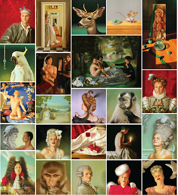
So yes, we should use his art to adorn the cover, but what painting could fit these beautifully "sad and lost" stories? The monkey wearing the pearl necklace? The drag Belle Époque self-portrait with the squirrels crawling all over his elaborate up-do?

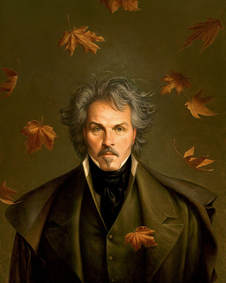
The one piece I thought of immediately was Autumn into Winter.


It's magnificently somber, quiet, introspective. Not only does the tone fit, but a detail from this piece accompanied one of his short stories, "From the Streetcar," when it was published previously in Nailed Magazine

But Stephen didn't really like this idea. It felt like too much him. I got that, so we sat down at his computer and went through his image files of his paintings together, looking for anything that might fit. Maybe a painting that featured a book or books in some way. Maybe a painting whose subject had some connection to the elements in his stories.

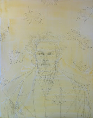
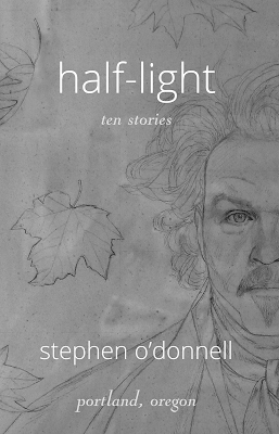
We were getting pretty discouraged when we discovered a folder that had Autumn into Winter, but not the completed painting: rather, a photographed work in progress. His pencil sketch with a wash of yellow paint on top, which is Stephen's first step in beginning the painting process.


Seeing that image was one of those moments. I looked at him and he looked at me, and we knew we had it. It gave us the mood we wanted but without Stephen's image being quite so up close and personal. There was also plenty of room to add text and not so much detail that that text would get lost. It was perfect. Well, near perfect.

I said at the start of this post that the design work for the cover was as much Stephen as me, and one way he really got involved was in putting his artist eye to our chosen artwork to make it perfect. He took the piece into Paint Shop Pro and adjusted the color, saturation, and tone until he had a few versions that he really liked. Then he passed them back to me to lay down the text.

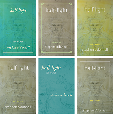
He wanted something simple and elegant for that. I made him some samples.


Once he chose the layout he liked best, we tinkered with the font color for the yellow in "ten stories," down to the most incremental adjustments in shade, until it was exactly what he wanted.


OK, in the end we did one print run and then went back to the drawing board to update the artwork color again. The original final was yellower, and Stephen decided, once he'd seen it in print, that he wanted something less bright. The above is our final-final. 

The Half-Light project gave me the chance to design not only the cover but the interior as well, and when you have your fingers in the whole of a book, design-wise, it can be a special thing. It lends a cohesion to the book and it lets you add extra details. It was fun to take the artwork and type treatment from the cover and apply it to our title page. 


Half-Light is out now. It can be found at Powell's Books, or ordered directly from Stephen through his website.

And psst. Now that the collection is finished and out in the world, Stephen is working on what he says he thinks might be a novel.

For a taste of Half-Light, here's an extract from his short story "The Leaves at the Top," which is set during the Depression.

Lying there in the shade of the tree, she laughed again thinking of that stupid boy who’d left her there. Figured he was pretty desperate to try and do that thing, the thing that boys have to do, that they have to prove, that he was picking up strangers off the road. In the two weeks she'd been on the road, most of the people who'd helped her out had been good enough folk, offering what they had. Which was pretty much nothing, all anyone had these days, anyone on the road. She stayed clear of the camps, afraid to rest, afraid to get slowed down by other people. She was mostly able to catch rides in the backs of trucks that somehow had room for one more, and she was glad enough to help watch out for the children she rode with, letting the mothers of babies get a little sleep. Everyone was so tired, seemed like the whole world was tired. 

There were men, too, men by themselves, who sometimes gave her rides. Men who gave her some money when they were done with her. One middle aged man, bald and pale, said he couldn't pay her after he'd said he would, after he'd done what she said he could. Said he'd lied about having it. She hauled off and bloodied his nose, before she grabbed her valise and slammed the car door behind her. He was so shocked, her standing at the side of the road cussing him up and down, that he just sat there, the motor running, blood running into his wide open mouth, before he slammed the car into gear and tore off.

Since she was eight years old—almost half her life—she had been learning what men were, what they wanted. And what they didn't care about. Who they never cared about. They didn't care, so neither did she. She wasn't afraid of men. And that's why she could laugh if off that way. Laugh that some boy would think that she would be too afraid, too dumb, that she would let him do it to her. Do it for nothing. That's why she could lie there after that. Lie there in the shade of a huge eucalyptus tree, in the warm of a fine California afternoon. She could breathe in the strange gray green smell of the tree, look up into the highest branches, the turning gray green leaves that disappeared into the color of the sky. And let herself think of nothing.