Sunday, July 9, 2017
Anatomy of a birthday card: July, 2017
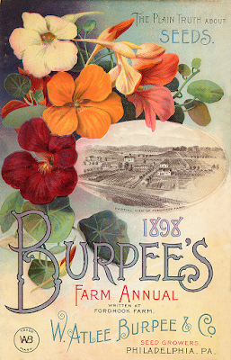
Sometimes when Stephen and I do birthday or anniversary cards for each other, we're able to take an image and simply change the faces out with our own or update in small ways. Sometimes one of us gets a bee in her bonnet and has to collage something together using more than one or two images. This year, I had an idea to have Stephen in a garden with a paintbrush, painting flowers into existence. When I googled to look at initial images of pretty women (because, you know) in gardens, I came upon all these old fabulous illustrations for seed packets and catalogues.
There wasn't a single that suited me best, so I created my card by cobbling together pieces of different illustrations.
For the outside...
...and...
And for the inset...
The backgrounds and flowers came from the first two illustrations (one of which, you'll notice, isn't a seed packet or catalogue but a farm annual) (incidentally from a company who shares names with Stephen's grandmother on his mother's side, the one who was a great influence on him, encouraging him to be an artist; it was one of her married names... she had a few... she led a very interesting life. Stephen wrote blog posts about Elizabeth Pennington Foster Matson Alberts Dahm Burpee here and here) (where was I?) (to get you up to speed, I started this sentence saying the backgrounds and flowers came from the first two illustrations...) and I cobbled together the wording from the wording on these as well. Then with the inset illustration, I had to expand the area of the peas and that took more cobbling. As did photoshopping out background lettering and details and expanding the space of the outside backgrounds. So, yeah, this card took a good long time.
The illustration for the inset, interestingly, is an ad for a stove company. But it worked great as a stand-in for one of those insets of impeccably-dressed ladies in the garden. I'll admit, I allowed Stephen's face to be probably a tad larger than it should have been. It was small enough as it was and, with making him a woman, I was losing clarity and recognizability when I reduced it, particularly for the printing of the card, and the primary goal is to create something that is Stephen.
The image I used for his face was an outtake from a Madeleine Prévert photo session:
We drove out to the Oregon Country Fair for his birthday yesterday, and had a picnic breakfast of sandwiches and cava in the parking lot as we waited for the fair to open, and he opened his card then.
He was surprised when I told him a little bit about the process and told me it looked like I'd just put his face on a single illustration, so whew, I knew I'd done what I'd set out to do. But if you want to see something really pretty, you should see Stephen's little flower garden along the side of the house, the first of much more gardening to come for our still new home.
Subscribe to:
Post Comments (Atom)


Aw, this is all so sweet! Very well done - but I must scold you again for taking so much time with these things; you have a novel to finish, my love! xoxoxox
ReplyDelete