Saturday, August 19, 2023

Book Cover: The Queen of Steeplechase Park

This is one I've been obsessed with.

I guess I get obsessed with every project, but with The Queen of Steeplechase Park, I've been even more obsessed. I've known the book and loved the book for a long time. Author David Ciminello brought it in various iterations to two different writing groups I've been in. This book that is a love letter to New York, to early twentieth century nostalgia, to Italian cooking, to his beloved great aunt Amelia P. Aguiar (after whom the protagonist Bella is based) is lushly written and over-the-top in the most wonderful way. Here's the publisher description:

The Queen of Steeplechase Park is the absolutely, positively, practically, almost-true story of infamous burlesque queen and magic meatball maker Belladonna Marie Donato. Pregnant at fifteen after gleefully losing her virginity to pansexual neighborhood strongman Francis Anthony Mozzarelli, she is robbed of her baby by a pack of nefarious nuns and her embittered papa has her sterilized without her consent (legal in 1935). With the help of a besotted Francis and her top-secret meatball recipe, a devastated Bella embarks on a riotous quest through Depression-era Coney Island sideshows, the tawdry world of peek-a-boo striptease routines, a queer mob marriage, and a tasty collection of wisdom-filled recipes to find her lost child, herself, and maybe even true love. It all leads Bella back home, to the scene of her Original Sin, where she boldly faces matters of life and death, questions of forgiveness, and a holy mess only the healing properties of great Italian cooking can fix.

When David's submission showed up in the queue for Forest Avenue Press's January-February open submission call, I got very excited. Before the book was even chosen, I had a picture in my head of what I would do if I got to make the cover.

It would begin with Bella, of course, front and center and big as life. Smiling confidently and dressed as a beauty queen.

I pictured the trappings of Coney Island around her: the Ferris wheel, the parachute jump, maybe a roller coaster or the steeplechase ride itself. 


And just as importantly, there would have to be food. From the book:

When Bella wasn’t dancing and stripping, she was cooking. The stove in the Neptune Avenue kitchen was never without a simmering pot of her tomato gravy.

Her lasagna Bolognese made Lolly scream.

Her lobster and crab ravioli made Oui Oui kiss her feet.

Her fettuccini carbonara made Minnie leap.

Her homemade peanut brittle made Peanut trumpet into the trees.

Her cacio e pepe brought Chester to his naked knees.

Her spaghetti and meatballs made the entire house sing, “We love you, Belladonna Marie!”

I pictured the ingredients of Italian cooking all around her: huge, sumptuous tomatoes, cloves of garlic, basil leaves. Maybe she'd be rising up out of a pile of these grand ingredients, or maybe they'd make a frame around her... or no, maybe not a frame. Bella is too full of life, I thought, to be contained within a frame.

Oh, this cover for a book we hadn't even accepted yet: I could almost taste it!

Another reason I craved this project is that it's a period novel and I'd get to play with the time period. I wanted to give it the look of an old movie poster or one of those wonderful vintage food advertising prints. The texture of the paper, the rich shading.


David had ideas, too, and I was excited that his thoughts lined up so well with mine. He was sending Laura images of some of those same vintage ads and others, pictures of tomatoes. One thing he wanted was to use a picture of the actual Bella.


Look at her there, strutting her stuff on the beach! Unfortunately the resolution/quality of the photo wasn't good enough for print. But I resolved to create my Bella to reflect the vitality, the boldness, the sparkle and fire of the Bella David had created for his book.

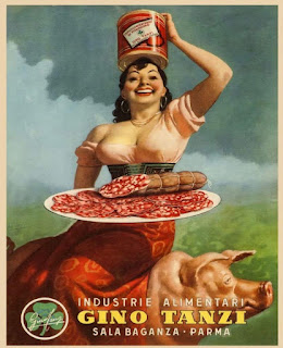
I particularly liked this Italian food poster he had sent in. Her open and strong, joyful expression, her head thrown back, her sexy but not rail-thin figure. I decided to use her as one of the models for my Bella. 


To scope out a set of legs and a hand-on-the-hip pose, I looked through vintage pictures of beauty queens until I found this photo of Bettie Page. She was in a similar position to the actual Bella in David's picture, but it gave me more detail to work off of, including shoes.


In early summer, I lost a close friend, and then almost immediately all three of us, Laura, David, and I, lost another, Robert Hill, who was a Portland writer and one of Forest Avenue Press's authors. During that very sad time, I was immersing myself in work on David's cover, and on building my Bella, specifically. Laura was working on Soul Jar, our upcoming anthology. Somewhere in the middle of things, Laura and I had this text conversation:

Laura: I’m okay. Looking forward to the work I guess. Just to pour energy into something. This weekend I was happiest when working on the garden. (Or not even happy, but not feeling dull inside and quite as lost as the rest of the hours.)

Me: I understand that. And we have to be able to be happy, too, when the garden makes us happy. 

Then both of us at the same time:
Me: Building Bella is making me happy 
Laura: Totally. I love that you are working on David’s cover. 

Laura: JINX!

Here's the first version of Bella, which I built in Illustrator out of various overlapping shapes. She definitely wasn't a beauty queen yet. But wait. She got better. That early in the game, she was very simple layers filled with flat color which would approximate the areas of future shading. I based her pretty closely on my source material, knowing that closeness would change the longer along I got in my process.

Along with Bella, I built a bowl for spaghetti, and you can see that I used the scalloped design I was seeing in those Italian food ads.

I liked the idea that Bella would be impossibly holding up this heavy bowl of pasta with her fingertips like her joy for food gave her superhuman strength.

I started to put together a simplified version of the Steeplechase Park Ferris wheel.


And a classic roller coaster.


And Steeplechase Park's iconic parachute jump.


I found pictures and pictures of beautiful vegetables and built tomatoes, basil, garlic, red onions. Alright basil isn't a vegetable.


Maybe there could be a ribbon wrapping around Bella—like a beauty queen's sash but also maybe like a banner advertising the best show on the boardwalk. Ooh, and maybe that's where the title and author text could go.


I popped in some chunky text using a stand-in font, but including the star detail that I found in this great poster for the 1943 film Coney Island. 

Then once I had my elements, I started to arrange and refine. I played around with color. Added some silhouettes behind my spread of Italian ingredients. Bella had an empty bowl for a while but then I finally added spaghetti and meatballs.


At this late moment in the process, I decided to double-check the history of my landmarks, annnnd... the parachute jump did not arrive in Steeplechase Park until after the book's finish. Oops.

So bye-bye, parachute ride. I did some more refining, added a burst of rays shooting up behind Bella, tried a night view with fireworks. I'd already been working so long on this project, as well as some others, and we were starting to come close to deadline. When Laura checked in with a nudge, I sent her a few samples of where I was.


We knew we weren't going to make that deadline, but we both wanted to get a cover that would best sell the book and would make David happy. He was happy with the early samples and had some requests, mostly around Bella, who he wanted to see be "much more voluptuous—bodacious. Big breasts and ample hips (think Adele before the ridiculous slim down, Claudia Cardinale at her most voluptuous)."

He sent more pictures of the real Bella, and examples of hair and shoes he imagined she'd wear.  Open-toed shoes with toenail polish. He asked, could we have more spaghetti and meatballs in the bowl, could I get rid of the red onion nestled in with the vegetables at the bottom. As I refined further and sent more samples, he asked about an even bigger bust, even higher hair, even more spaghetti. "(can it touch the top of the book or even bleed off the cover?)" I like this close-up screenshot on my file in Illustrator, showing the names I'd given to the various layers I was adding in response to his feedback. More Bella. More spaghetti. More hair. 


It feels fitting, as The Queen of Steeplechase Park is all about more. All about, as David wrote to Laura, "abundance—even excess."

Another detail he asked about was maybe a halo of stars around her head "like a Saint or Mary" to reference the often-irreverent religious aspect of the book. Laura thought this would probably be too busy with all the detail already in the cover, but she wrote to me suddenly with an epiphany based on that request:

"The daylight cover, I love, for the colors and summery feeling and the softness, but what if the stripes around her continue behind her legs? Like her belly would be the center of the stripes, they'd encircle her? That might be enough of a religious aspect without the stars (or with them). You could leave the tomato colorful outlines but the stripes would go where the tents are."

I loved what moving the burst of rays to center on her belly did to the design. Whether or not it got to the religious aspect of the book, it just made the whole thing better, more dynamic. I added a shine of yellow-almost-white, like a glow, also, close in around her. More samples:


This old blog. Examples never drop in with their original sharpness, but hopefully you can get an idea of things from what you can see.

We honed in on the design with the purple sash and bowl, and I started the shading/texturing process.

There's probably some quick way, or semi-quick way, to create a texture like a vintage poster, but I don't know what it is. I didn't want to just add a grain effect or something. And yes, my process was probably more painstaking than other designers would bother taking on. But it's the way my brain works, and I wanted the texture to look really real. I found this print on Wikimedia Commons. I don't know how much of the texture you can see from this image, but it's there.


And from that, I created my own blank textured paper that I then made copies of in various of the colors from my design.


Then I married each shape from my design with that colored paper by making what's called a clipping mask of each shape. Here are some of the layers of one bunch of basil.


I took those pieces into Photoshop, layered them on top of each other, and created the shine and shading by erasing away what I didn't want from each layer.


Again, the reproduction in this blog is a little fuzzy, but you get the idea. It's sort of like painting but backwards. Or inside-out. It took a while, but it's what got me from this:


to this:


Now as for Bella, I had sort of Frankensteined her together, so I wanted to make completely certain that I had everything in the right place. Luckily, I live with a fine artist who specializes in, among other things, the human form. I printed Bella out and asked Stephen to have a look. He discussed it with me and even gave me some pencil guides, which I took back to my desk for more refining.


Some of the steps in Bella's metamorphosis.


After a little more tinkering here and there, some flag garlands to add a little something more to the background, and a great blurb excerpt from author Blair Fell, we finally had a cover that we all liked, and which I hope would make Bella proud.


The Queen of Steeplechase Park will be out in May of 2024. More info is on the Forest Avenue Press website here. 

I think this excerpt, which is the opening to the novel, will give you the perfect taste:

Had William Randolph Hearst known about her he would have inked her onto the front pages of his newspapers directly above the banner headlines barking about the war crawling across Europe. Walter Winchell would have broadcast about her on This Is Your World! They would have told you how beautiful she was. How men dropped in front of her and howled. How Einstein created a new theory and how Freud folded his cards after she lit one of his cigars. Hollywood could have made her a great big star. She would have taken Bette Davis and wrung that bug-eyed hambone dry. King Kong would have let go of Fay Wray, dropped that dizzy dame those one hundred and two Empire State stories, just so he could hold her in his gargantuan hand. Glenn Miller would’ve raised his baton and crooned, “Come on, baby! Front my band! You can swing! I know you can!” Pity was never a song she chose to sing. Her anthems were always “Shoo Shoo Boogie Boo” and “All of Me!” When she Coney Island cooch-danced, air-raid sirens rang, Lucky Strikes lit themselves, and palm trees sprouted out of Coney Island’s sand. After her Cooking Spirit swooped in, meatballs were never the same. Everyone wanted to taste her tomatoes and dip their bread in her Sunday gravy. Had he met her, David O. Selznick would have ceased his search for his silly Scarlett O’Hara and cast her in a Technicolor epic all her own. Fiddle dee dee! Frankly my dears, there was no one like her!

Friday, August 11, 2023

Book Cover: Moss-Covered Claws

Recently, I was excited to be asked to create a new cover for the short story collection Moss-Covered Claws by Jonah Barnett. The book, published by Blue Cactus Press, came out two years ago, and I loved it and blurbed it. When the second printing got low and Blue Cactus started prepping for a third, they decided that it would be fun to give it a whole new edition with new content inside and a cover refresh. Publisher Christina Vega contacted Laura Stanfill, publisher of Forest Avenue Press, to be a consultant on the project, and Laura has been acting as a go-between, tossing out ideas and helping me refine my work.

The main element of the original cover is a painting by Sam Breaux. Look at that cool minotaur! For the redo we wanted to keep that art and build around it. 

(If you look close, you may notice that the author's name is one letter off from the name on the cover of the book. Originally their name was Jonah Barrett. But after being recently married, Jonah and their partner decided to combine their two last names into something new—and the best combination turned out to be only one letter different. I love that this new edition of the book also serves as a bit of a celebration of that new name.)

I met on Zoom with Laura, Chris, and Jonah to discuss the book and throw out ideas. Then Laura emailed with a comprehensive rundown of her thoughts. Right away, she had super fun ideas about new approaches. 

"I wondered if you could create some kind of layer effect around the monster that would give it more dimension," she suggested. "Maybe even looking like the monster is being torn out of the background of the painting or separated from it somehow."

She also said: "You are so awesome at frames and borders. I’m not sure if a border would work with this illustration as-is, but I could also see shrinking the art and putting a border around it, or making it look like we’re viewing it through a telescope or cave or something—distorting the space on the outside."

Jonah forwarded a great collection of imagery to use for fodder as well, including some fonts they liked and an array of vintage book covers. Thinking on Laura's ideas and Jonah's fodder, I started picturing the cover of Moss-Covered Claws as a storybook gone rogue, where at first it looks like a sweet old-time fairytale book—but the monster in the forest is ripping its way out and into your world.

I started simple, with the paper of the illustration tearing to reveal the title text behind, the minotaur popping out of that confined frame. I knew I'd need to do some toning to the original artwork, but I figured I'd wait until we had a colorway decided for the cover before I did any tinkering. I would also eventually want to add some shadow behind my emerging minotaur. (And I would also-also eventually notice and fix the typo that sneaked into (or more specifically out of) the terrific blurb by the equally terrific Sequoia Nagamatsu, a writer I was fangirling all over the whole time I was working on this cover, I can't lie.)


But with Laura's suggestion of working with borders, and Jonah's examples of vintage book covers, I started to get a little more fancy as I went along. Jonah liked fonts with a swoop in them, so along with my chunky, modern-looking original font, I folded in a more classic font that I could get fancy with, for the text that lived within the bounds of what I was thinking of as my storybook portion.

(You might notice some dropouts at the very bottom of the painting in a couple of these samples. That's where the painting ends, and I knew I may have to photoshop a little more in to make the layout I wanted work—but I'd cross that bridge when I came to it.)

There was back and forth with Laura and I came back to her with more samples. This time I dispensed with the paper tear, playing, instead, with the idea that the minotaur is busting through the border, itself.


Getting more elaborate with the border and futzing with the title, even, in this last sample, cracking it up a little.


As sometimes happens when you get more and more elaborate with your tinkering, Jonah, when we shared samples with them, preferred the most simple. The no-border approach with the paper tear at the top and bottom. They had some suggestions for tweaking, including updating the title color because "I don't like yellow. Maybe it's because I hate sunshine, who knows." Haha! But they also had a new suggestion: "What if the cover took on more of a Jules Verne vibe? Think old dark green covers with nice gold type, and a bookplate-ish illustration (there's probably a better word for this) based on the minotaur painting."

Here's the example of Jules Verne they forwarded along.


And here's one of my own that I had saved because I love, and have a file of, those wonderful vintage book covers.


I got really excited about the prospect of going full-on Jules Verne with this book cover. Sometimes I muse on the question, what are the dream projects. The ones that give me the most joy. And again and again I think it's those projects where I get to go all in on a theme—and particularly where I get to have the book cover be something more than a book cover. Like how the cover to City of Weird got to also be an old pulp magazine cover. And the cover to Queen of Spades got to also be a playing card. In a way, it's like being a set designer for the movies. How immensely fun would it be to get to create a set that's New York City in 1955 or Amarna in 1346 BCE? To try to be absolutely meticulous in creating something genuine. I like book covers that allow me to do that: recreate and emulate. 

So yes, I got very excited at the prospect of emulating, of recreating one of those fabulous ornate Victorian-era book covers.

I've done something like that before, with Froelick's Ladder. That one was such fun. But it was a modern take, and for Moss-Covered Claws, I would let the design stay in and of its time.

So, I did have plans to work on Jonah's tweaks to the paper-tear cover, but first I couldn't help myself. I started playing with a Victorian-era design.

I started by building a decorative frame for the painting. Designing a piece...


Duplicating and rotating it.


Adding another detail to duplicate and rotate, duplicate and rotate.


When I had a frame, I started to build banners to place my text inside.


And then I spent an inordinate amount of time creating what I thought would be the best scrollwork to fit the space.


There were other steps, of course. Finding fonts I liked and working the text in. Fiddling with the color of the minotaur painting until I liked the tone and contrast and vibrancy. Adding all the tiny details. But most important was going back to Laura's original idea of the minotaur breaking out of the background. When I shared this direction, it was obvious that I wasn't going to go back to the paper-tear concept. We had our cover.


As an addendum, with a design like this one, and a nice, thick spine width, you can even get fancy with the spine.

I love those old ornate, gilt-stamped book spines, and because Jonah had enough pages in their book, it gave us room to create horizontal decorations to break up the space.

I used some of the elements of decoration from the cover to create the elements for the spine, and it was fun to fake-gilt-stamp the logo of Blue Cactus Press at the bottom.

The new edition of Moss-Covered Claws will be releasing soon. More info is here.

Here's an excerpt!

I walk to the edge and look down into the dark abyss. At this time of day—the very beginning—the sunlight hits the water just right, and you can see down to the peat floor in honey golden rays. I peer into the water. It’s filled with shapes—shapes that are familiar and yet so remote. There are people down there, so many people, just lying at the bottom as if in slumber.

Tuesday, July 11, 2023

a moment in the day: drop-off

Early morning, outside with Nicholas, the air chilled and full of the sound of crows. I'm sitting in a chair while Nicholas wanders and sniffs. Pull out my phone and am looking at the weather app.

Through the shatter of crow sound, suddenly, just above me is a thud at the edge of the roof, and now something drops, fast, past my head, and lands on the concrete just an inch or two away from Nicholas. 

He sniffs at it. I look up: edge of the roof and sky above.

A crow swoops out from somewhere above the roof, passes above me, and lands on the edge of the roof of the studio a few feet away. 

Did a crow just try to drop a pinecone on my dog?

Now more crows are trading places across the yard: the roof, the arbor, the fence post. I pick up the pinecone and set it on the table. I figure we might as well head inside, and as I gather Nicholas up and turn toward the door, the crows are already dropping one by one onto the grass. I go in, close the door, and head up the steps, then stop and look out the window as the mirthful murder, all cackle and flutter, close in around and dive into our small offering of last night's chunk of leftover birthday cake from my dessert plate, devour it in moments, and are gone.

Tuesday, July 4, 2023

a moment in the day: another

Morning, the radio on, me sitting at the computer with fingers tapping, half-listening.

The NPR reporter says, “We’ve got another shooting. This time in Fort Worth, Texas.”

My first reaction is the expected sadness, but then I find myself struck by how he said it. There’s the inevitability conveyed, the resignation in his voice. He only lets a touch of emotion into his words, but it’s enough to show how he feels.

But really, it’s the very opening of the statement that stays with me. Those first two words.

We’ve got.

We, America. Got, have, own. We own this. 

Sunday, July 2, 2023

Book Cover: Chicano Frankenstein

Had I not been handed a few specific directions at the start of the project, I might have done exactly what the author didn't want. After all, when you're presented with a book that's based on Frankenstein, your mind immediately goes to that classic image of the monster. Also I am a certified monster-story fanatic (see: City of Weird), particularly vintage monster stories, so I can see myself going all Groovy-Goolies-slash-Boris-Karloff on my cover design, if left to my own devices. Alright, maybe not Groovy Goolies.

But for the cover of Chicano Frankenstein, author Daniel A. Olivas had two specific wishes, which publisher Laura Stanfill liked and sent my way. First, he wanted to avoid any stitched-together bodies or body parts. So no imagery directly referencing a Frankenstein-monster type of character.

If you're wondering whether there are in fact any Frankenstein-monster types of characters in the book, here's the publisher description:

An unnamed paralegal, brought back to life through a controversial process, maneuvers through a near-future world that both needs and resents him. As the United States president spouts anti-reanimation rhetoric and giant pharmaceutical companies rake in profits, the man falls in love with lawyer Faustina Godínez. His world expands as he meets her network of family and friends, setting him on a course to discover his first-life history, which the reanimation process erased. With elements of science fiction, horror, political satire and romance, Chicano Frankenstein confronts our nation’s bigotries and the question of what it truly means to be human.

(Doesn't that sound so cool?)

Daniel's second wish was that I use the iconography of Día de los Muertos in my cover design. Specifically the skeletons and the lovely, decorative skulls.


I was excited to work with this beautiful and thought-provoking imagery, but I wouldn't have explored using iconography with roots in Mexican culture, a culture that isn't mine, if it hadn’t been Daniel's wish. I may have done so, say, ten years ago, but I understand so much more, now, how people are the gatekeepers of their own culture. Only because it was Daniel's suggestion did I, and Laura, feel comfortable referencing it, and what I created would have to get his approval if we were to use it.

One idea Daniel had was to reference the old Hitchcock Vertigo movie posters with the swirling vortex and the body falling down and down. 


And one idea I had was to build the title and author name out of bones. Including skulls for the Os in Chicano and in Daniel's last name.

The first thing I did when getting started was to throw down the title in the 6" x 9" space I had for a cover, to see the room it might take up on the page. I was concerned about how long the word Frankenstein is. The longer the word, the smaller the font has to be. I tried slanting it.


I tried breaking it.


That was interesting. I wondered whether Laura would be okay with broken words. Would she worry that it would make the title hard to easily and quickly read? I liked the idea of really filling the space up with words made of bones, and the three-piece version left nice space open for the author name and blurb. I decided to give it a try.

I liked Daniel's Vertigo idea, too, so I decided to try the vortex as a background for my very text-heavy concept. I built a vortex and some bones.


I built a couple of skulls. I wanted to keep them simple and similar since they would be smallish details in a larger text scheme.


Working in multiple layers, I arranged the bones into (on top of) the shapes of the words.


When I had the layout of text as I wanted it, I popped in the skulls for the Os, and then added some flowers, referencing the flowers in the skulls, as extra ornamentation, particularly so that I could get some more color into the design. Added the requisite placeholder blurb and "a novel," and...


The biggest tinkering I did with this concept was with the skull Os. Did they want to be the detailed skulls I had made, or did they want to be something simpler? Again I worried about readability. I tried simplifying them using the actual Os of the original font with added skull detail/decoration.


Hmm. 

For a moment I tried to tell myself their shape referenced Frankenstein with that classic squared-off head, but no. They just looked like Tic Tacs. I tried with a more rounded O and simplified the design further, thinking if the faces blended into the background, they might look more like Os.


But they looked like decorated eggs.

I resolved to send all three, plus a version with no skulls as Os at all, to Laura and see what she thought. Then I moved on to Daniel's Vertigo idea. 

This time I built a whole skeleton and positioned it falling down through the vortex. I thought it might look cool if the lettering also followed the shape of the vortex, so I used a simple Adobe Illustrator effect to get my title and author name, still in bone form, to twist. I arranged them around the fulcrum of the falling skeleton man and then I started to refine the letters so that they wouldn't look so warped by the effect I'd used on them. Knowing it would take a lot of refining to get the lettering to look as I wanted it to look, I only worked so long before sending samples to get Laura's opinion on the concept. If she liked the concept, and then if Daniel liked it, I'd refine it further.


I wish I remembered the thought I had that made me pivot to a third concept. I know I was experimenting with what might look good if I left the lettering un-broken and un-warped. If it just sat straight across on the page. Something made me take the skull and blow it up and fill the whole space with it to see where things would fall. Where they fell was great and I got excited. I could position the title and author name so that the eyes and the skeleton teeth peeked out between the words, and it was an arresting image. Then I arranged a handful of flowers at the edges to bring in some color and some balance (dark/light, death/life).


And one last impulse before I sent it all off for Laura to look at. After all the monkeying about with bones, what if the text were simple and clean?


I was very pleased that Laura didn't have any readability issues with the skull-face Os or the broken Frankenstein. In fact, she said, "I also love FRANKEN STEIN split onto two levels because he’s made up of two different bodies. It gets to the stitched-together theme in such a cool way."

I always love how conceptual Laura gets with her thoughts on cover art. It was a connection I hadn't made, and I loved that she had found it.

She was drawn to the covers with more color and asked if I could try bringing more color into both the big-skull cover and, in particular, the Vertigo cover, which had very little ("The tiny skeleton face makes me really happy because of its colors," she said.). For the big skull cover, we experimented with different numbers and arrangements of flowers.


Laura suggested adding another color to the vortex in the Vertigo cover, and I was surprised and pleased with how well that worked. I was able to add the color and line things up nicely so that it didn't obscure the lettering and kept everything in balance.


And the three added flowers not only added to the color but also to the sense of the twirl. 

Another thing Daniel envisioned: bones breaking or falling off the body. So I added that detail too.

Laura pulled together a sampling of favorites and sent them to Daniel for his thoughts. He chose his favorite, and we had our cover. In his back and forth with Laura, he sent her this cute comment:

"I am so happy with my new baby's outfit."

I am so happy too. In the end, the simpler concept won out. And we may just sneak some of that vortex design onto the back cover.


Chicano Frankenstein will be out March 5, 2024. More information is here. More info on Daniel and his other books, including How to Date a Flying Mexican, is here. The photo I used in this post of Día de los Muertos painted skulls was taken by Nikola Tinková and shared from Pixabay.

Here's an excerpt from the book!

The man closed his apartment door and entered the cool evening. He stretched his legs and twirled his arms in three clockwise circles. The man took a deep breath, put on his hoodie, and then started on his nightly run. He turned left on Hurlbut Street toward Pasadena Avenue and then turned left again. The man let his legs stretch out in long strides as his muscles slowly warmed up. Running cleared his mind, made him feel whole. This night, his arms and legs moved as they should, as part of one machine that was created to function without a hitch, in perfect rhythm. This was not always the case, but tonight, the man felt the kind of balance that calmed a desperate small voice in his head. His breathing grew heavy as his legs moved faster and faster in the cool evening. The man’s mind was free and clear as he ran and ran and ran.