Saturday, July 9, 2022
A dozen random things about my aunt Kathy
Saturday, July 2, 2022
Book cover: Plums for Months
As a neurodivergent child in a hundred-year-old house, Zaji Cox collects grammar books, second-hand toys, and sightings of feral cats. She dances and cartwheels through self-discovery and doubt, guided by her big sister and their devoted single mother. Through short essays that evoke the abundant imagination of childhood, Plums for Months explores the challenges of growing up mixed race and low-income on the outskirts of Portland, Oregon.
"The abundance in it, the single mom raising two girls in a house with fruit right outside the door, the sweetness of your relationships, how this book is not full of trauma, but of wonder. How you receive and receive from the outdoors at the Gresham House, how it never gets old or boring to you—you keep finding joy in nature. Even the hard things in your book come with wonder and surprise, not fury or anger. I also love that evocation of senses—purples and sweetness..."
Some nights, the three listen to the wind howl, the house creak, or the rain and wet tree branches thrum against the house, and continue to adjust to the new nature. They huddle closer in the living room, closer to their popcorn and movie and each other, and let the outside music play in the background.
Sunday, April 24, 2022
In the bathroom with Barbra Streisand
I've been looking through my old kid diaries trying to find passages about my aunt Kathy to share. But I came across this, which seemed appropriate for Barbra Streisand's 80th birthday. Kathy features a little, but mostly this is my cousin Heather and me and our brush with Streisand.
From my diary, with all spelling and punctuation errors intact. June 7, 1984.
*
Well, last night was the N.O.W dinner with Barbara Streisand. First, mom & I rode down to Heather's house with our clothes and everything. We got dressed & made our selves beautiful. (I went & got a dress at the mall with mom) at Heather's. A long, blue limosine picked us up and we started for the place. There were 4 seats in the back, 2 facing each other and the other 2 facing each other. We drank virgin Marys from the limo while Mom & Kathy drank champagne. It was raining. People would watch to see if we were anybody famous. We walked in after leaving instructions with our shofer (however the hell you spell it), Rob. The place was packed. I had a ginger ale & we found our seats. Dinner wasn't very great. We had dry chicken breasts with the bones still inside and some rice. Heather & I got served white wine with it. Then Heather & I decided to walk to the bathroom. In the bathroom, Heather was waiting on a stall and out came Barbara Streisand. I brushed her arm slightly as she rushed past & Heather sat on the same toilet.
Saturday, April 2, 2022
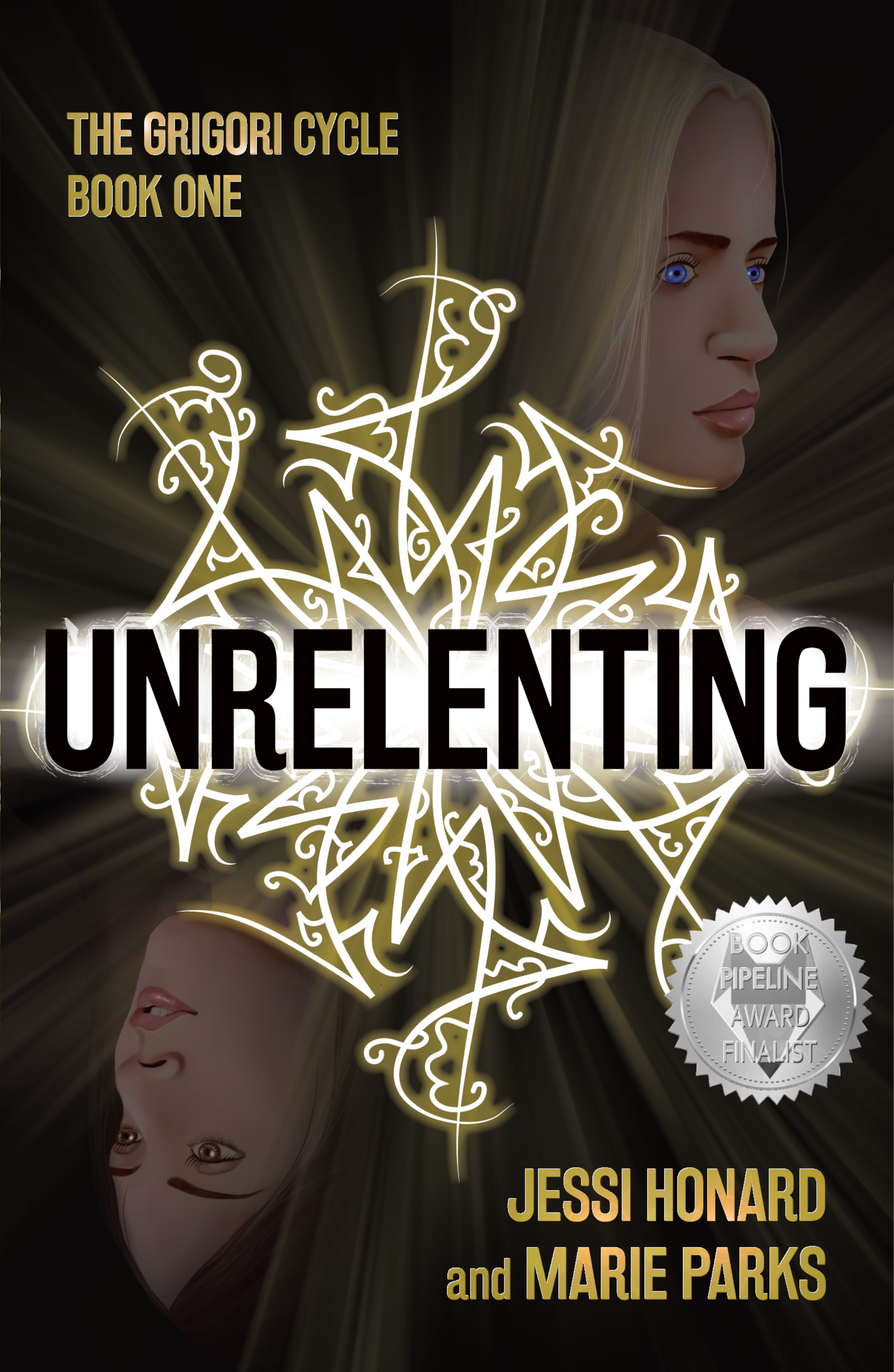
Book Cover: Unrelenting
One of the reasons I love design work is that there’s always a challenge. Fitting the elements together, the colors, the fonts, it’s always a puzzle, and I love the puzzle of it.
The challenge in Unrelenting, a novel due out April 19 from Not a Pipe Publishing, was that I offered to produce a painted illustration as part of the cover design.
Now, I'll say it's not that I've never stepped back from the computer to create art for a cover before. I had, not too long before, done the cover art for Caitlin Vance’s Paper Garden by hand-painting the faces and tulips for that illustration, and it had turned out nicely. But the style of art that authors Jessi Honard and Marie Parks wanted for Unrelenting was much more finely detailed. In fact, in sending me examples of the type of illustration they like, they referenced my cover for The Untold Gaze, the book I co-produced with my husband who’s an actual fine artist.And yeah. Sadly, I’m no Stephen O’Donnell.
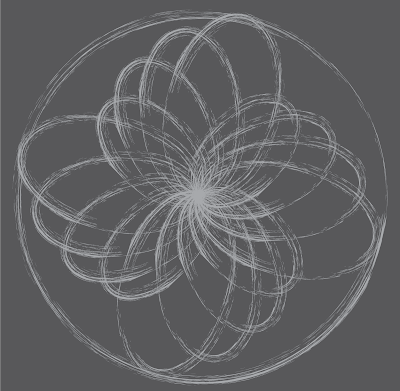
But I’m getting ahead of myself. Before I even started working on the painting of the book’s most important characters, Bridget and Dahlia, I created the main element of the cover design, the Grigori symbol.
Briefly, the book is about Bridget, a young woman who, in searching for her missing sister Dahlia, discovers, as the publisher describes it, “a carefully-guarded plot tied to powerful, age-old magic.” The magical dark forces in the story are called the Grigori, and their calling cards are symbols that are found in various places throughout the novel—on walls as graffiti, even on people’s skin. Here's a description from early on in the book:
An intricate array of black strokes covered the worn cinder blocks. The artist had taken care to ensure the geometric pattern was precise, creating an expanding knot of swoops.
And further down:
“It’s cool,” he remarked, stepping forward to get a closer look. “Kinda reminds me of fractal art.”
My early experimenting to create one of these symbols relied heavily on the combination of graffiti and fractal art and the description of the symbol as "an expanding knot of swoops."
But then Jessi sent me an extra explanation that really clarified the idea behind these symbols:
They are a precise written language that is so complex that people train for decades to interpret and create them. Each symbol essentially creates a 'contract' (our magic system is based on signing contracts via these symbols). There are several different types of symbols, but each individual one is unique. Some create new Grigori, some impact physical objects, and others put conditions on people. The different swirls, lines, and shapes within the symbol create these stipulations, show the signature of the signer, and give it its power.
The thing that struck me the most in this description was the idea that the symbol was a complex written language. That allowed me to think beyond the concept of pattern to something more intricate.
Once we had a symbol we all liked (Jessi, Marie, publisher Benjamin Gorman, and editor Viveca Shearin), I moved on to the sisters.
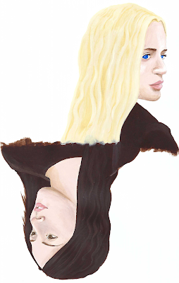
The authors sent me stock photos representing how they pictured Bridget and Dahlia looking. I found two that worked well as mirror images of each other, that felt right for the layout I wanted, and I started by sketching them out on paper. Then I moved to acrylic paints. My plan, knowing my art and design skillset, was to start the art as a painting and then bring it into Photoshop to refine it.
Annoyingly, when I had a painting that I was happy with, I found it difficult to reproduce digitally. Subtlety and softness disappeared in the scans I took, and brushstrokes came through chunky and less-than-elegant.
And finally, here are both Bridget and Dahlia and the completed cover sporting a spiffy award badge from the book earning a finalist nod for the Book Pipeline award.
*
Bridget hit play. Again.
A dark alleyway appeared on her phone’s screen, its rough brick walls gleaming as a fine rain fell. A puddle reflected the single light that flickered above a worn metal door. It was the kind of scene that would kick off an old noir film.
In the fourth second of the clip, a woman stepped into the alleyway from the quiet street beyond. Her face remained in shadow, a hood covering her hair. She cast her gaze over her shoulder once before wrenching open the heavy door and stepping through. Dim, hazy light shone from the window, then faded. The video ended.
Dahlia. There was no doubt in Bridget's mind. Yes, the scene was dark and misty. No, the camera never clearly captured her face. But she would recognize that walk, that glance, that posture anywhere.
It was her. It had to be her.
As Bridget watched, she found herself repeating a familiar refrain. It isn’t your fault. The words felt flatter each time. For the rest of her life, she’d never shake the angry, abrupt end to their last call. And all over a guy Bridget knew was bad news. Their fight had carved out a hollow place within her.
At first, the reigning theory was that Dahlia and her boyfriend, Dan, had run off together. But Dahlia wouldn’t do anything so extreme without confiding in her sister, even after a blowout. She refused to give up hope. Even after Dan’s car was found, Bridget knew her sister wasn’t gone. She would’ve known if Dahlia was dead.
And now she had proof. The video’s metadata told her the recording happened two months after Dahlia’s disappearance. It hadn’t arrived in her inbox until a couple of weeks ago, with the file attached. The first time she'd played those ten seconds, alone in her bedroom in North Carolina, it was a moment of vindication. Finally, she had confirmation her sister was still out there. Since then, she must have watched the clip a hundred times, relief giving way to frustration as Ivanova dismissed her.
She returned to her inbox, staring at her messages. She'd planned to send a follow-up to their meeting, but given the way Ivanova treated her, she doubted she’d get a response. The detective had made herself clear. Bridget should have known better than to trust the police.
But she had made herself clear, too. She wasn’t giving up on this lead. She needed to find out what had happened to Dahlia.
With a steadying breath, Bridget returned to the email chain containing the video. It was a long back-and-forth by now, after two weeks of correspondence. The sender, a classmate of Dahlia’s, had provided a spark of hope when everyone else had given up. Maybe he could help.
James, she wrote, I made it to Cleveland. Any chance we could talk in person tomorrow?
Bridget felt a small surge of satisfaction as she hit send and turned off the screen. She refused to keep waiting for news that never came. At least she had a plan. A loose, unformed plan, but it was better than nothing.
As she settled among the blankets, she hoped it would be enough.
Monday, March 28, 2022
a moment in the day: just to say
I come up the stairs with a cold glass of water to offer to my dog because he was just lapping at the very bottom of his. He's up on the futon bed, now, curled up comfy, so instead of pouring it into his dish, I take the glass and sit down next to him. Take a drink to show him how much he'll enjoy it. Reach the glass down to his level.
Nicholas looks at the glass and then at me. He's not interested.
I drink again, offer it again. He looks at the glass.
"Drink this," I tell him. "It's so good. So cold. Like a plum from the fridge or whatever. Don't you get poetry?"
Nicholas is unimpressed.
Sunday, February 20, 2022
Book Cover: Please Be Advised
Grace Paley Prize for Short Fiction winner Christine Sneed's Please Be Advised, pitched in the vein of Dear Committee Members, a humorous novel in corporate memoranda chronicling the implosion of a “miniature office products” company through the work lives, extracurricular relationships, and dubious business strategies of its employees.
And here's something Christine mentioned in an email to me, that I think is an even better, deeper description of what this book is all about: "...my overall goal was to write a book that expressed the absurdity and accidental sadness of office culture, i.e. how nuts it is that many of us are forced to spend most of our waking hours doing jobs we don't like alongside people who, in most cases, we don't like much either."
When we first started working on the concepting for the cover, Christine shared some of these memo pieces with me, and they're witty and clever and hilarious.
Christine suggested that the cover, like the book itself, be constructed of memos, and of course this was perfect. In my head it was one memo for the title and one for the author name, arranged askew and with some office detritus scattered around. I pictured the cover as an organized mess, reflecting the "implosion" of the office world Christine had created.
And maybe there could be some particular object sitting on the main (title) memo. "A coffee cup," I tossed out to Christine and to editor Kurt Baumeister, "a bunch of crumpled paper, one or more of those miniature office products mentioned in Publishers Marketplace... Is there some funny element that could be hanging out on top of the memo? Spilled coffee?"
When Christine wrote back to say she liked the way I was thinking, she shared one of the specific memos from the book, and it was all about spilled coffee, and it was so good that I went all in for the coffee spill concept.
I started by arranging some pieces of paper and my husband's overturned coffee cup on the cutting board in my kitchen and taking pictures of it. Then I got on illustrator and recreated the pages and the coffee cup. See, this is how simplistically my design work starts. ------->
INTEROFFICE MEMORANDUM
Date: September 12
To: All Quest Industries Employees
From: Ted Kluck, Junior Partner, Gounes and Flinderman LLC
Subj: New Doughnut Policy
This memorandum serves as your formal notice that forthwith and without exception, all doughnuts that appear in Quest Industries’ communal spaces must be shared with everyone. Quest doughnuts may not be thrown into the trash due to someone’s punitive relationship with food, hoarded at anyone’s desk, or resold on the neighboring streets to children and dimwitted tourists.
This memorandum does not serve, however, as an endorsement of doughnut-eating in general. Doughnuts are widely considered by licensed nutritionists and other healthcare professionals to be a source of empty calories, if not an outright danger to one’s health due to the manner in which they cause one’s blood sugar to spike and subsequently plummet with life-threatening swiftness.
We are cognizant of the fact they are extremely delicious treats, but nevertheless advise you to consume them at best infrequently and with humility.
Please direct any questions about this matter to President Bryan Stokerly’s executive assistant, Hannah-Louise Schmidt, not to me, i.e. Ted Kluck. This is my last day in Chicago for the foreseeable future, as I am heading to Washington, D.C. where I will be serving on a federal grand jury focused on corporate malfeasance, offshore banking, red light camera abuses, money laundering, and rooftop gardens.
Thank you for your attention to this matter.
Sunday, February 13, 2022
Book Cover: House Fire
Recently, I had an email from Leland Cheuk, the publisher of one of my favorite small presses, 7.13 Books, asking if I had time in my schedule to design a book cover. All he said in that initial email was, "It’s a special one!"
Leland's promotional text for the back of the book explains it best:
From an automaton navigating a forbidden relationship with a man in post-apocalyptic Australia to a reimagining of a friendship between Franklin Pierce and Nathaniel Hawthorne, Nawrocki’s short fiction ranges from futuristic to historical and everywhere in between. House Fire, the winner of the 2009 James White Poetry Prize, judged by Mark Doty—a book that was never published—blazes with poems that are erudite and precise, even when confronting the messiness of love, grief, and mortality.
The work of the late Jim Nawrocki, who died of cancer in 2018, is poignant, rangy, and genre-bending, and House Fire is a debut collection from a literary voice gone far too soon.
So, a special one, indeed. I've never before designed a book cover for someone who wouldn't see it. I definitely felt the tension of that as I experimented with colors and shapes and lines. And what a tragedy that the original book never happened for him in his lifetime. But how lovely that, recently, when Jim's partner Jason approached Leland with a pitch for finally making this book happen, Leland said yes.
Jason had two thoughts about the possible design direction. First, he shared that when Jim's book was initially going to be published, Jim had suggested a famous piece of stencil art by David Wojnarowicz for the cover. "But after 12 years," Jason told me," and a Whitney retrospective, it might be too popular now. (Also, I think another book used it for a cover design in the past year or two...)"
Then Jason shared that another image that had been talked about for the cover of that original book was an old photo of two men that Jim had picked up somewhere, an antique store or a bookshop: "Jim had always projected onto the photo the idea that these two gold rush-era men were lovers or partners of some kind."
I loved the photo—and the back side even appeared to have the names of the men on it.
But I did worry about copyright issues in using it outright on a book cover. Even with antique photos, copyright stuff can be a bit of a minefield. And then I saw that the image was too small to reproduce well in print.
But I started thinking. Why not combine both of these directions into one? Why not make a stencil of sorts out of Charlie and Roy's picture?
I started by drawing lines around the various areas of the men's forms and creating shapes in Illustrator
After I had created Charlie and Roy simplified down to just three colors each, I worked on a couple layouts incorporating title, author name, and place for a blurb. And added some stencil-like texture. The lettering I played with was a stencil font, which I figured I'd refine and make more my own if they decided they liked that direction. My original idea for color was reds, oranges and yellows—fire colors.
So, okay, it's a little harsh on the eyes.
Tarantino-y is what Leland called it when I sent him the samples.
He said he and Jason liked what they saw but were interested in a softer, more obviously historical tone. "The stories and poems are wide ranging," Leland said, "contemplative, about art and history and gay identity. There’s a level of erudition in the work as well. Would love to see something a little softer to reflect that."
To get more of that historical feel, I chucked the stencil font and played with adding a decorative border. I experimented with different color schemes, including shades that could evoke a sepia tone.
They liked the border and the sepia-like color scheme, and we refined it further. Bringing the colors up a little brighter. Trying a very deep red for the main text.
"I actually read about Leland and 7.13 in an article/blurb in Poets & Writers magazine," he said, "which Jim was still receiving for a bit after his death.
"After reading more about Leland’s journey, I wrote him a heartfelt email (taking a chance to stray from the usual query letters I saw Jim had used for many of his past submissions) about how similar their journeys seemed to be, with one major exception—Jim didn’t make it through his illness.
"I felt like I needed to do this for Jim, to finish his life’s work ❤️❤️❤️ As I wrote to Leland, who wouldn’t do something like this for someone they loved?"
House Fire will be out in the world on May 18th. More info on this and other 2022 7.13 titles is on the 7.13 Books site here.
And here's a little sneak peek from the very first story:
*
Severin Park was, almost literally, a work of art. The creation and crowning achievement of Chansen Soo Park, the eccentric, reclusive, and infamous cybernetics genius of Seoul, Severin had been the world’s first fully functioning automaton (to use the archaic parlance his creator preferred). He was virtually indistinguishable from a human, but for the strange and almost ethereal cast of his skin, which Park père had fashioned from a mysterious kind of advanced ceramic, durable and specially developed for his robotics work.
Severin had become a celebrity of sorts. He’d been deliberately gifted with a combination of a face and physique considered both unusual and attractive. Seen often at art and fashion-world fetes, he had more or less stumbled into a kind of side career as a model, appearing in several high-end European fashion magazines. He’d had some roles in films in what had been called independent cinema. He was even something of a playboy; his creator had also taken care to endow Severin with not only the functioning anatomy required for physical intimacy, but the desire (albeit a moderate one) to use it as well, and there hadn’t been a shortage of women, or even of men, who coveted the chance to earn a turn in Park’s bed.
His wealthy creator had appeared indifferent, at least publicly, to the unusual life assumed by his handiwork. His only formal statement on the matter had been a manifesto, which, true to his preference for old technologies, he published in a limited edition and expensively produced letterpress book On the Moral Autonomy of Automatae. As its title suggested, one of its proposals was a radical addition to the system of Linnaean taxonomy, a recognition of cybernetic creations and artificial intelligences as worthy categories of “life.” The manifesto was quickly reproduced on electronic media and available to everyone. It was widely read and debated at the time. While it was clear that the inventor had used his considerable wealth to finance Severin’s emergence into the world at large, it was also evident that, after a certain interval, the quasi-human being he created had been able to support himself and live independently. Park and his creator had little contact after that threshold had been crossed.